Company News • 08.02.2013
Elegant wood, warm colors and cool steel
Presentation of the 6th EuroShop RetailDesign Award
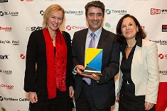
EHI and Messe Düsseldorf presented the sixth EuroShop RetailDesign Award for the stores with the most successful concepts.The ceremony took place in New York City at the 42. International Store Design Awards Gala of the Retail Design Institute.
Once again, the key criterion was a coherent store concept with a clear message about the merchandise range. The international panel of judges selected this year’s winners from a field of 26 finalists. Since two of the leading stores received the same number of points, EHI and EuroShop decided to name four winners in 2013.
Hieber’s Frische Center, Bad Krozingen
The food markets owned by the Hieber family have long been standard setters in German food retailing. The store that opened in Bad Krozingen in October 2011 introduced a new design concept. Its unusual architecture, with matte black paintwork and an exterior wall inclined at a conspicuous 15 degrees, offers striking contrasts in the interior as well.
The biggest innovation is the creation of merchandise worlds. Although the individual departments contrast markedly in materials, floor coverings and lighting, they still form a harmonious whole. Minimalist line drawings and black-and-white lettering on the rear walls identify each department, creating a signage system that runs through the entire market. “Buy and learn” is the motto. “Instructional panels” give information on the product ranges and describe special details, while at the same time serving as design elements.
Liverpool Interlomas Department Store, Interlomas
The Liverpool department store in Interlomas, a suburb of Mexico City, successfully combines the functions of a park and shopping center. Besides being a department store, Liverpool creates a public space, allowing it to play a new role as a social meeting place. The round, futuristic-looking building with a silver façade opened in 2011 as the flagship of the Liverpool chain.
Its four storeys, with a total of 30,000 square metres of retail space, are connected by an atrium that is flooded with daylight. Changing materials and colours create warmer shades as customers ascend. In this way they discover a whole new world on each floor and encounter impressive visual merchandising. The climax is the parklike rooftop garden covering 3,000 square metres, which includes a gourmet food area.
Louis Vuitton Island Maison, Singapur
The Louis Vuitton Island Maison store, which opened in September 2011, occupies one of two glass pavilions on an island at Singapore’s Marina Bay Sands resort. The asymmetrical steel and glass buildings were designed by architect Moshe Safdie. This is the first Maison store in southeast Asia. Its interior, with a nautical theme, was exclusively designed by American star architect Peter Marino.
Elegant teak and chrome, plus sails for protection of the façade from sunlight, emphasize the maritime style of the light-filled pavilion. From the centre customers have access to the various departments, including a bookstore, gallery, sun deck and – for the first time ever – a “travel room”. Visitors can reach the Louis Vuitton Island via a walkway from the shore, via a tunnel from the Marina Bay Sands shopping mall or on a special boat from the store’s own jetty.
Neiman Marcus, Walnut Creek
The American department store company Neiman Marcus opened its latest branch in Walnut Creek, California, in March 2012. The building’s transparent architecture, which makes it seem almost like a museum, offers a splendid view of the San Francisco region’s East Bay. This panorama also inspired the interior design. Incident daylight connects the store with the surrounding landscape in a way achieved by few other stores.
Bright, warm colours, glass and metal enhance the feeling of transparency and openness in the sales area, which covers some 8,000 square metres. The Walnut Creek store also features 163 works of art that are permanently integrated in the interior. The most conspicuous objects are two kinetic sculptures by local artist Ned Kahn that cover whole sections of the façade, with vertical fins moving in the wind.
The EuroShop RetailDesign Award for 2014 will be presented at EuroShop in Düsseldorf in February 2014.
channels: shop building, shop design, shop concepts

