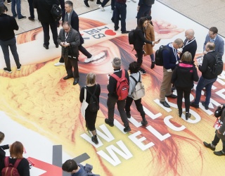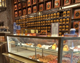
Shopping, working, watching movies and watching the Berlin monkeys groom each other: Bikini Berlin has many different facets. The former “Bikinihaus“ (Bikini House) from 1955 was recently remodeled into the world’s first concept mall. Exclusive retailers take advantage of its box concept, which they can use creatively for a set timeframe. In this interview, Dionys Ottl of the architecture firm Hild und K describes how the building complex could be designed in an ultra modern fashion despite monument protection issues and initial structural problems.
Mr. Ottl, as the world’s first concept mall, Bikini Berlin differs from traditional shopping centers in that you won’t find your typical chain stores here but rather very specific brands. How is this concept reflected in the architectural design?
The concept mall creators’ desire for individuality and authenticity has also guided us in the design: you’d be hard-pressed to find exposed steel lattice beams like the ones that particularly dominate the three-part hall on the ground floor in a traditional shopping mall. The materials of the interior are consistent with the genuine quality customers are able to find at the Bikini Berlin Pool: solid oak planks frame the long seat bench by the window facing the Zoo and make up the staircase to the roof garden; the gallery level was laid out with oak parquet
The glass fronts of the retail units are defined by a flexible system of different glass sizes and structures, whose steel sections were merely waxed. The hall’s reinforced concrete ceiling also remains exposed and visibly showcases the installation and the lighting elements that were specifically designed for the building.
The remaining wall surfaces echo a theme from the outside facades: the renovation made it necessary to replace a number of historic structures and materials, for instance the solid-colored glass panels of the facades. To save a piece of the old substance for the new construction and thus create continuity, the original glass surfaces of the building were shredded and used as an aggregate in the plaster. The old building materials were given a new life and illuminate the interior space with a “folded“ looking plaster structure, whose elements overlay each like the intricate folds of a summer dress.
Can you explain the ”box“ principle? What are its design advantages?
The Bikini boxes are a unique modular system: smaller temporary retail units are spread out like islands across the entire hall. The boxes are available for experimental concepts. Possible lease terms are between three and a maximum of twelve months. The virtually makeshift look of the timber construction made of untreated wood also mirrors this temporary character. At the same time, the system is extremely variable. For the most part, it’s up to the tenants as to what they do with this creative freedom. We are counting on some creative minds here!
One goal of malls currently is for customers to spend as much time there as possible. What turns Bikini Berlin into such a place?
Bikini Berlin overall features a high degree of memorability. Aside from the new Premium Kino Zoopalast (a unique movie theater) or the gastronomic specialties, architectural design aspects are certainly also responsible for this: first and foremost we should mention the publically accessible 7,000 square meter terrace on the rooftop of the Bikini Berlin Pool, called Bikini Berlin Garden by us. It is accessible via the grandstand staircase on the inside forming a ring closure with the freestanding staircase in the front at Budapester Straße and thus creating a link between Breitscheidplatz and Zoo. At a height of almost ten meters, it offers a unique view of its animal neighbors in the Zoo. During the past months, Berlin citizens and tourists have already enjoyed this view immensely. This also applies to the four by fourteen meter picture window on the inside of the Bikini Berlin Pool, which opens towards the neighboring monkey hill.
During the renovation, you had to be mindful of the historic buildings. What design challenges did this create?
In 1955, architects Paul Schwebes and Hans Schoszberger created an uncluttered, transparent structure with the “Zentrum am Zoo“ and the adjoining “Bikinihaus“. The entire building complex stood for economic revival and was a milestone for the creative departure of the Federal Republic of Germany. During the renovation, we always remembered to make this lightness from the original building construction visible again. This is not an easy task: first, there were serious structural problems with a building and its reinforcement that were planned based on standards common in the 50s. The existing conditions fell far short of the standards we need to apply today.
Besides the structure, energy efficiency of the existing buildings presented a problem that caused quite a headache for all involved planners. The “Bikinihaus” façade in particularly is known for its airy appearance. Thanks to jutties and setbacks in the concrete and varying designs of filigree windows and glass rail systems, it gives an airy and almost meshlike impression.
Given today’s energy conservation regulations, adopting the delicate elegance of the structural shapes and the original chromaticity so typical of the 1950s was no easy feat. Among other things, this was solved by making special building components that maintained the outer profile, but achieved the necessary reinforcement on the inside.
What did you like the most during this design process?
We have a certain fondness for haptics here at Hild und K. That’s why the design of unusual surfaces, for instance the plaster with the aggregates from recycling was one of our favorite tasks. Another favorite of ours is interior work, which is why I would also like to mention the decor and the furnishings in the form of seating accommodations developed by us for the mall as well as the roof terrace.
Particularly, the successful relationships with all participants have made the construction period for this large project a positive experience. In some ways this also continues after project completion: since the office of our Berlin agency is located in the “Großes Hochhaus“, that being within the Bikini Berlin premises, we get to experience the reaction by people to our work every day. Watching this process of appropriation – for instance the large staircases or the well-received roof terrace – is definitely what is the most fun after the work has been completed!
Natascha Mörs; iXtenso.com
Click here to get to the photo gallery of "The First Concept Store".

