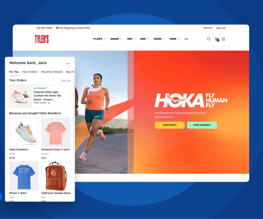
"Thank you for your purchase!" Statements like these make customers happy - and their minds more open and receptive to new ideas according to a study by web store optimizer Rokt. Special emphasis is put on the moment right after a successful transaction.
Mr. Smith, in your study titled "The happiest place in digital marketing", you asked nearly four thousand consumers from the UK, the US, Germany, and Australia how they use the Internet and inquired when they feel their happiest. What was your objective in this case?
We wanted to find out when Internet users are happiest and most engaged and focused. We always knew that the transaction moment when consumers shop online is a very special experience. But we wanted to know how special this moment exactly is compared to all other online activities.

What did you find out?
People are happiest online when they are shopping. Having said that, they are even happier when they get to the confirmation page, meaning during or right after completing their purchase. You also have to remember that the user’s focus and attention are also at the highest level when he/she shops. When consumers shop online, they are not sidetracked and essentially don’t do anything but shop. Marketers need to take advantage of that!
Based on your study, what is your recommendation for online store operators?
We know from experience that e-commerce operators focus intently on the customer journey. They try to encourage consumers to not only browse but also to buy. They spend a lot of time optimizing this process to get people in and out as quickly as possible. Meanwhile, we also notice that most e-commerce operators spend very little time verbalizing and articulating their transaction confirmation page.
We have seen countless examples of the most beautiful and optimized and the worst, non-optimized checkout pages. This is where marketers and operators must take decisive action since this is where customers are their happiest and open for cross-selling or up-selling activities. Unfortunately, e-commerce operators are not taking appropriate actions or are unaware of the untapped opportunities confirmation pages provide in this area.
What challenges must online store operators face up to?
These are opportunities and not challenges. The confirmation page tells you precisely who your customer is. Operators know exactly what customers have purchased and can presume what they must do next. They now know which additional measures or further offers and suggestions make sense to encourage the customer to continue shopping. Needless to say, the shopping cart will dictate the products operators should suggest and offer.
What should a perfect confirmation page look like?
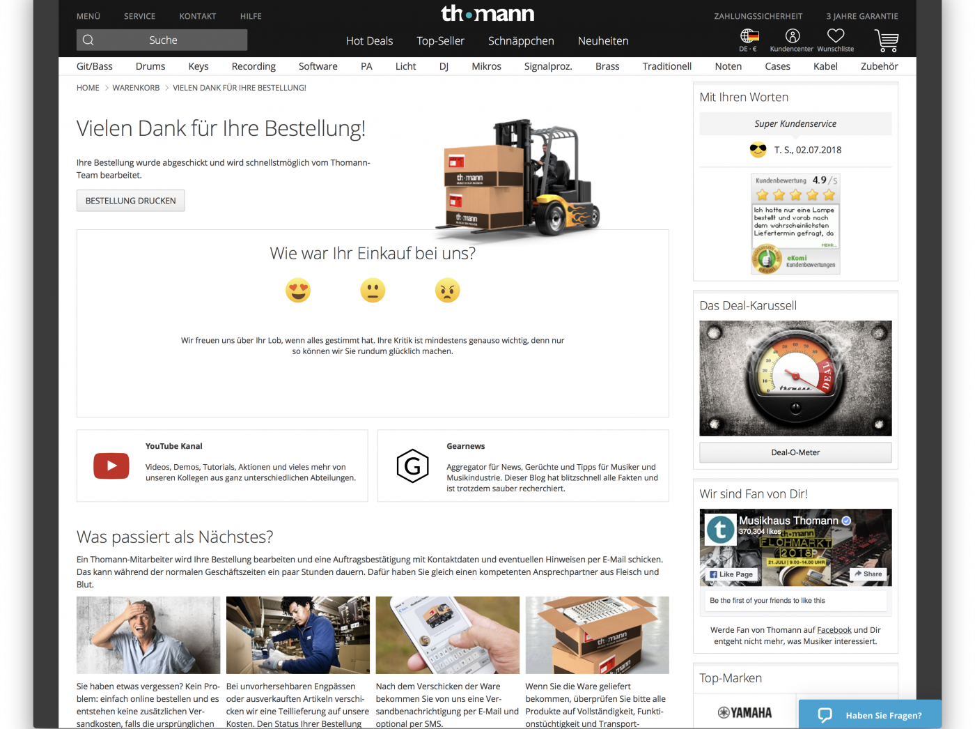
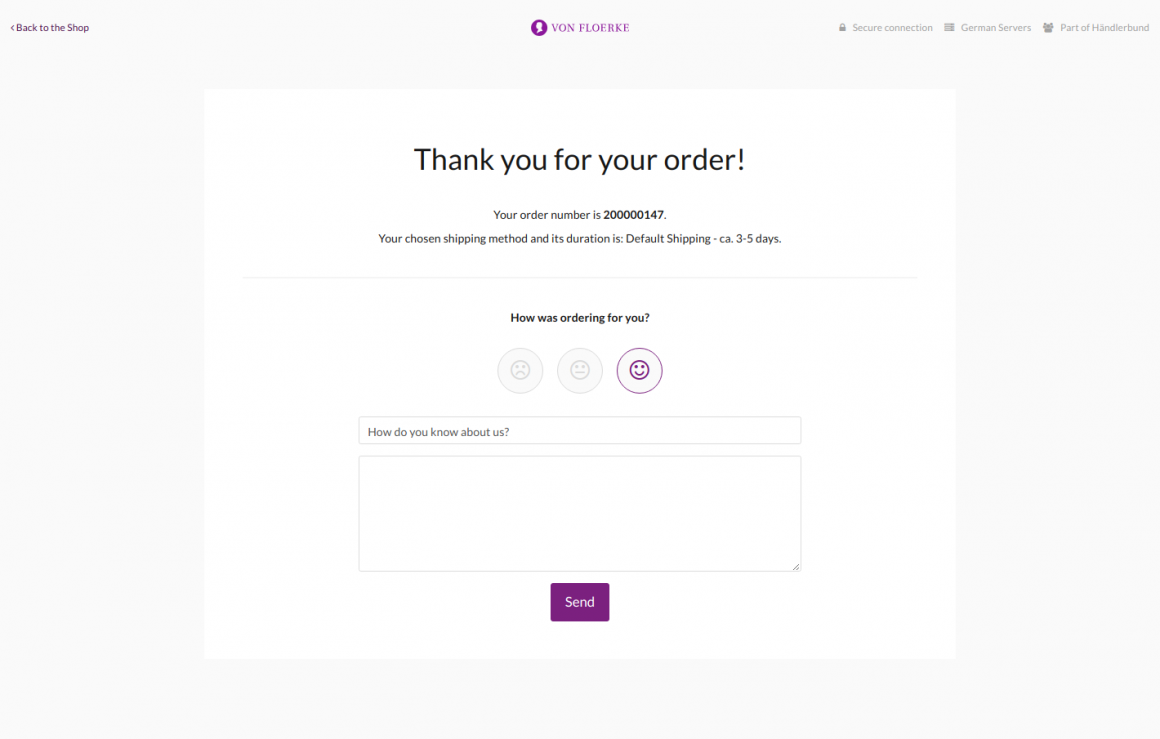
The confirmation page is hardly ever used for information. The page usually only states the order confirmation number and confirms that the order is now complete. That’s a complete waste of resources! You can offer customers more than that. You can offer a coupon, a discount on the customer’s next purchase or suggest similar products that might interest the consumer.
I was actually surprised to learn that the confirmation page is the moment when the customer is ready to buy more. After all, he or she has just reached his or her goal. How do you account for that?
That's a great question. Customers are simply open to new things at that time and are excited about further offers and suggestions.
Do the results of your study apply to all industry sectors or were you able to identify any differences?
We asked consumers about the types of purchases they made online over the past two weeks. Customers visited nearly all industry sectors online. The industry sector is actually not the crucial part in this case. Instead, it’s essential that the optimization matches the brand and goes with the product only to a lesser extent. If you operate a premium fashion e-commerce site, Hotels.com is likely not the right match for your brand, though there may be other options that fit the brand that consumers might be able to take advantage of. This includes tips and tricks on how the buyer should best care for the newly purchased product and matching products for example.


