For the majority of companies an appearance on Instagram, Facebook, TikTok and Co. is obligatory these days, social media seems to be a valuable communication tool for retailers. However, they should keep a few things in mind when designing their content. We asked the design expert Louis Victor how retailers can optimize the design of their online presence to increase their reach and strengthen their brand image.

Mr. Victor, what is the importance of shape, color and design for a social media account?
Louis Victor: People don't just act out of reason, they are subconsciously influenced by images that are tied to emotions. Thus, we perceive colors, shapes and relationships in images on a level that words cannot reach.
According to the “iceberg theory”, customers make around 85 percent of their decisions emotionally and not rationally. Accordingly, retailers should dare to integrate certain colors, arrangements or symbols into their communication – they create a recognition value that remains anchored in customers' minds.
This also applies in social networks: Designs, colors and shapes appeal to human emotions. However, there is a great deal of competitive pressure on social media in terms of content. Only those who dare to stand out with their content will be noticed by users in the long term.
How can online retailers use a strategic design of their social media channels to increase reach and engagement rates?
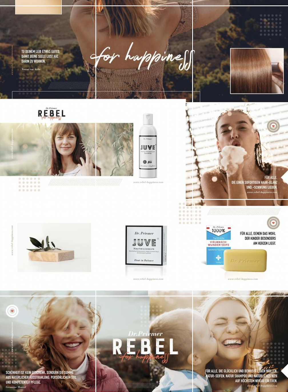
How a company's content and social media profile should look is ideally based on the target group. That's why it's important for retailers to align themselves with their customers. To do this, they should develop personas and answer fundamental questions: How can problems of the target groups be classified? Do the users have a purchase intention or do they simply want to be entertained? Do customers also value learning something new and receiving important input?
In terms of design, it's important to know what colors and shapes the target group loves. Truly good design should always excite and, above all, inspire the customers. Design demands interaction and action – one of the foundations for success.
Are there other aspects that retailers should consider regarding their design in their social media presences?
Online retailers should offer their target group added value on social media. Basically, retailers don’t sell here, but rather provide entertainment and information to win new prospective customers. Retailers must therefore focus on solving customers' problems.
A supplier of greenhouses, for example, could provide simple and fun assembly instructions in video format on YouTube. This helps customers understand the product better and builds trust between the supplier and buyer. It also makes it easy to reduce the rate of returns. Most visitors also appreciate the answers to typical questions in the form of a "FAQ" section.
How important is a consistent design across channels such as social media, website, online store and newsletter?
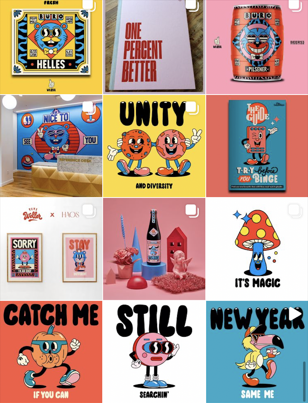
The choice of colors should be tailored to the respective medium and target group without appearing too "artificial". Internet users value reliability and orientation. So retailers should also use their design to convey values they stand behind – for example, trust, convenience, competence or punctuality. Many companies establish a corporate design to which they adhere in the long term and across every medium. This creates a recognition effect that binds customers to the brand.
Should retailers use their logo and "their colors" in corporate branding?
The key to success is corporate communication. This includes products and services as well as posts on social media. Retailers should always consider the impact their presence can have – from advertising campaigns and postings to employee attire and the company building. The ticket to a successful online presence is authenticity. It is generally advisable to have an agency customize the logo and branding for social networks.
What mistakes should retailers avoid in their social media presence?
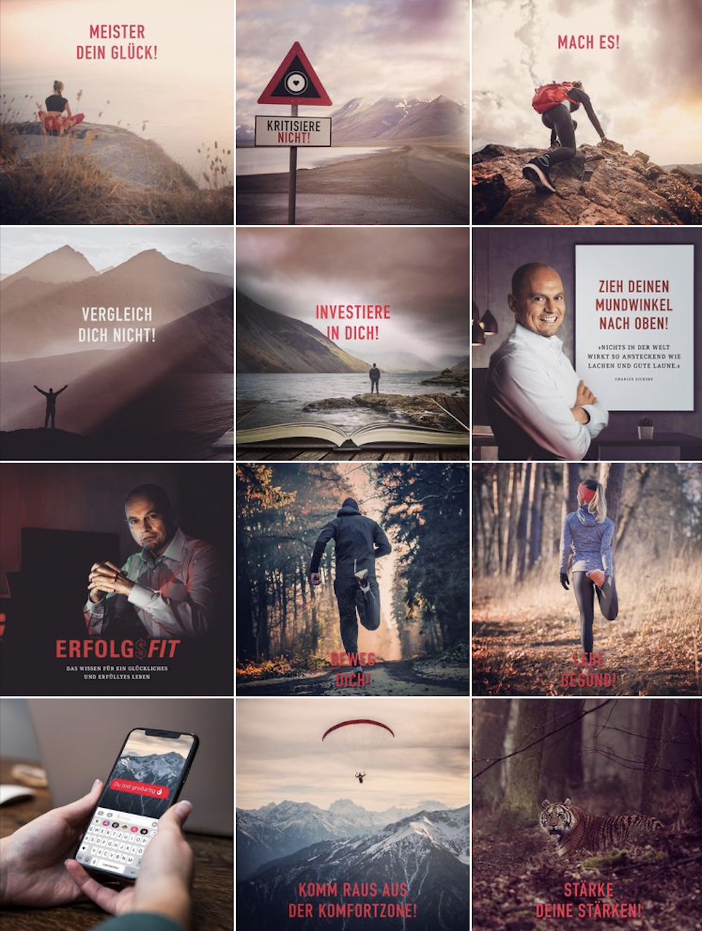
One of the most common mistakes is an inconsistent color concept. This looks very unprofessional, especially on Instagram. Also, if colors, shapes and design don't match the content, you quickly lose the attention of users.
Another mistake is that retailers outsource social media to amateurs such as interns, inexperienced employees or trainees. The online presence is elementarily important. It shapes the company's image both internally and externally – this is where professionalism and expertise are needed.
What are your insider tips for designing social media postings?
My recommendation to retailers is: Dare to be different from everyone else. Stay true to your values in the company, but also be a little crazy.
In addition, always clarify the "why" in your company. Show users why you do things in simple images, colors, shapes and words. This way, your actions are comprehensible – which ensures reach and likeability. Appeal to the imaginary self-image of the target group and ultimately take into account what added value the user gets from following you.


