After Fraîchement Bon opened its first grocery store in the Villeray – Saint-Michel – Parc-Extension district in Montreal in 2020, the fruit store has now opened another store in the same area, on Jarry Street. The architecture and design firm Dupont Blouin also helped with this second store, contributing its expertise to redesign and improve the shopping experience. The store is designed to offer an efficient and friendly concept for everyday grocery shopping.
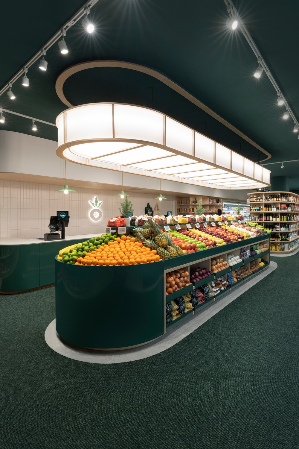
The design emphasizes light, curves and color to create a smooth, flowing and pleasant shopping experience.
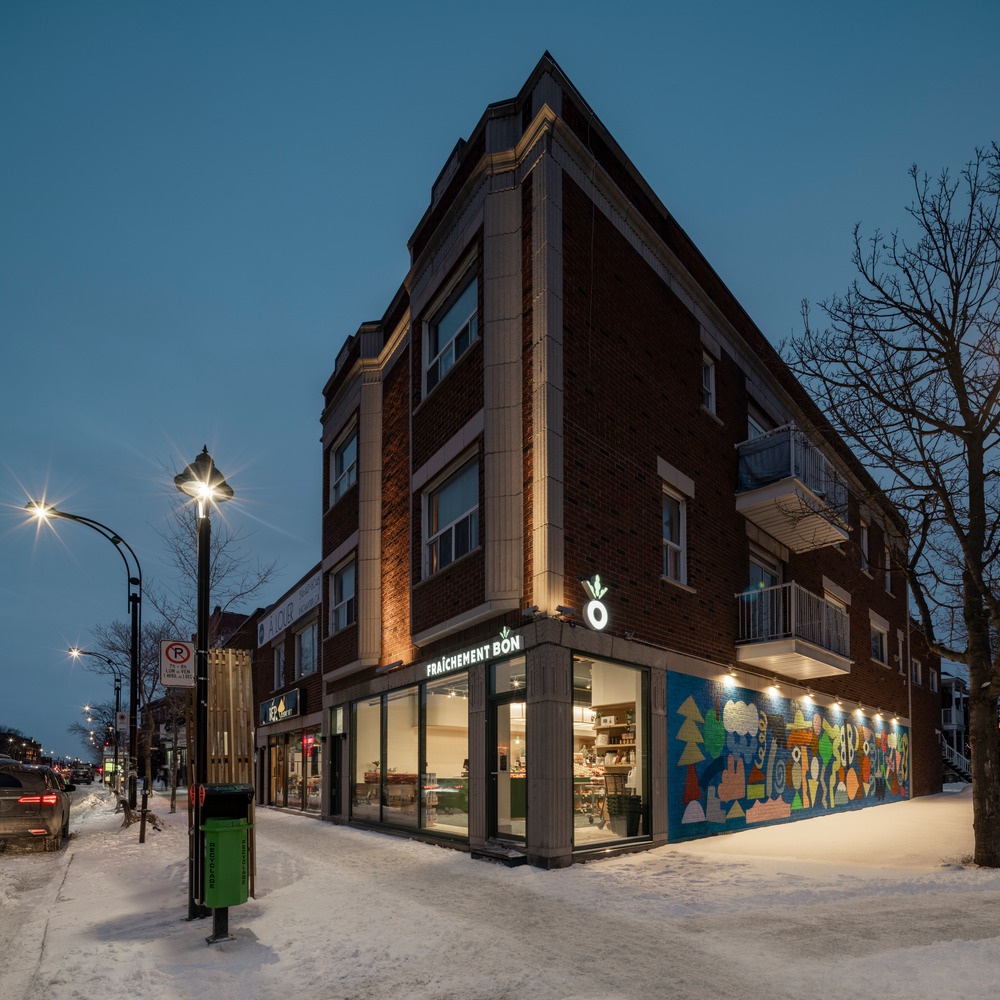
The store is in an historic, red brick building from 1935. The architects adorned the building only with a few signs on the outside to preserve the beautiful decorations and pillars. The door and window frames are made of aluminum - simple and modern. The color coordination in forest green suits the company. The name of the store is displayed in bright letters at the front.
Through the large windows at the front of the store, you can see attractive pieces of furniture, for example a curved lamp that looks like a hanging lantern. This not only has a strong visual impact, but also makes the store cozy and attracts passers-by.
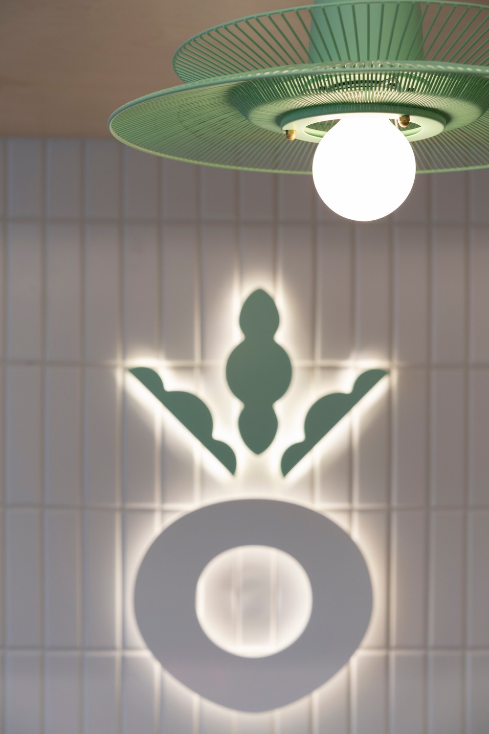
The design of the store was inspired by the Freshly Good logo and the shape of a radish - a circular circulation. There are no confusing aisles in the store. Instead, the furniture runs through the store as if along a ribbon. This makes it easier to move around and leads to a pleasant shopping experience. The wide aisles and the clear alignment of the furniture also support this and ensure visual calm.
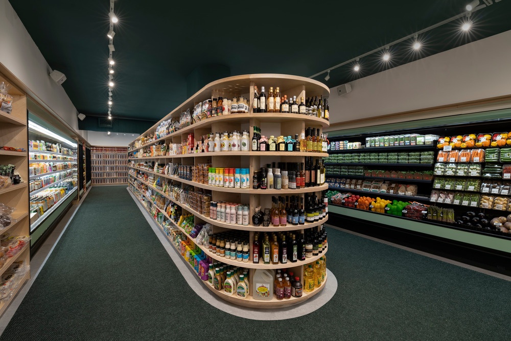
The fridges are placed at the edge and the wooden furniture is in the middle of the store. They hide the pillars of the building.
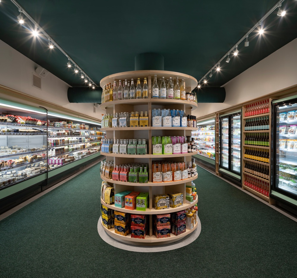
Shelves on seven levels make it easy to see the products clearly, which makes shopping easier.
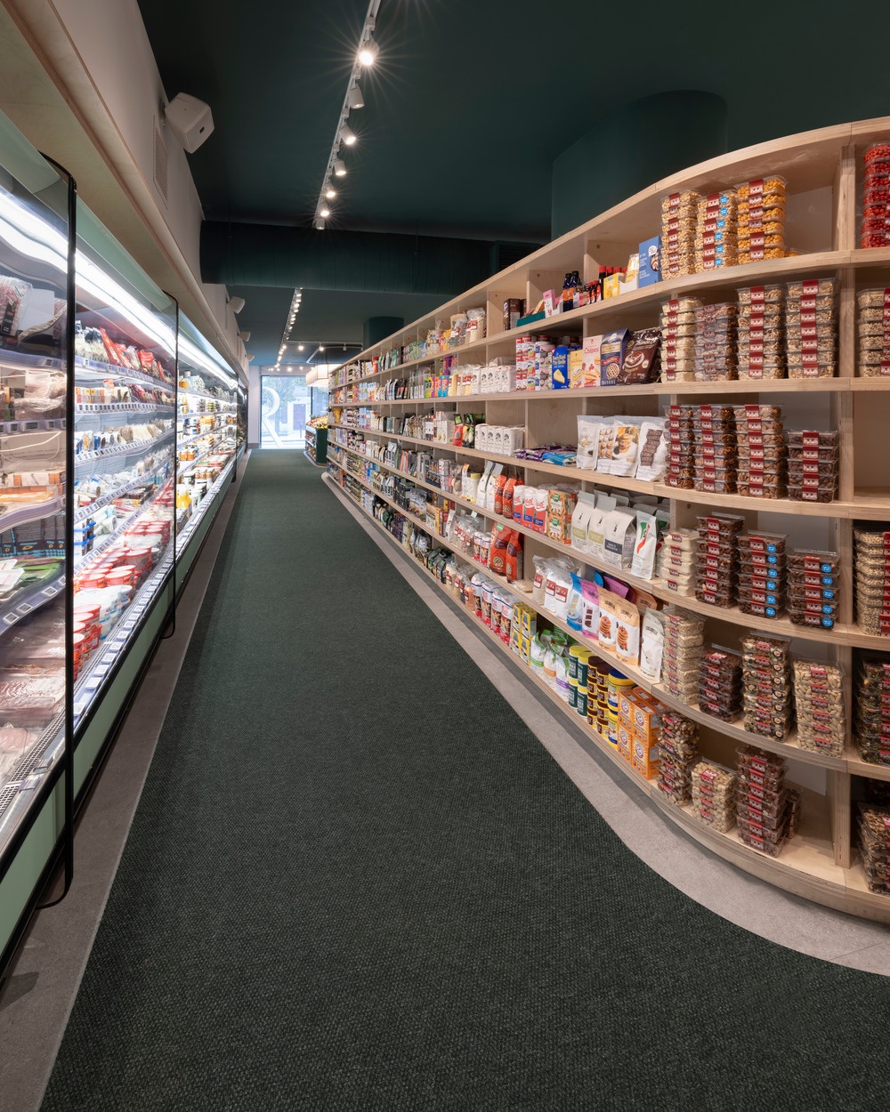
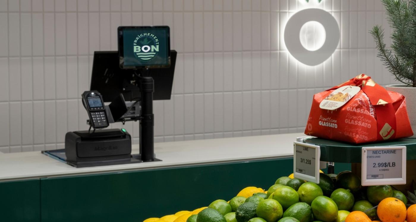
The atmosphere of the store is homely with soft curves in the furniture, which contrast with the otherwise straight-lined commercial spaces. It is rounded out with the warm glow of LED lighting.
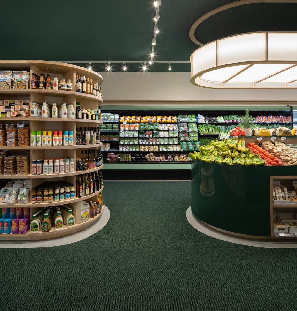
The design ensures that plenty of daylight enters the store. The glass front lets in the direct sunlight but the orientation of the store ensures that the light does not harm the food. Low furniture is placed along the windows to display certain products while others are visible in the store. The large windows create a lively market-like atmosphere.
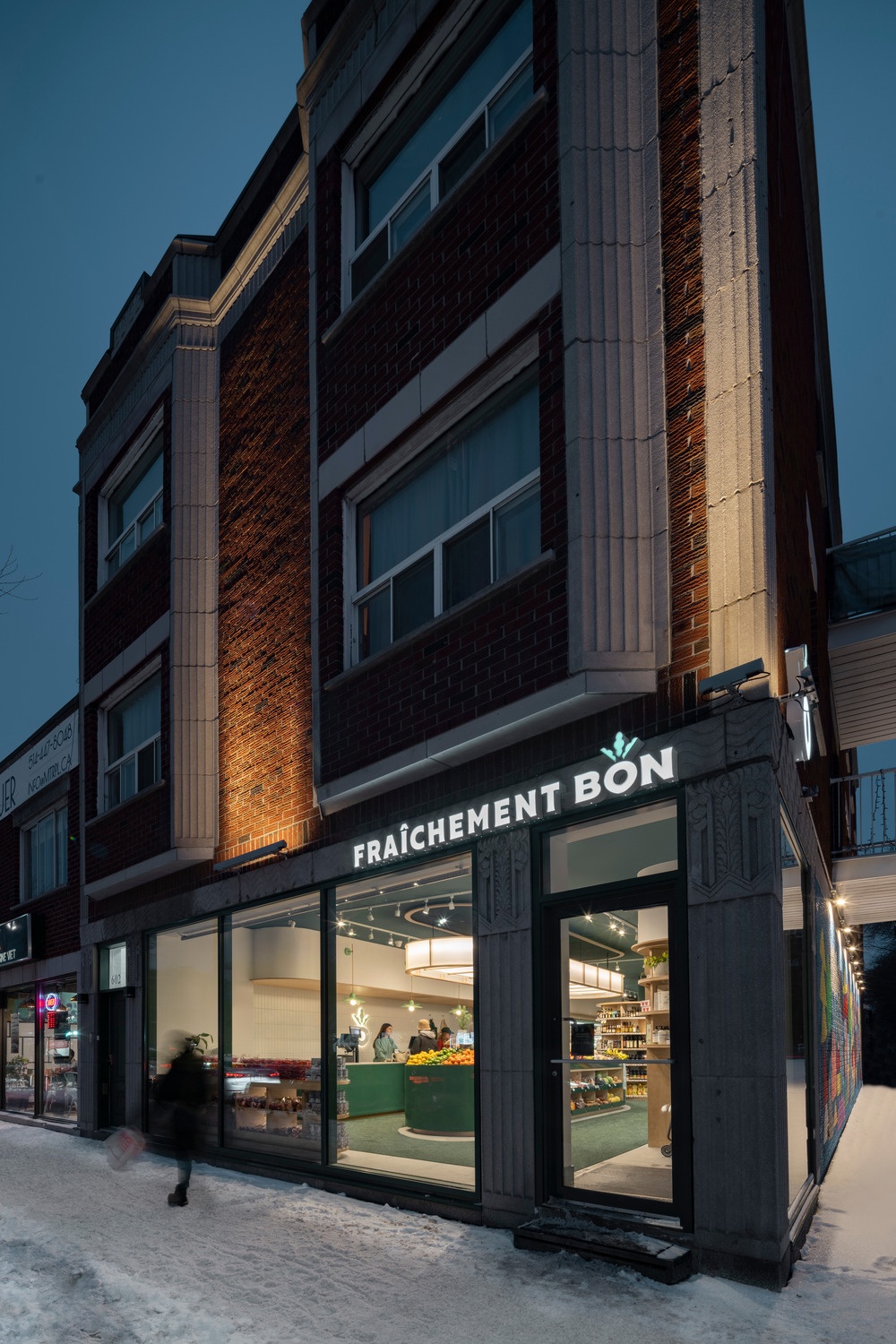
The color palette and materials suggest freshness and are easy to clean. Pre-painted steel, for example, makes cleaning easier. Wooden furniture is integrated to offset the cool, industrial look of the metal. A clear color palette between soft green and forest green connects with the fresh products that are sold. A bright ceramic floor brings plenty of light into the room. The tiles are covered with a special carpet that not only defies the muddy snow in Canada, but also matches the green of the furniture. The overall effect is a friendly atmosphere.
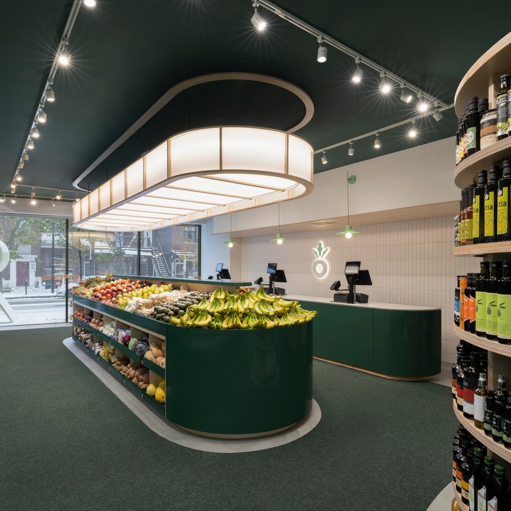
The store is designed in such a way that every area is optimally utilized while still conveying a feeling of lightness.

