It has only been recently that retailers pay increased attention to their store windows. By now, they realize that they can use them specifically as a means of communication to attract customers.
That’s why according to the EHI, approximately 80 million Euros are annually being invested in store window design in Germany alone. For retailers this means decorating in an individual, accentuated and effective manner. Changeable and interactive design elements that can turn the store window into a customer magnet and calling card of a company are right on trend.
Highlighting the essentials
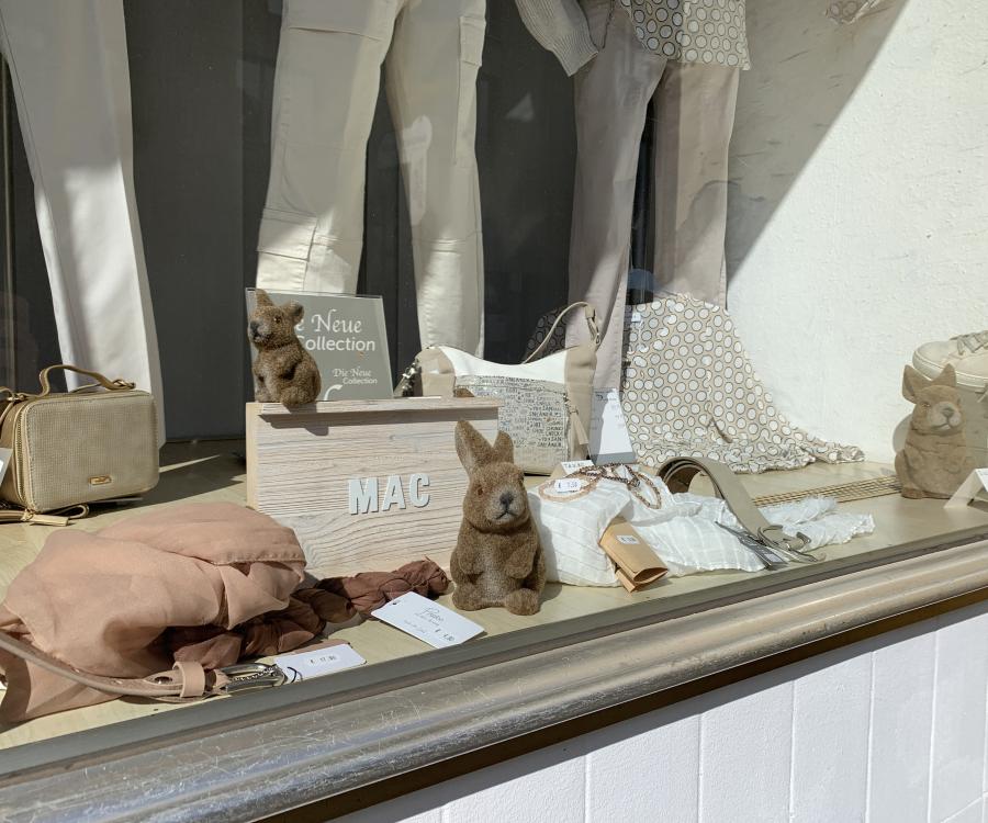
Store windows can have a positive impact on the buying decision on several levels. On the one hand, they address consumers on an emotional level with decorative elements, lighting and colors. On the other hand, they provide information about the product. The more the customer likes the window, the more money he or she is willing to spend in the store. In product presentation, it’s not about showing your entire product selection, but about offering eye catchers instead. Even though customers want a lot of information, it is proven that they are more responsive to carefully designed store windows. This means, you should only stage as many products to where they are still clearly visible. But be careful, because not enough products could suggest that something is missing.
Customers constantly want new inspirations, which is why decorations should be changed on a regular basis. Department stores frequently choose to change items every four to six weeks, while retailers like to change their themes more often and are being more flexible about it – sometimes every other week. This depends both on the size of the store and the location. "At the Modehaus L+T in Osnabrück, we change the design depending on the season. With a planning schedule of half a year in advance, a shorter interval is actually also not desirable," explains the company’s visual designer Nicole Werner. The store features a coherent design starting with the store windows to the advertising material all the way to the company’s web presence.
Changeable eye-catchers
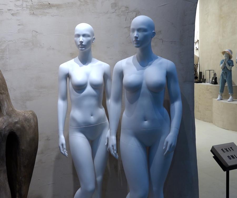
Display mannequins are still – especially in the textile industry – a key element in store window design. Even though there are still very realistic versions out there to showcase the current collections, more and more retailers tend to choose more abstract types of mannequins. Mannequin manufacturer Professor Dorman Lee of A2 Mannequin in China explains their advantage: "Retailers prefer the more abstract models, because they can be used for many years." Their style can be easily changed by replacing their extremities or by using changeable and combinable designs such as mannequins with textile surfaces for example.
Dynamic elements are other typical eye-catchers in store windows. Every year at Christmas time, the Galeria Kaufhof in Bonn, Germany, brings a huge window facade to life with moving stuffed animals by Steiff. It’s not just the kids that press against the glass to discover this exciting setting.
Digital signage elements: "In the future, customers will decide what they want to see" (Nicole Werner)
Retailers and visual designers increasingly use digital signage elements; this includes QR codes that guide you to the store – regardless of the time of day, digital gender recognition and touch screens all the way to interactive store windows.
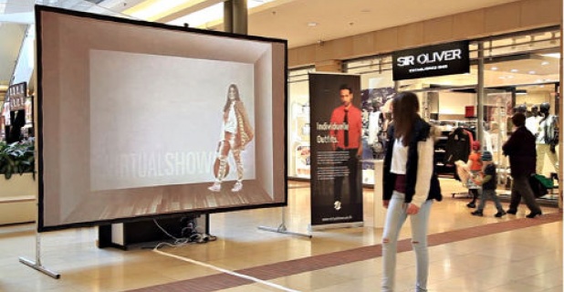
The "Virtual Showcase" project by Luigi Bucchino, a student of the School of Design at the University of Pforzheim, utilizes several of these elements. When a pedestrian walks past the store window, motion caption cameras pick up his or her movements, depth cameras identify the person’s gender based on the face and the approximate age. Then a virtual model is shown on the screen or the monitor, which approximately corresponds to these parameters and imitates the movements so to speak. "Using simple swipes, the pedestrian can also change the outfit both in the upper and lower part of the virtual model projection – thus obtaining a personalized clothing configuration," explains the designer.
The advantage for retailers: they can address specific campaigns such as seasonal sales and sales discounts much quicker and without much effort. The desired attention by the customer is guaranteed, as was shown during a test phase in a shopping mall. People of all ages wanted to try this. "At first they seemed to be somewhat irritated when they noticed from the corner of their eyes that the virtual model moves like they do, but then they got really excited about it. And not just the younger, but also the older generation, because you don’t need to do much with this type of communication," explains Bucchino.
The costs for this type of installation range between ten and twenty thousand Euros, depending on whether the projection is implemented via a screen that fills an entire store window or just via beamer projection to a screen. Currently, he is still looking for project investors. The student points out: "Our goal is to give brick-and-mortar retailers an effective product to stand up to online retailers."
Coherent design
The key to all store window design elements is to convey a theme, a story and offer an informative connection at a glance. This is the only way to reach customers on an emotional level, which makes them pay more attention and indeed more willing to spend money. Ideally, the design and thus the corporate identity are consistently reflected on all levels of the company. This increases brand recognition and thus brand loyalty.
Author: Natascha Mörs, iXtenso.com

