Retailers face increasing pressure from online competitors. Although brick-and-mortar businesses take in the lion’s share of sales revenues, online shopping will play an increasingly important role in the future. That’s why it is important for retailers to focus even more on the "right" or best possible visual merchandising strategy and harmonious store ambience than they have in the past.
If the customer is inside the store, he or she is likely there to buy something. Many consumers first check online before they visit a brick-and-mortar store.That’s why it is important that retailers can be easily found on the internet, that they have an attractive website with a clear site structure and also take advantage of social media.

How customers decide to buy
First, two-thirds of consumers' purchase decisions are still made at the store, meaning that customers buy most items based on their gut level. We are talking about an impulse to buy that is triggered inside the store. Although the "ordinary" customer knows exactly what he/she plans to buy, he or she can still be enticed by a successful presentation of new products to make additional purchases.
However, it all hinges on how well the merchandise is presented in the store and whets the consumer’s appetite, prompting them to buy the product, even if it is not on his or her shopping list.
Second, today’s consumer has ever-higher expectations of his or her favorite store. That’s why the goal is to create a pleasant shopping ambiance.
You never get a second chance to make a first impression
The shop window display:
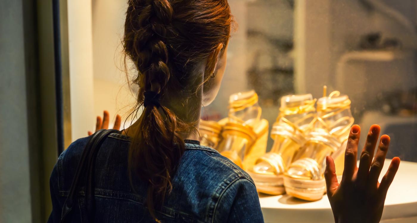
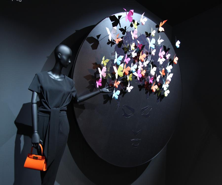
Always hinges on the designer’s creativity and has to match the products sold at the store. The idea is to use great visual merchandising to “lure” customers to the retail store. The phrase “less is more” applies in this case and it means you should not place too many products in the shop window display. It makes more sense to feature a few select intentionally placed products that will attract attention. These displays point to new items at the store or highlight seasons or occasions such as Christmas or Easter.
The store entrance:
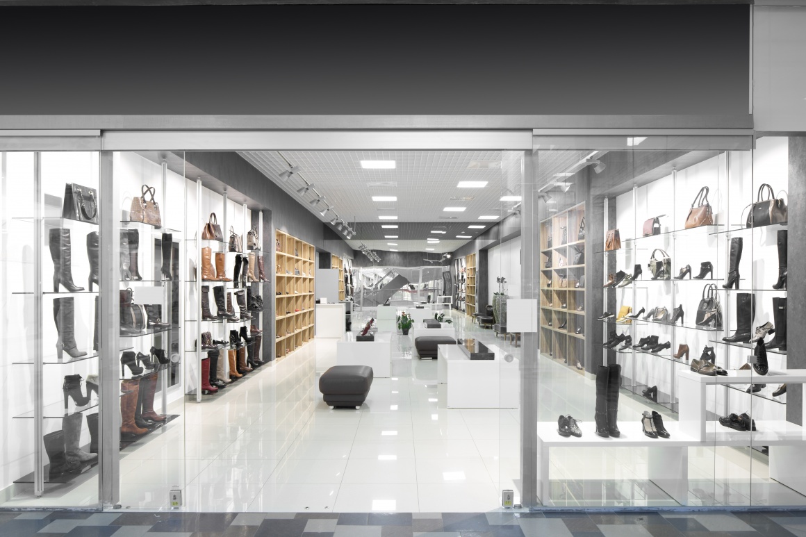
Is meant to welcome customers. It should be open, bright, and inviting. While customers are still outside of the store, they should be able to glimpse a peek inside. It is critical for the setting to look clean and tidy as customers expect it to be.
Company name or logo:
Fulfill an important function, create a company identity and should be reflected in the building facade, in the shop window and at the entrance area.
In the case of specialty stores, it is vital for customers to instantly recognize and categorize the store’s name. If possible, use bold colors such as red or yellow for the lettering.
Cleanliness and organization:
Are simply paramount. One important aspect to consider is whether you should have ashtrays outside the store. This might prevent smokers from carelessly throwing their cigarette butts onto the sidewalk.
The interior should be bright, light, and inviting
Colors:
Greatly influence the ambiance on the sales floor. Subtle and lighter hues – pastels and beige tones – and patterns are recommended. Darker shades "swallow" light and can negatively impact customer moods. This is especially important when it comes to wall and ceiling design.
Lighting:
Should showcase the merchandise. Warm white color temperature is recommended as it creates a more luxurious and warmer ambiance.
Organized and clear layout:
Is an important criterion for today’s customers to encourage them to return to the store. Larger stores should provide signs at eye level to guide consumers.
Price tags:
Are mandatory and still important for customers today, as research has repeatedly shown that consumers tend to not buy items without a price label. This means that retailers must indicate the price per pound or unit price on the price tag.

Customer traffic flow analysis reveals visited areas
Customer traffic flow analysis helps retailers to understand high traffic and low traffic areas and their effects on sales and conversion rates.
Some golden rules to remember:
- Don’t position merchandise too close to the entrance area. Customers usually pass through the entrance rather quickly and don’t pay attention to what’s placed in the first few yards of the store. Once they have passed this area, they start to get their bearings.
- Shoppers usually prefer to move right and walk counter-clockwise around the store, causing them to move along the outer walls.
- Customers don’t like to make U-turns.
- Bright store areas are more attractive than dark ones.
- Consumers tend to pay more attention to sloped displays as they often head directly towards them.
- 70% of shoppers generally reach with their right hand and tend to be drawn to the right-hand side of any space or counter. This means visual merchandise placed on the right side attracts more attention and sells better than items placed on the left.
- The checkout area is a great place to encourage additional sales from impulse buys.
Experience-oriented sales promotions or secondary placements
This is a trend that will continue and help create more revenue. Use themes for special product placements and come up with your own great ideas. Product placements for sales promotions should always be displayed in well-frequented areas of the store.
For more information, also check out the author’s book “Mehr Umsatz mit optimaler Warenplatzierung” / ISBN 978-3-639-443479 available at Akademiker Verlag or online at www.lemke-training.de.
Curriculum Vitae
- Hans Günter Lemke lives in 32457 Porta Westfalica, is an independent coach, book author and retail consultant since 1998.
- His customers include top companies in the retail and industry.
- His main areas of expertise are: "Successful Customer Retention Strategies", "Inventory Safeguarding Techniques" and "Increasing Sales with Optimized Visual Merchandising".
- Lemke incorporates over 20 years of management experience with renowned retail companies into his training courses, making his classes unique.
- Since October 2018, he also offers his services in webinar format. For 2020 dates, please visit www.lemke-training.de


