Report • 27.12.2022

Baking fresh tradition that tastes great!

Store design in the traditional bakery Mi Pan in Mexico City

Whoever buys their baked goods here will be wide-eyed at first – not only because of the huge selection of breads, pastries, nibbles and cakes. The store design of the Mi Pan bakery is also astonishing. And it doesn't take much to make customers feel at home.
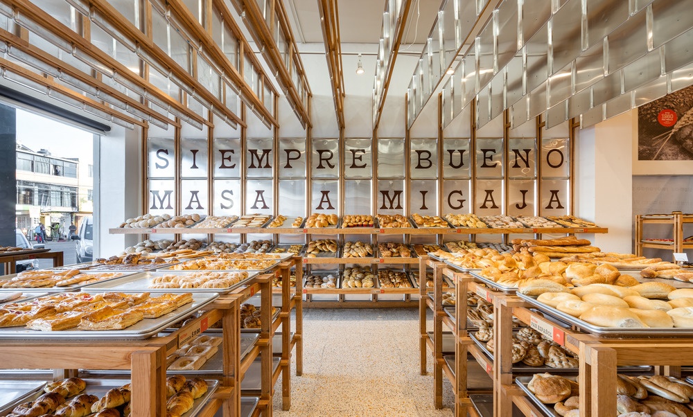
A counter display in a bakery with many different breads and buns...
Source: Jose Miguel Gonzalez / Apertura Studio

For more than 40 years, Mi Pan has been baking for Mexico's citizens, and the owners seem to want to combine the modernity of today with the tradition of yesterday, because Mi Pan's design honors the bakers and respects the traditions of the bakeries.
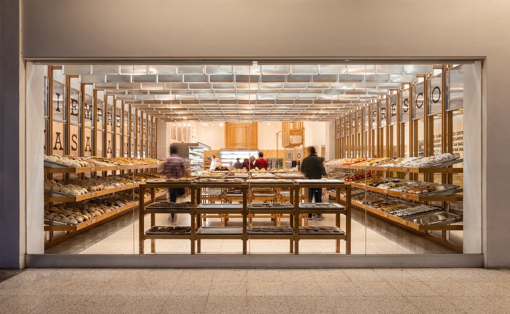
View from the outside into a bakery
Source: Jose Miguel Gonzalez / Apertura Studio

For the optimal design, in which the citizens of the city feel particularly comfortable, the responsible designers of Concentrico have looked around in the surrounding streets. They used elements such as signs, messages on walls and floor coverings as inspiration for the interior design. Despite modern equipment, it was important to maintain the self-service layout that usually characterizes bakeries. This was successful!
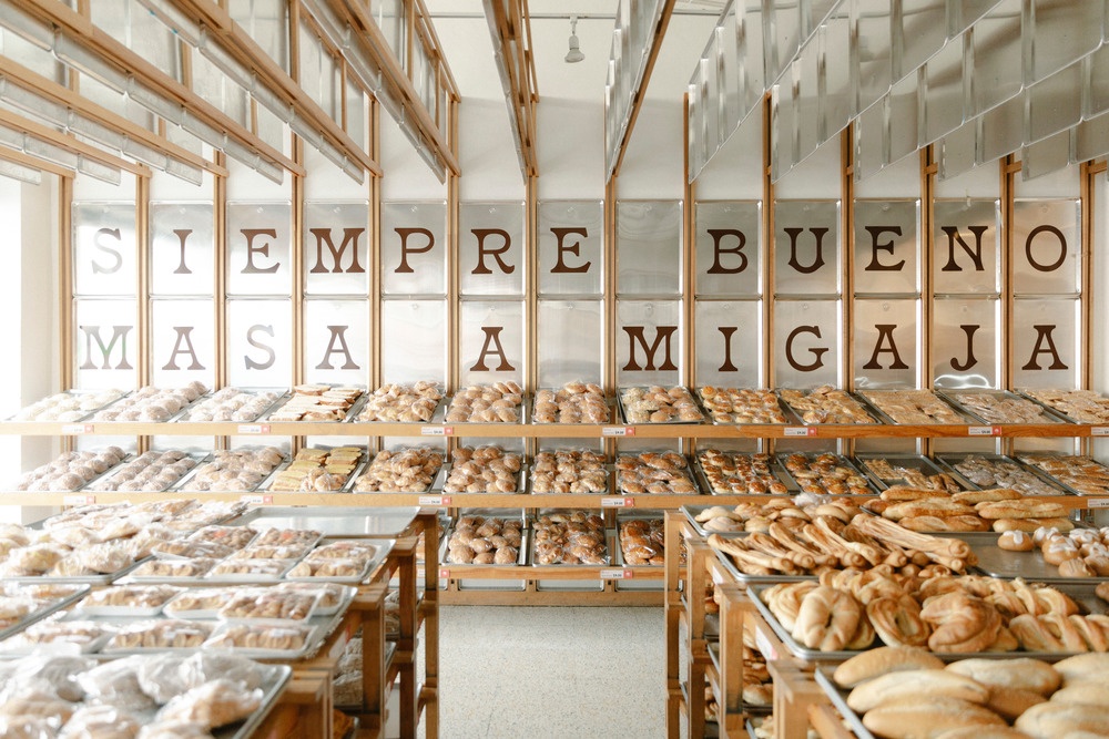
A counter display in a bakery with many different breads and buns...
Source: Jose Miguel Gonzalez / Apertura Studio

An eye-catcher: the metal sheets hanging from the ceiling. They are intended to link the all-important baking process and the in-store shopping experience. The characteristic use of metal trays in the design makes it clear that everything revolves around bread and its production process.

"Mi Pan's concept derives from its heart: its kitchen. There we experience the magic and talent of the bakers who shape each loaf individually", explains designer Alejandro Peña. "Throughout the bread baking process, trays are used to reflect the freshness of the product, so we integrated them into the store."
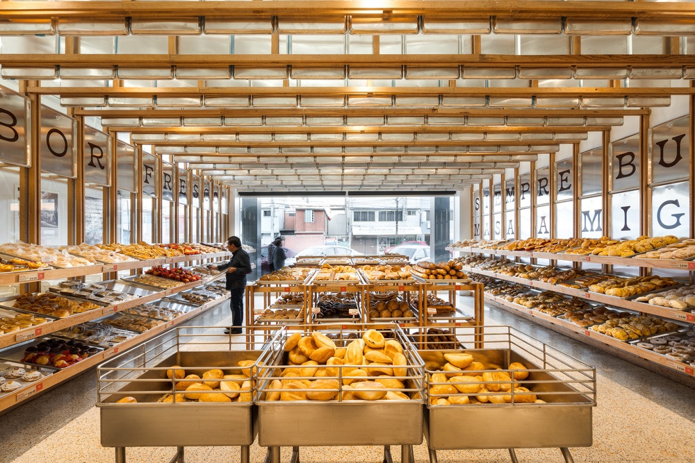
A counter display in a bakery with many different breads and buns...
Source: Jose Miguel Gonzalez / Apertura Studio

The space also features custom metal furniture inspired by the design of local restaurants from 1980, when the bakery opened. Pine panels in warm brown manage to add texture to the design and provide a warm balance to the coldness of the metal shells and furniture. On the floor, the outside influences show through. Such terrazzo flooring can be found in many local supermarkets in the same vicinity of Mi Pan Bakery.
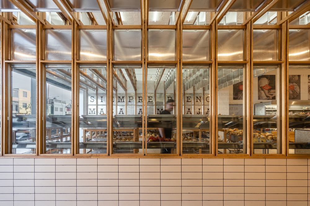
View from the outside into a bakery
Source: Jose Miguel Gonzalez / Apertura Studio

The coffered ceiling is not only impressive to look at, but also helps to make the room smaller and more inviting. It reflects the ceiling lighting and creates a great diffused light in the room, accompanied by product spotlights.
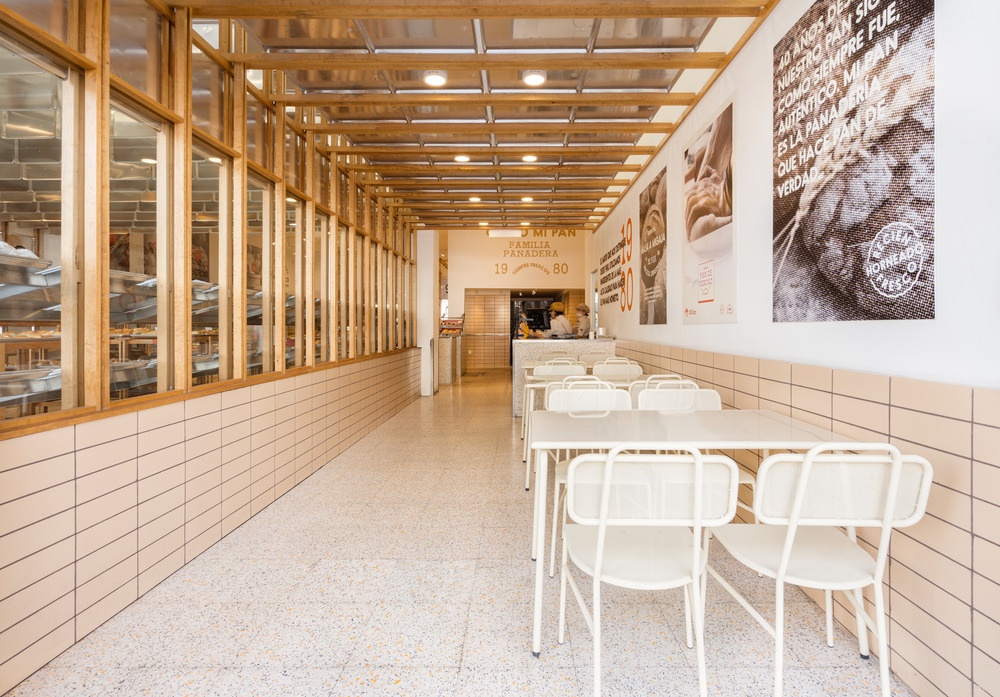
White chairs and tables in a hallway
Source: Jose Miguel Gonzalez / Apertura Studio

The concept of the store is clear: through a side entrance through the coffee shop area, customers come to the center of the store and stand directly in front of the large selection of bread, at the end is the checkout counter.

With the help of handmade signs, the story of the bakery is told piece by piece throughout the store.

Author: Katja Laska

related articles:

popular articles:

Thumbnail-Photo: Shop-in-Shop: Small solutions with great potential?...
12.06.2024   #sustainability #light systems

Shop-in-Shop: Small solutions with great potential?

Toy manufacturer Schleich reveals what is important for POS concepts

When brands rely on shop-in-shop, the following applies: As much as possible on ...

Thumbnail-Photo: Store design at Niederegger: marzipan and maritime charm in Lübeck...
05.09.2024   #brick and mortar retail #customer experience

Store design at Niederegger: marzipan and maritime charm in Lübeck

How the confectionery manufacturer brings together company tradition and city history

The Niederegger store in Lübeck combines many things: it reflects the city's close connection to the marzipan tradition ...

Thumbnail-Photo: Store concept: the magical pop-up store in Munich...
22.05.2024   #brick and mortar retail #shop building

Store concept: the magical pop-up store in Munich

Idea, implementation and challenges in “The Wizarding World Shop by Thalia”

Diagon Alley, Hogwarts, Quidditch pitch - there are many places to visit in the stories of Harry Potter. Why not in a bookshop too? What was a great success in Hamburg can now be experienced by fans in Munich. For the 200 square meter pop-up store, ...

Thumbnail-Photo: Store design: a boutique workshop for gourmet pastry...
03.06.2024   #online trading #brick and mortar retail

Store design: a boutique workshop for gourmet pastry

Lecavalier Petrone combines functionality and aesthetics

Lecavalier Petrone, a renowned gourmet pastry shop run by Chloé Migneault-Lecavalier and Loïse Desjardins-Petrone, has ...

Thumbnail-Photo: Penny in Colognes Latäng Quarter: A special store design with Cologne...
12.09.2024   #brick and mortar retail #customer experience

Penny in Cologne's Latäng Quarter: A special store design with Cologne flair

How the Penny store combines local ties and modern design

Im Herzen des Kwartier Latäng in Köln hat Penny ein besonderes Store Design geschaffen, das die Verbundenheit ...