Power Stores is the name Foot Locker gives to its new stores in different locations. The most recently redesigned store is located near Marble Arch and Oxford Street.
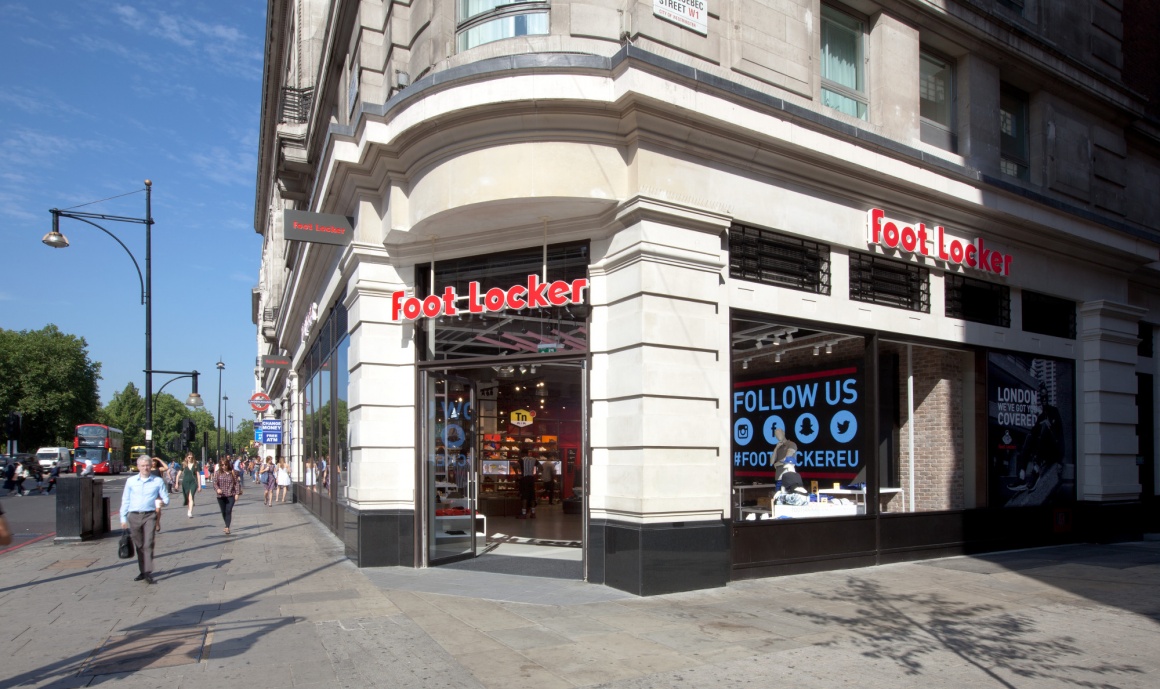
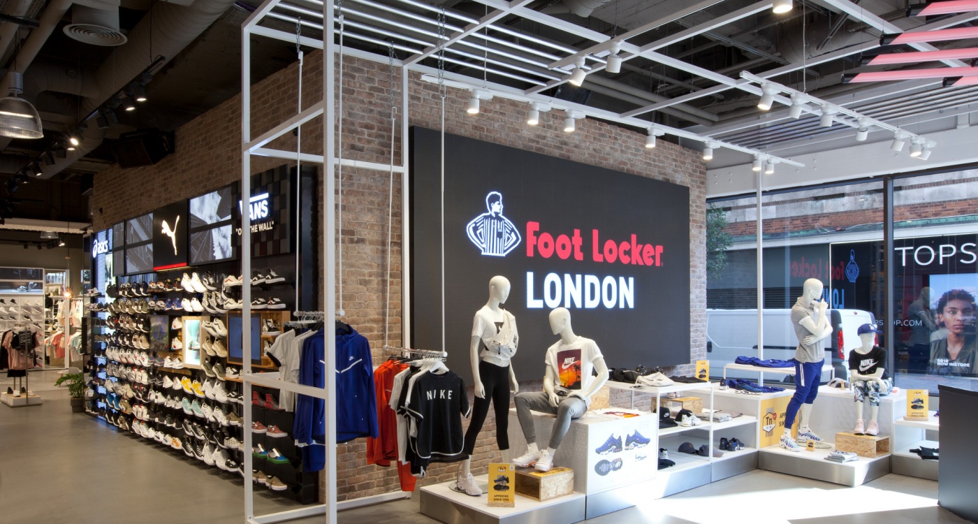
"London - We've Got You Covered" is the motto of the brand presentations - also digitally on the large LED screen at the main entrance. The store's storytelling is explicitly technology-driven. For this the digital elements were integrated into the design.
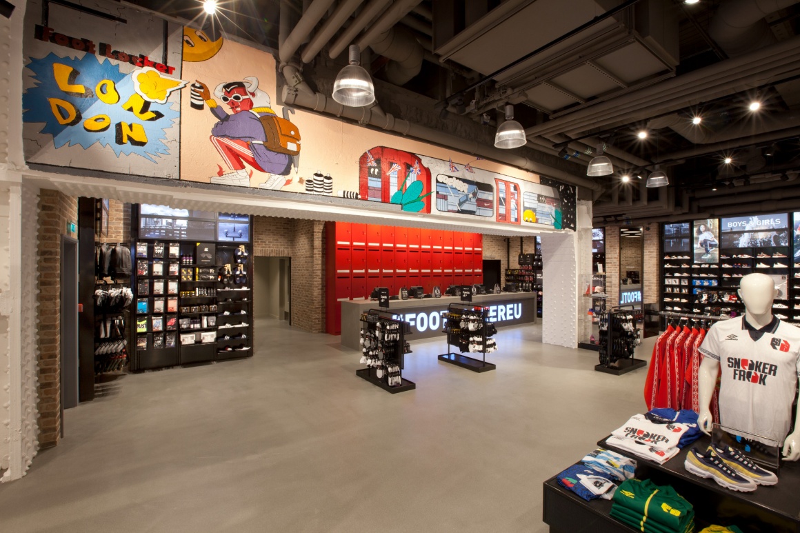
The 647 square metre sales area includes several premium sales stands.
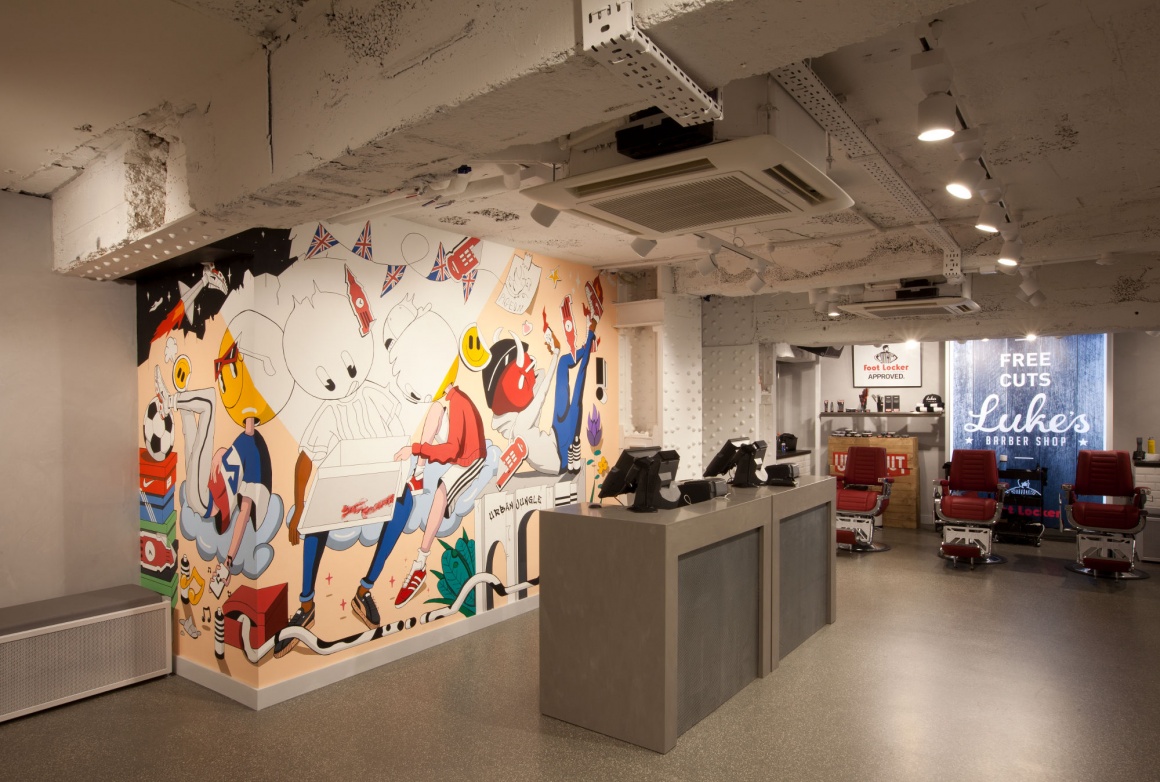
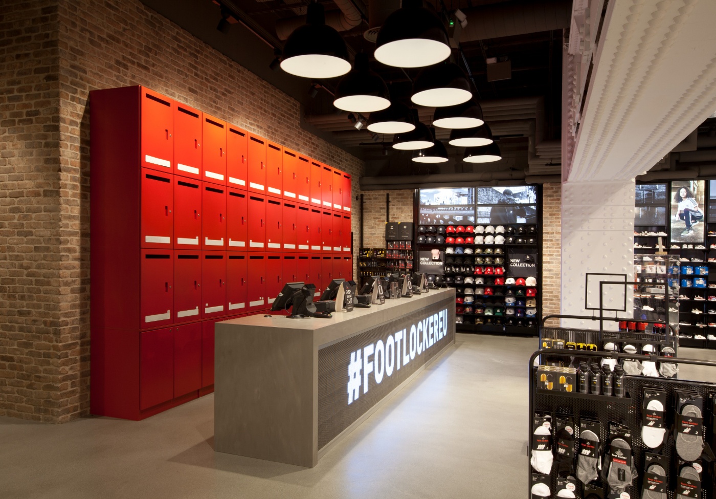
An eye-catcher is the "Red Locker Wall" - a wall with works by the artist Tommy Bates. Next to it: an area for customer service.
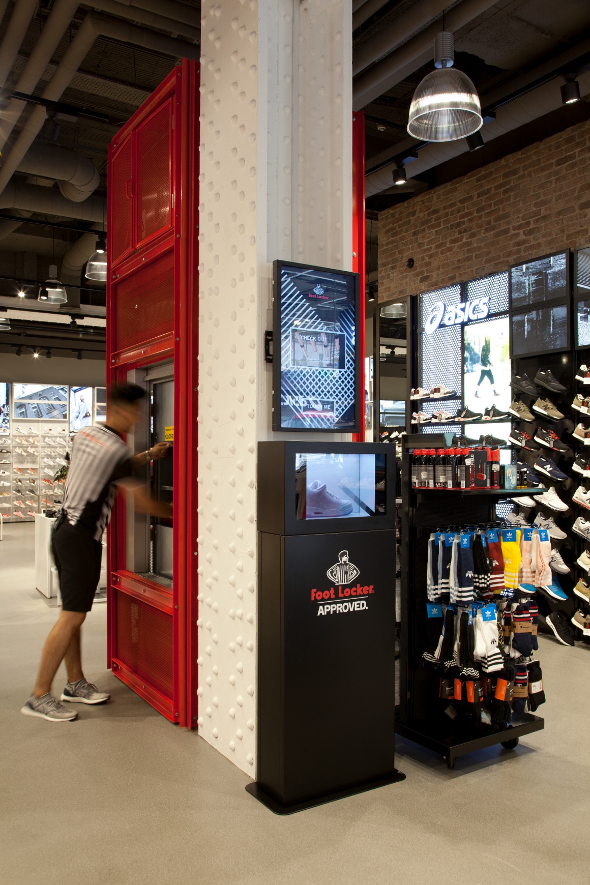
The almost 24 meter long and one hundred ton heavy girder (on the ceiling) with riveted pillars was uncovered again (in 1931 it is said to have been the longest girder worldwide). In contrast, lightweight elements were used to present the goods.
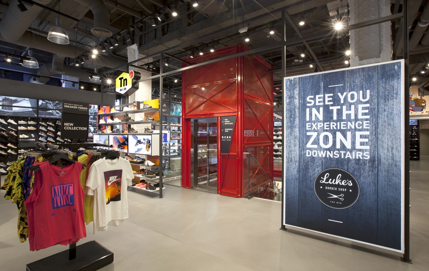
A frame construction in the middle of the ground floor combines displays, product focal points and digital activations. The focus is on the product range and customer experience.
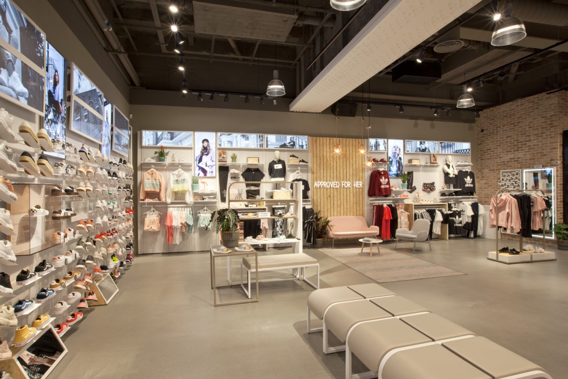
The interior design was designed and conceived by rpa:group - based on the strategic brand concept of Foot Locker.
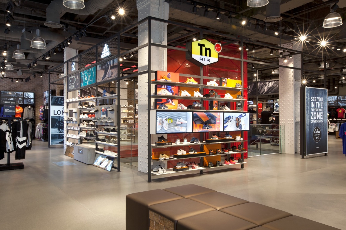
After the stores in Marble Arch and Liverpool ONE, the new concept will also be implemented at other Foot Locker locations.

