Images • 17.01.2019

What shop design can look like: The Schubert pharmacy in Pullach on the Isar

Warm wood and limestone from the surrounding area greet customers after the renovation

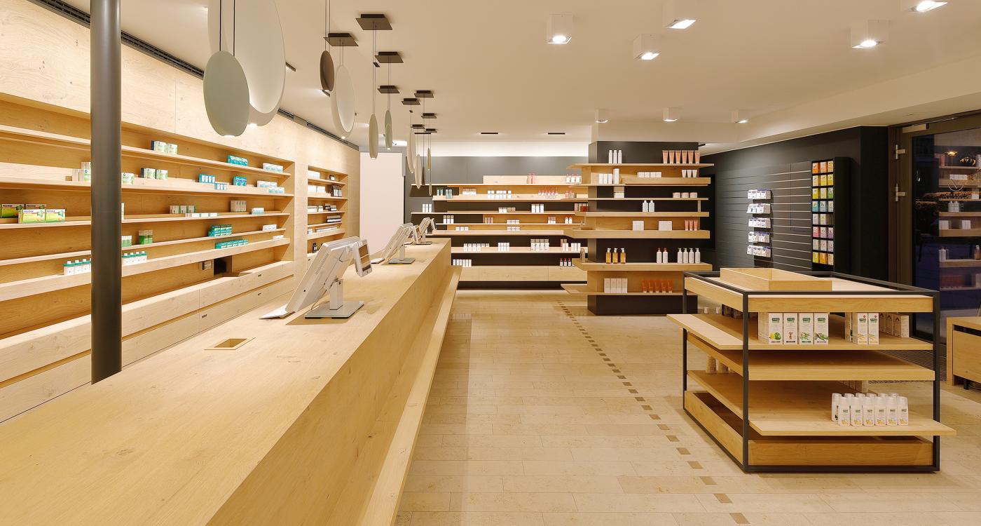
If you enter the newly designed Schubert pharmacy, you will directly feel comfortable. After the modernization, the premises score with a holistic appearance that is both concise and modern, yet fits into the rural region with its traditions. Therefore, the DDC competition "Gute Gestaltung 19 Award" in the category "Space" was also awarded for the new concept!
Photo
Source: Hans Jürgen Landes

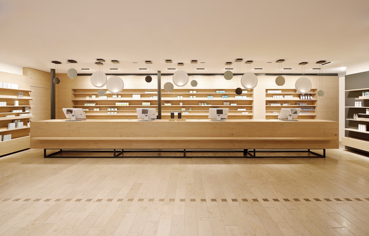
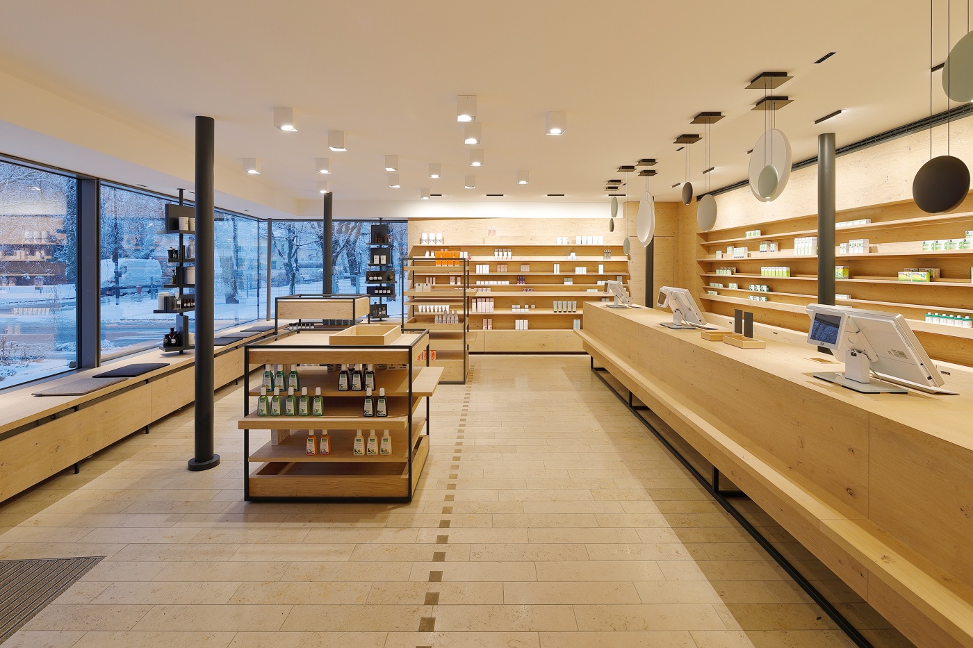
With great attention to detail, the interior architects of raumkontor from Dusseldorf have proceeded during the renovation. Many wood elements with a soft radiance greet the customer. The color matching limestone floor is pleasantly warm. At the generous hand selling table up to four customers can be advised at the same time. A special eye-catcher: the pendant lights above.
Schubert Apotheke
Source: Hans Jürgen Landes

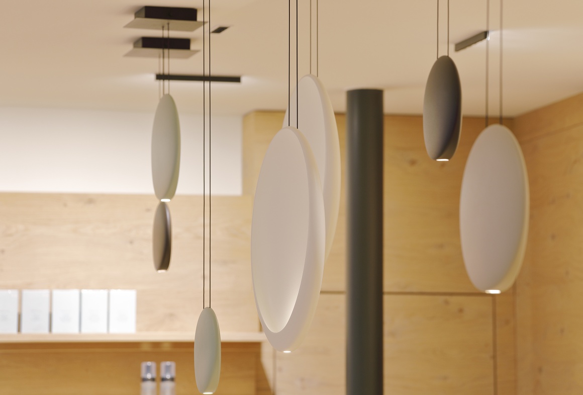
The lights are reminiscent of the moon. Their precise and warm luminosity sets the goods perfectly in scene.
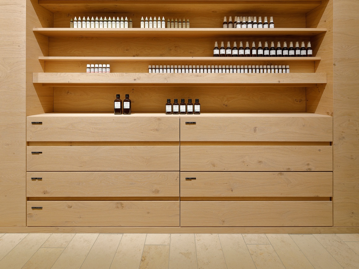

Photo: What shop design can look like: The Schubert pharmacy in Pullach on the...
Source: Hans Jürgen Landes

Behind the sales table, the products can be stowed clearly on wall shelves or in drawers.
Photo
Source: Hans Jürgen Landes

Individual floor shelves complete the sales area. Products can be displayed here for the customer. They fit into the room and give structure to the division. The large window front was covered with wooden benches. They invite the customers to take a short rest.
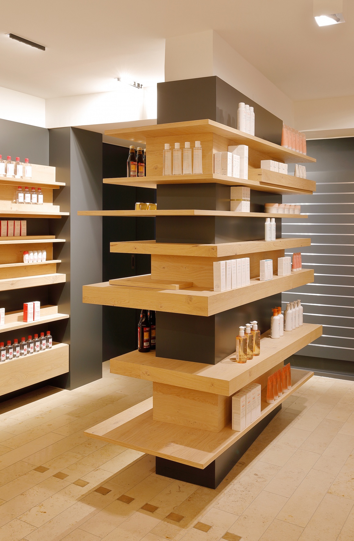
Photo: What shop design can look like: The Schubert pharmacy in Pullach on the...
Source: Hans Jürgen Landes

The relief-like structure of the shelves is not only a formal game, but also supports the optimal presentation of goods.
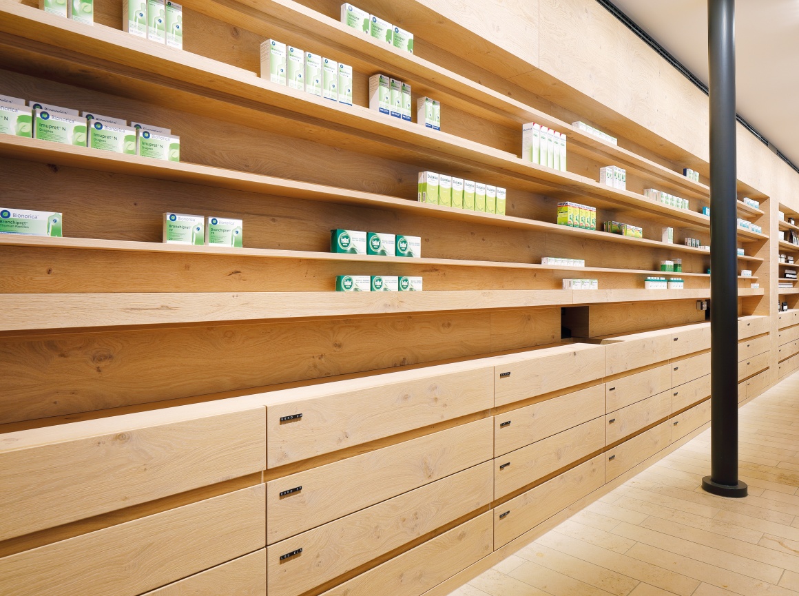
Photo: What shop design can look like: The Schubert pharmacy in Pullach on the...
Source: Hans Jürgen Landes
Author: Simone Ernst, iXtenso - Magazine for Retailers

related articles:

popular articles:

Thumbnail-Photo: Penny in Colognes Latäng Quarter: A special store design with Cologne...
12.09.2024   #brick and mortar retail #customer experience

Penny in Cologne's Latäng Quarter: A special store design with Cologne flair

How the Penny store combines local ties and modern design

Im Herzen des Kwartier Latäng in Köln hat Penny ein besonderes Store Design geschaffen, das die Verbundenheit ...

Thumbnail-Photo: Store design: a boutique workshop for gourmet pastry...
03.06.2024   #online trading #brick and mortar retail

Store design: a boutique workshop for gourmet pastry

Lecavalier Petrone combines functionality and aesthetics

Lecavalier Petrone, a renowned gourmet pastry shop run by Chloé Migneault-Lecavalier and Loïse Desjardins-Petrone, has ...

Thumbnail-Photo: Store concept: the magical pop-up store in Munich...
22.05.2024   #brick and mortar retail #shop building

Store concept: the magical pop-up store in Munich

Idea, implementation and challenges in “The Wizarding World Shop by Thalia”

Diagon Alley, Hogwarts, Quidditch pitch - there are many places to visit in the stories of Harry Potter. Why not in a bookshop too? What was a great success in Hamburg can now be experienced by fans in Munich. For the 200 square meter pop-up store, ...

Thumbnail-Photo: Store design at Niederegger: marzipan and maritime charm in Lübeck...
05.09.2024   #brick and mortar retail #customer experience

Store design at Niederegger: marzipan and maritime charm in Lübeck

How the confectionery manufacturer brings together company tradition and city history

The Niederegger store in Lübeck combines many things: it reflects the city's close connection to the marzipan tradition ...

Thumbnail-Photo: Shop-in-Shop: Small solutions with great potential?...
12.06.2024   #sustainability #light systems

Shop-in-Shop: Small solutions with great potential?

Toy manufacturer Schleich reveals what is important for POS concepts

When brands rely on shop-in-shop, the following applies: As much as possible on ...