Selected items are showcased in an abundance of space. The branding of the label is reflected in every corner. A flagship store like no other. The digital applications show what the future may bring.
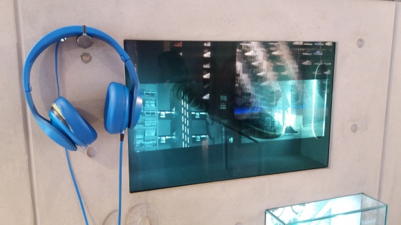
Back when Umdasch Shopfitting introduced a transparent shelf at EuroCIS two years ago, this type of fixture still seemed quite futuristic. But no more: the adidas store in London relies on a similar type of visual merchandising. One of the cases displays a shoe with a transparent display in front that shows a film featuring the product in action.
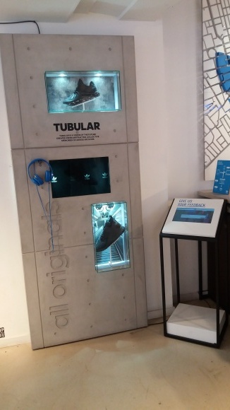
Additional headsets for customers enable a multimedia experience and ensure that other shoppers are not disturbed by the sound of the video. More shoes in two glass cases are highlighted above and below the display, while a specially directed light accents the products.
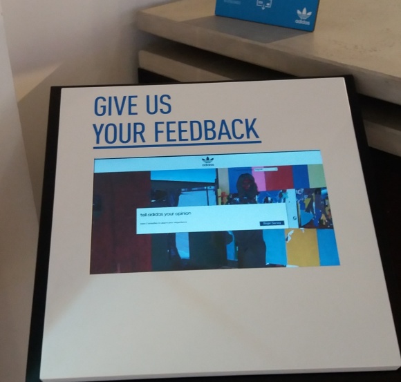
Next to the shelf is a touchscreen on a waist-high column where customers can give direct feedback. These types of digital applications are not expensive and enjoy increasing popularity in stores and supermarkets. Retailers are able to address the requests of their customer a lot faster and with limited technical effort and don’t have to tediously get their feedback in written form or other ways. The playfulness of customers plays a major role in all this – the target audience of a modern company like the sports brand adidas is able to interact with this type of technology without any reservations. What’s more, this type of feedback request makes customers feel like they are being included and taken seriously.
Trend: Industrial-Chic
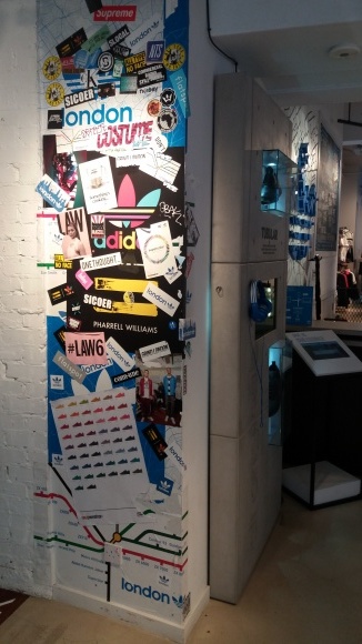
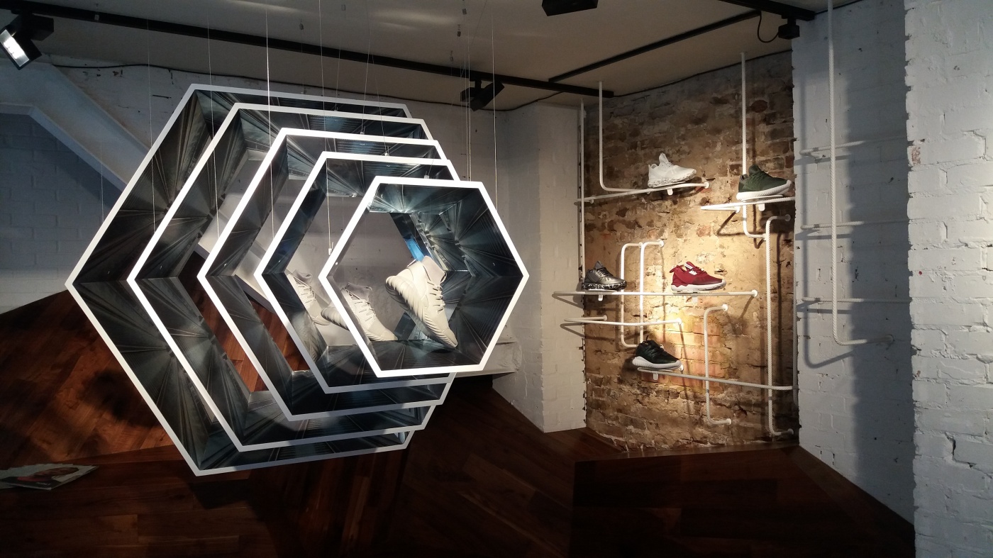
The store features a minimalist urban style design. Following the current “industrial chic“ trend, twisted steel wires in white varnish protrude from a concrete wall and serve as showcases for individual shoes. Next to this is a corner wall decorated with numerous stickers and newspaper clippings with keywords about adidas and London.
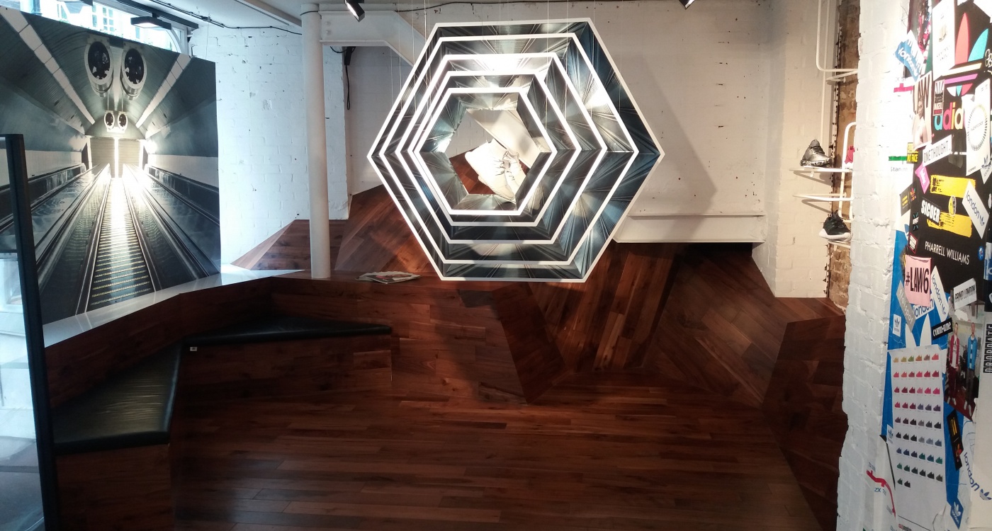
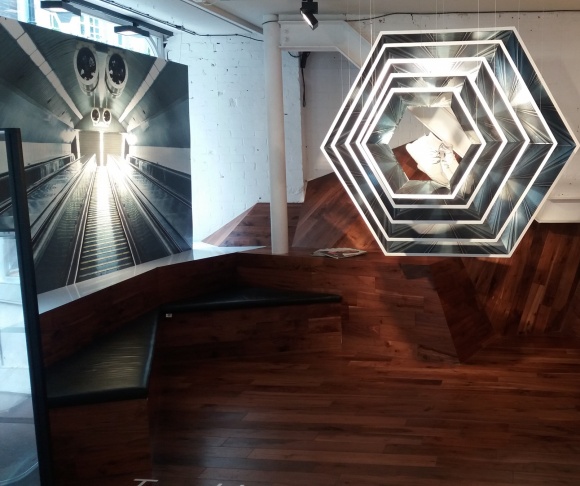
Perhaps the most impressive eye-catcher is a hanging display made from five octagonal frames, each of which presenting a white shoe centered in the middle. Since the frames are arranged in descending order, the installation appears like a giant zoom. To the left of this installation is a wall with a picture of a typical steep escalator of the London Underground transit system which adds further depth to the space.
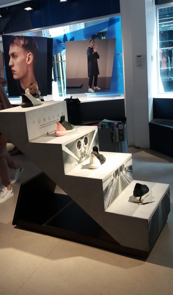
In the middle of the room are steps, each one again showcasing a single shoe. The tube image is repeated again. This emphasizes the connection to the product line named "Tubular".
No stress here – lingering is welcome
Under the large photo wall are two sitting areas covered with black leather on dark furniture in wood design that transition seamlessly towards the floor. Right next to this lounge are magazines for browsing.
This area clearly illustrates: customers are invited to hang out here and take in the design impressions. The main goal is not to quickly sell as many products as possible but rather to focus on customer loyalty to the brand, the products, and the experience thanks to the digital elements. The friendly staff does not rush and lets customers explore the space at their leisure. The effect is an interactive showroom. The way design and digital elements are interlinked in this store make it easy to imagine that more and more stores will follow this trend and move in this direction in the future to create an impressive and memorable shopping experience for customers.

