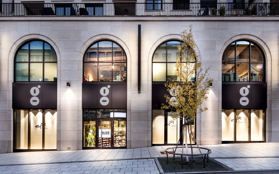
Mattias Mußler hired Dittel Architekten to implement his new fragrance and beauty product store concept. At Stuttgart’s Gerber shopping mall, the team created an impressive design, which optimally complements the company’s consulting service, customer experience and the union of online and offline retail.
Back to the roots
“What is the origin of trade?“ That’s the question Mattias Mußler, Managing Director of Mußler Beauty and Frank Dittel of DIA - Dittel Architekten asked at the beginning of the project before they created the first Mußler Beauty by Notino store in Stuttgart’s Gerber shopping mall. Their objective was to build a shared foundation to showcase an online/offline union. The reason for this: just last year, Mußler Beauty, the iconic company with its long tradition and proven track record of success merged with Notino, one of Europe’s largest online retailers for beauty products.
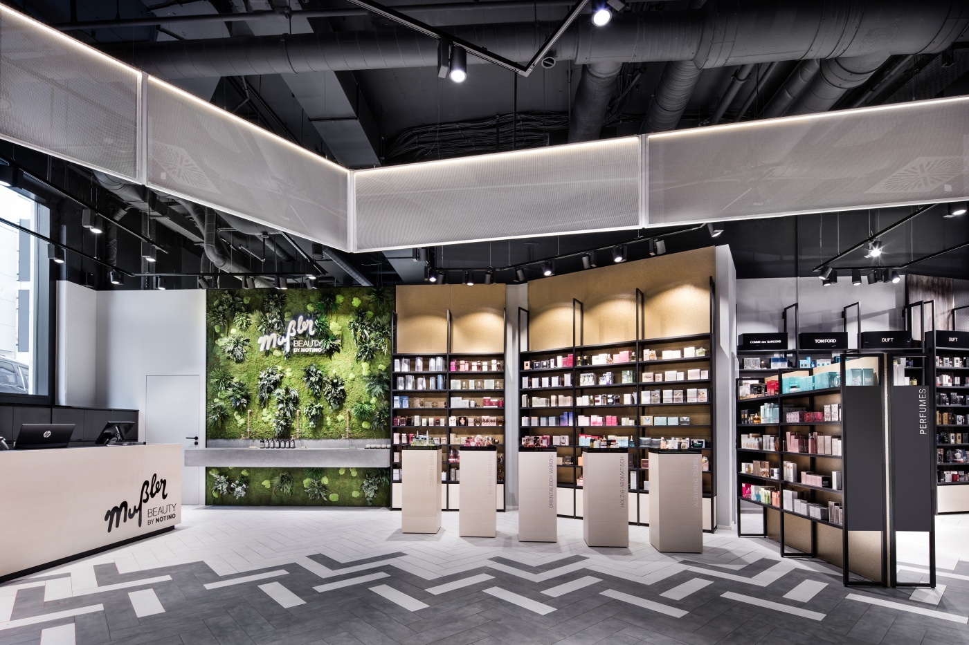
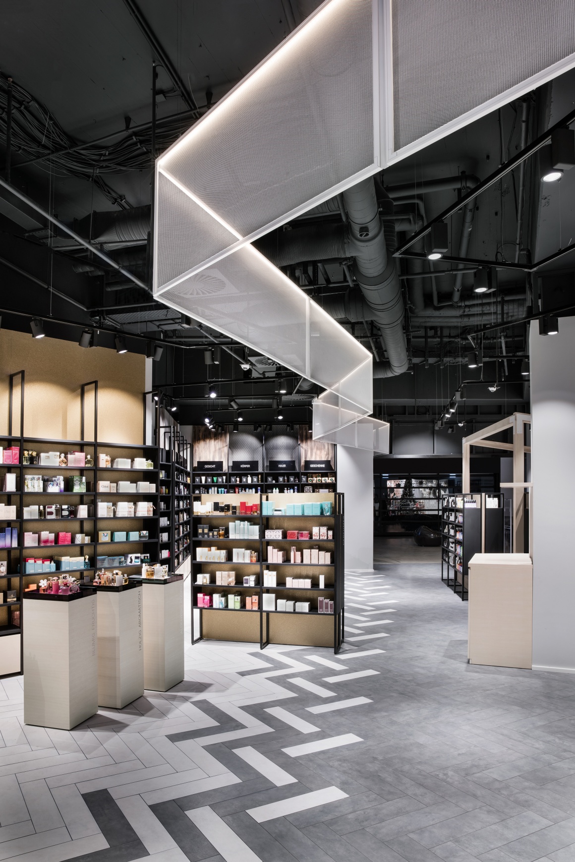
The answer to this fundamental question led them to the Orient. “In the Arab world, markets were the center of social life and embodied the original idea of the retail trade. In this setting, retailers are physically separated by merchandise and trades. We created the areas of the Mußler Beauty by Notino store, which features 300 square meters of floor space, based on this concept to fully embrace the large variety of products in the world of perfumes,“ says engineer Frank Dittel. The areas were then incorporated into the store design and feature different looks.
According to Dittel, the project implementation took four and a half months, during which planning and implementation partly overlapped to ensure a quick store opening. The completion took almost nine weeks.
Interaction, emotion and - most notably - consulting service
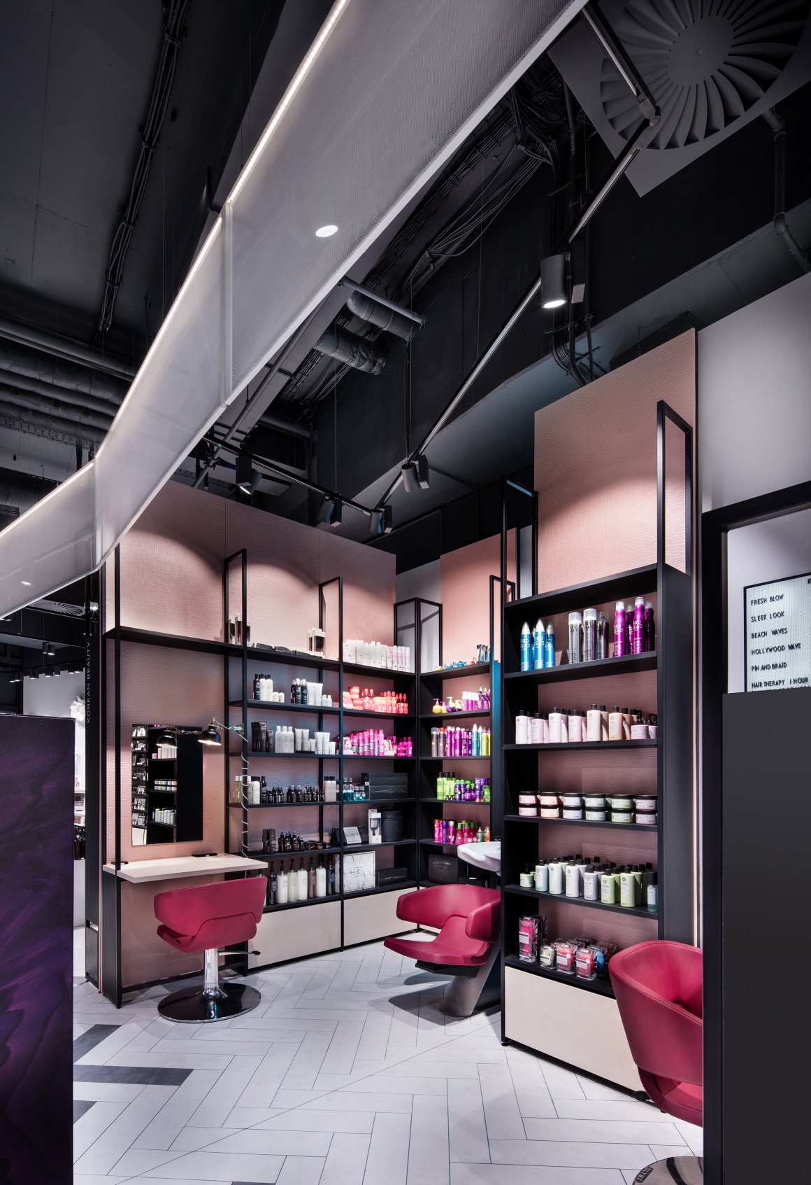
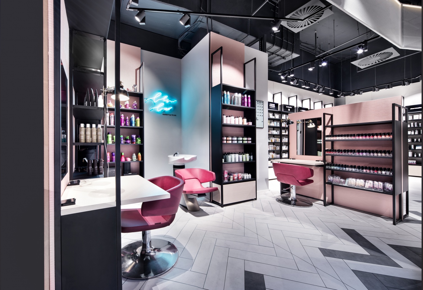
While the roots of the store concept go back to the Arabian bazaars, the so-called Blow Bar (“Hairstyle to go“) and Brow Bar are inspired by trends that Mußler discovered on his many trips to Paris and other cities of the world. These are the areas where customers can try out beauty products, style their hair, shape their eyebrows and look to experts for advice – all at no charge. Even after Gerber’s shopping hours, the store beckons with special promotions and offers, such as private makeup classes featuring professional makeup artists for example. A separate entrance to the shopping mall makes all of this possible. Dittel explains that “Brow and Blow Bars are quite common abroad and very popular. Whether this will also be the case for these area remains to be seen.“
He adds that the overall store is primarily driven by its consulting services. Eight staff members are available to assist customers. They can also introduce products that are not showcased on the shelves and thus create a link to the online store. After all, another aspect of this concept is to feature niche products and forego showcasing the store’s wide variety of available products. If a certain product is unavailable at the store, customers can order it online and have it sent to their home. The store associates communicate to customers that they may certainly purchase any of the items but that they should not feel obligated to do so. What’s more, products that were ordered online and don’t meet customer satisfaction can also be returned to the store, also in conjunction with an additional consulting session. There is also a click & collect option. This store pickup alternative is designed to attract more customers to the store.
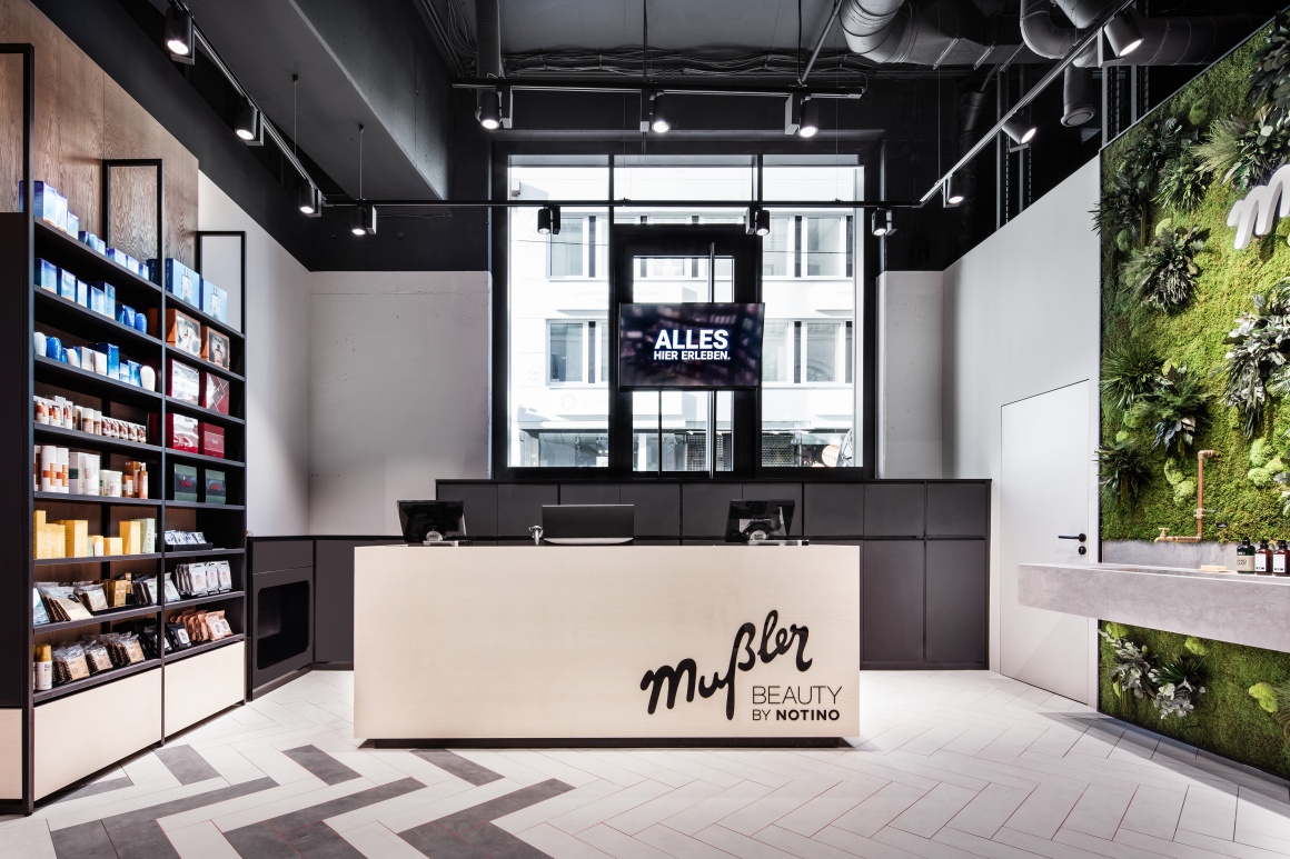
Showrooming is expressly welcomed – Turning the brand into an experience
Dittel emphasizes that “the concept of the store is to build trust and create a brand experience. The services are designed to show the customer what this brand stands for. Customers also take this mindset home with them and remember it when they use the online store.“ After countless conversations with companies, the architect is certain that a brand generates far more revenue in places where it is present in both online and brick-and-mortar settings versus situations where there is no connection between online and offline channels. That’s why the store’s “online/offline symbiosis“ explicitly embraces and welcomes showrooming.
The details: The exclusive store design of Mußler Beauty by Notino at the Gerber shopping mall
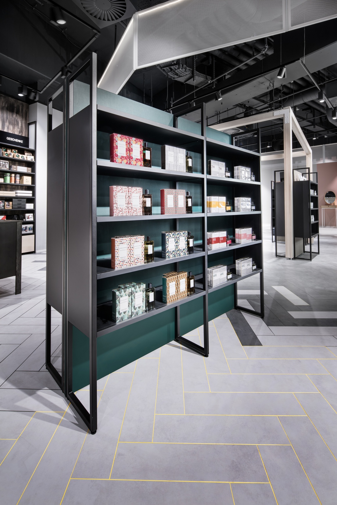
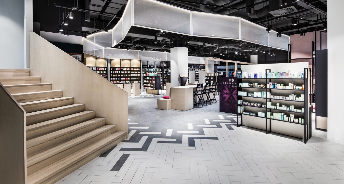
The sectioning into different areas is reflected in the store’s use of different materials and color palettes, especially on the rear walls. To echo this, the designers created different subtle color schemes.
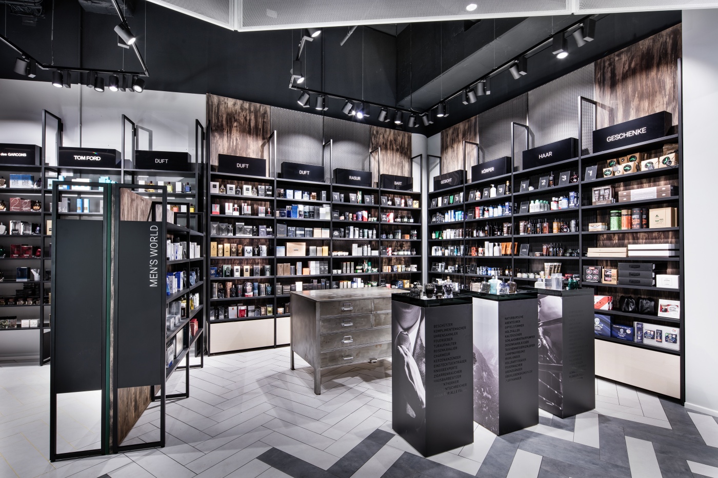
The key materials are wood, metal, and leather. Especially the men’s department reveals its very own charm with a more rugged look. The three columns in the front and their product selection appeal to three different age groups – 60, 40 and 20-year-olds.
That is in stark contrast to the gold plated and rose-colored wallpaper, which lends the area a more refined and feminine touch. The perfume section is kept in a neutral gray tone to let the product variety take center stage.
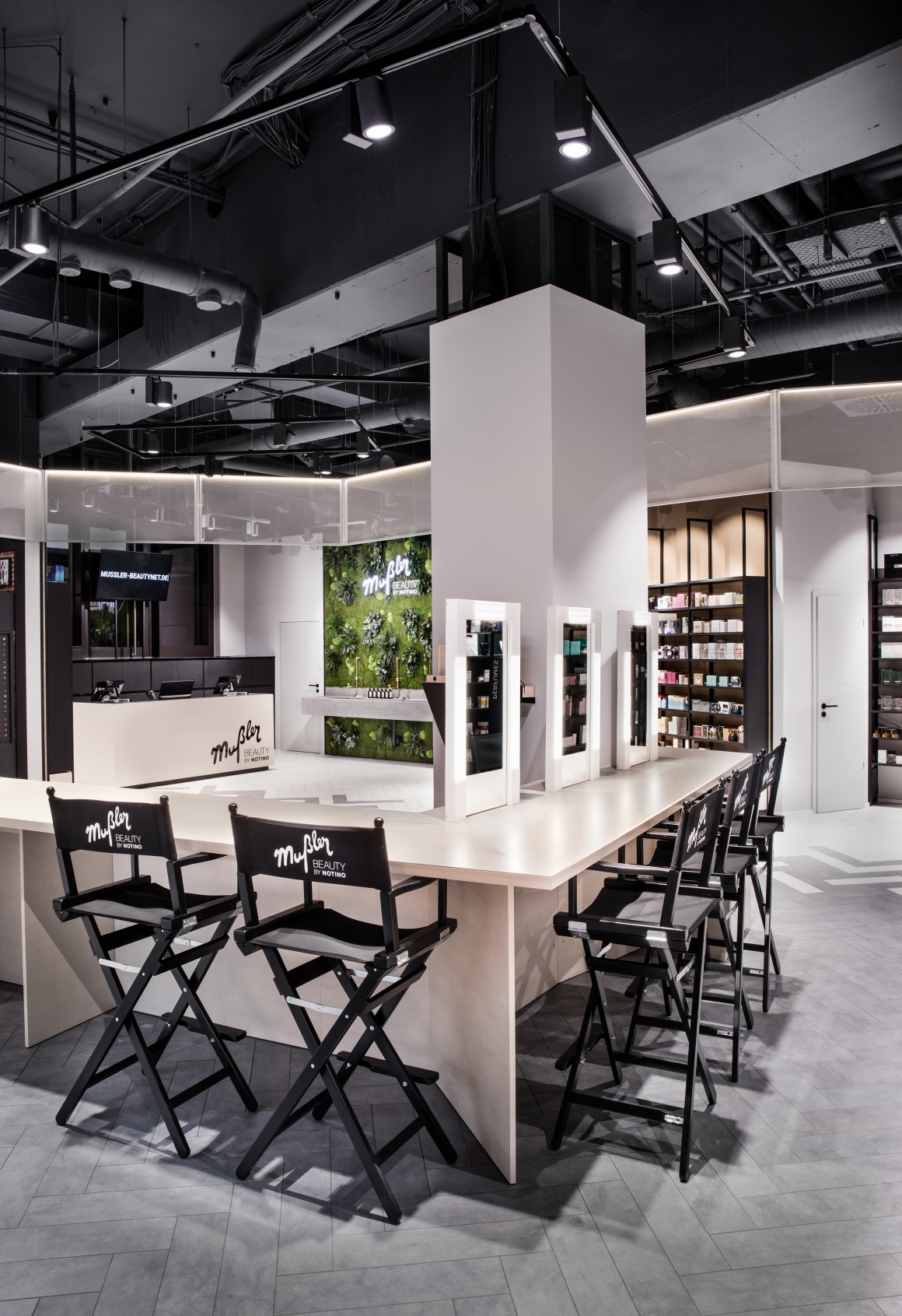
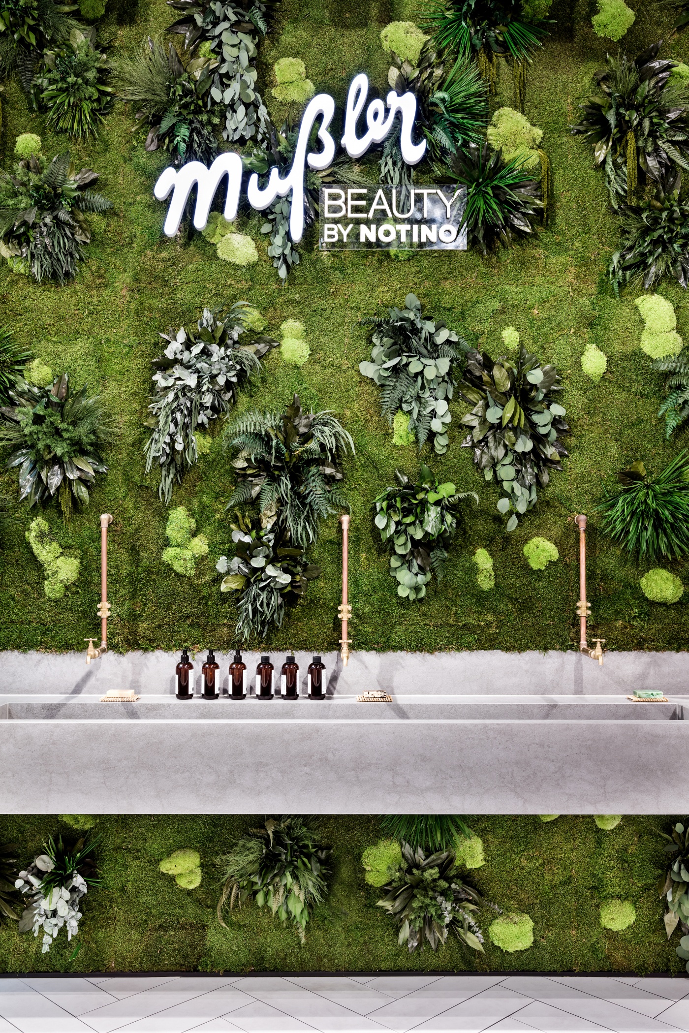
The total eye-catcher of the store is the living green wall. Live moss is attached to a modular wall system. Dittel explains: “The green wall is maintained by the humidity of the area. However, we added additional sinks underneath it to make sure the plants truly get enough moisture. This was something we were concerned about in the run-up to the project due to the often dry, climate-controlled air in the shopping center. The wall is one of my favorite highlights because it strongly evokes and captures the reference to natural cosmetics.“
White, indirect light ceiling mounted panels frame the different areas. Numerous track light fixtures with warm-white color are the primary light sources. The people in charge emphasized a certain level of flexibility for the entire system – not just as it pertains to the light fixtures but also when it comes to the furnishings, which were custom designed for the store by DIA and built by the Czech shopfitter Bakos.
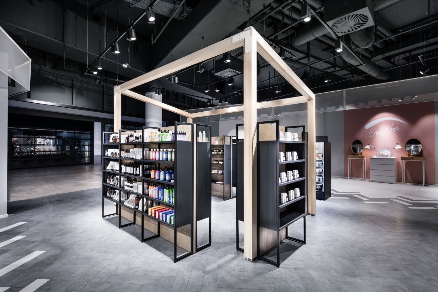
The main entrance area is particularly flexible. Says Frank Dittel: “We positioned the pop-up space at this location to give the store the option of changing its appearance in the shopping mall. The wood frame is permanent, the shelves are movable – this creates a modular space. Niche products and special promotions are primarily showcased in this area. They are designed to evoke an emotional response, show customers new trends and invite them to come inside the store.“
Digital store components
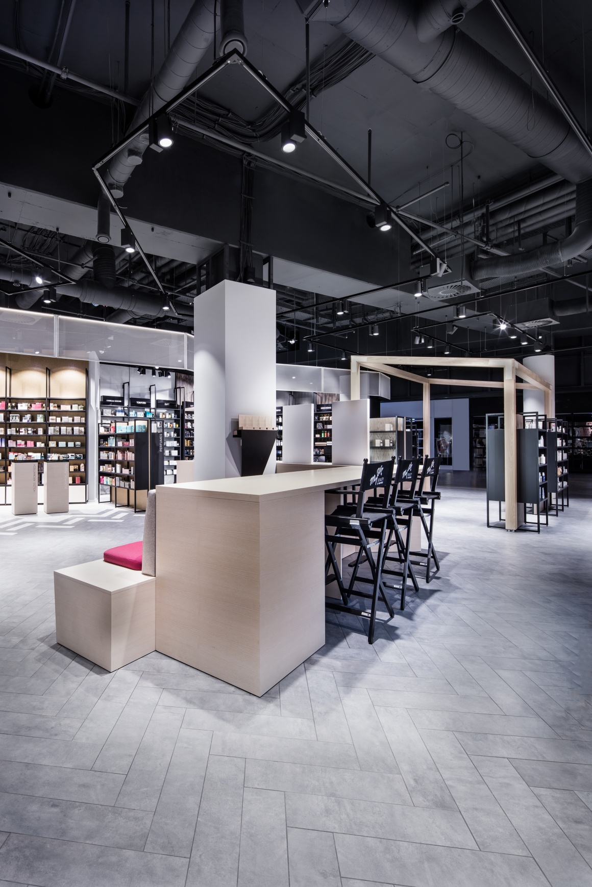
Customers can sit down in the center of the store, drink a beverage and use tablets to find information online. The shop window that faces the street features a digital screen that shows corporate image clips and highlights the store’s services. Digital price tags are also in the store’s future. Dittel says: “Digital media are designed to be used by the customer – but not in a way where they blatantly take center stage.“
