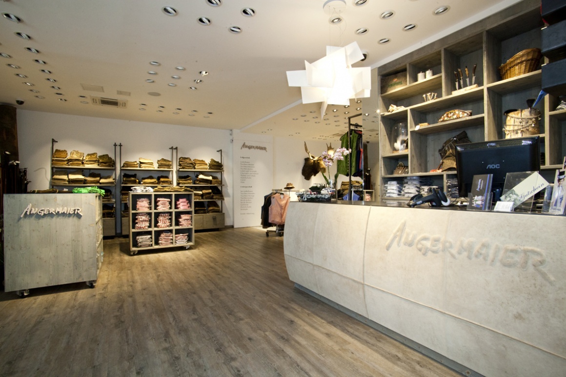
Time and again, people can admire them at the Oktoberfest in Munich: the most fashionable and trendy Dirndls and Lederhosen. Fans of the so-called ‘Tracht’ attire (it refers to traditional garments worn in German-speaking countries, especially in Austria and Bavaria), frequently head for the retail stores of Angermaier Trachtenmode. And since these garments innately reflect the rustic charm and passionate love of nature’s beauty, the design of the stores also echoes this sentiment.
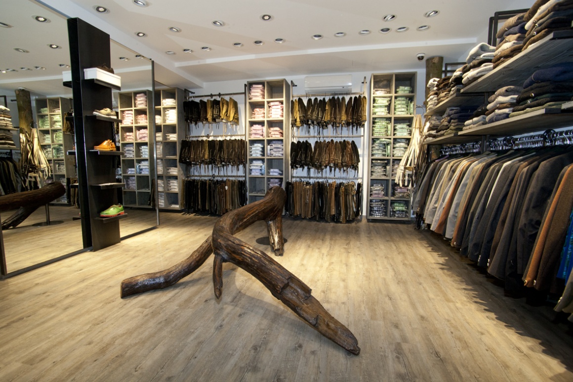
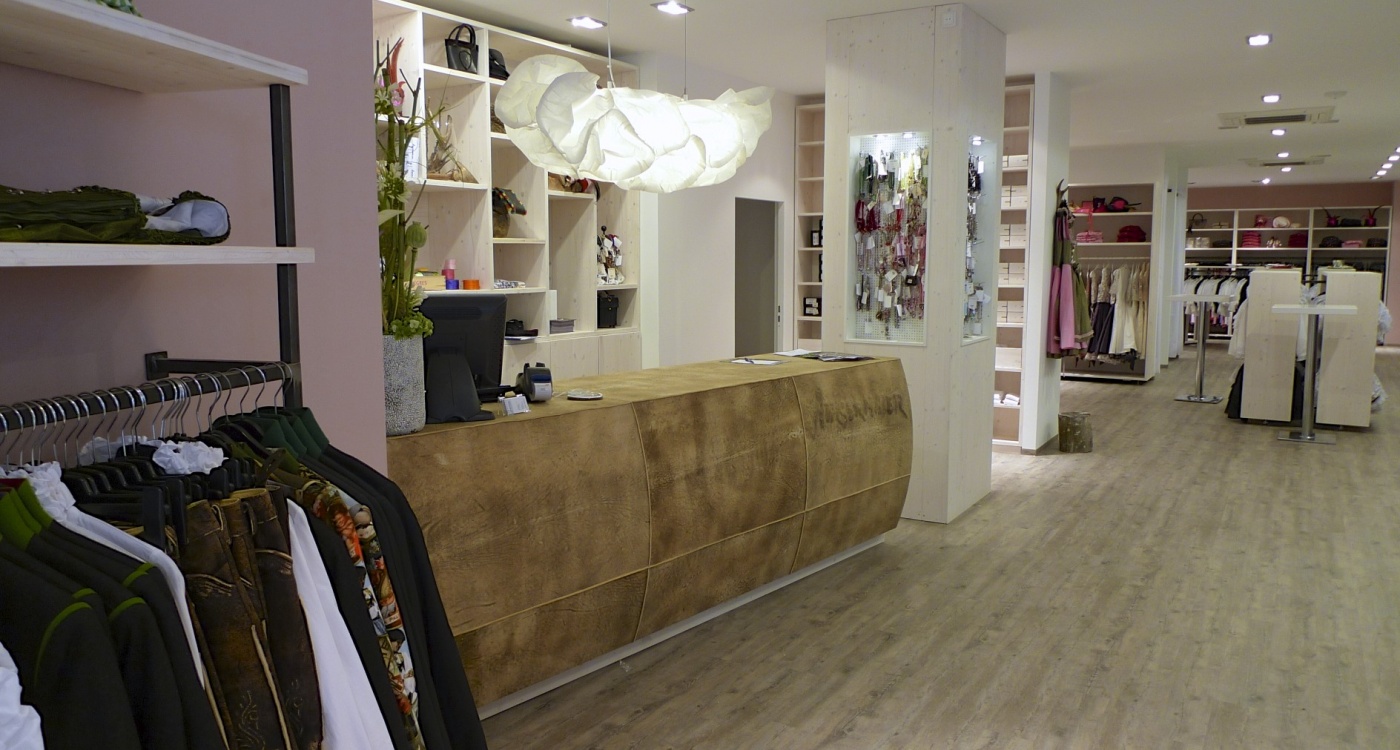
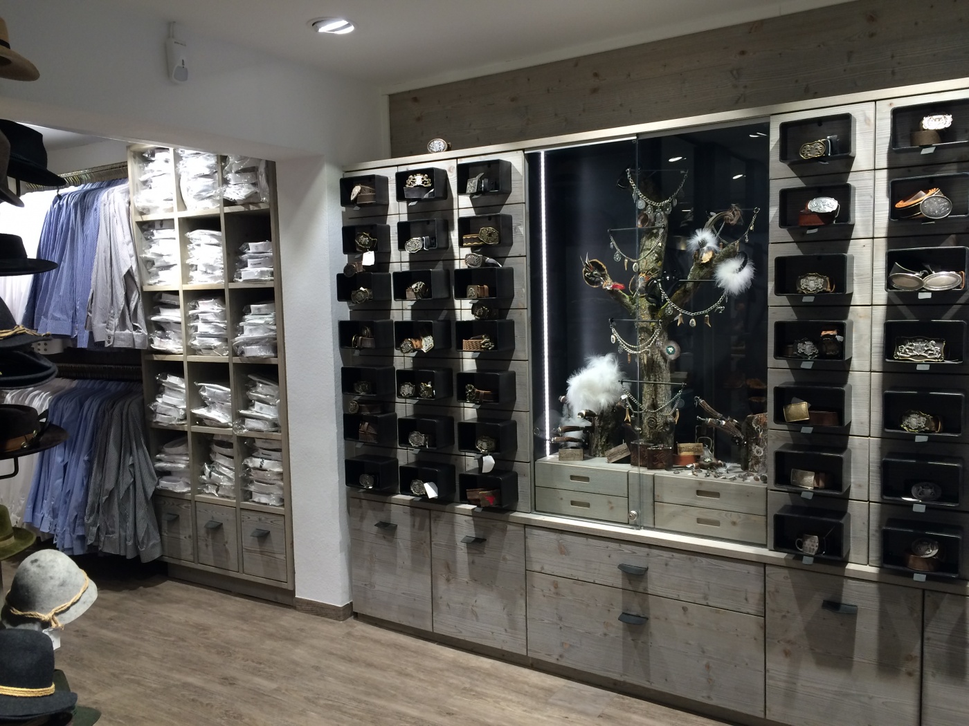
Deerskin, wood, and steel are the materials store designer Sabine Rohs used in her concept. From the sales counters to the curtains, all furnishings are covered in leather. Although the crude version has a more natural look, working with this material proved too intricate, which is why the newer Angermaier sales counters were covered with a lighter toned, treated leather.
When the first store in Rosenthal opened in 2012, whole tree trunks were used as decorative elements and shelves. While they are frequently used as a design element today, the concept was still unique and novel at the time. And transporting the tree trunks right through the heart of the pedestrian zone also presented major challenges for the shopfitters. Five men were needed to hoist just one tree trunk. Metal feet were custom built to install the tree trunks inside the store. This required precision work.
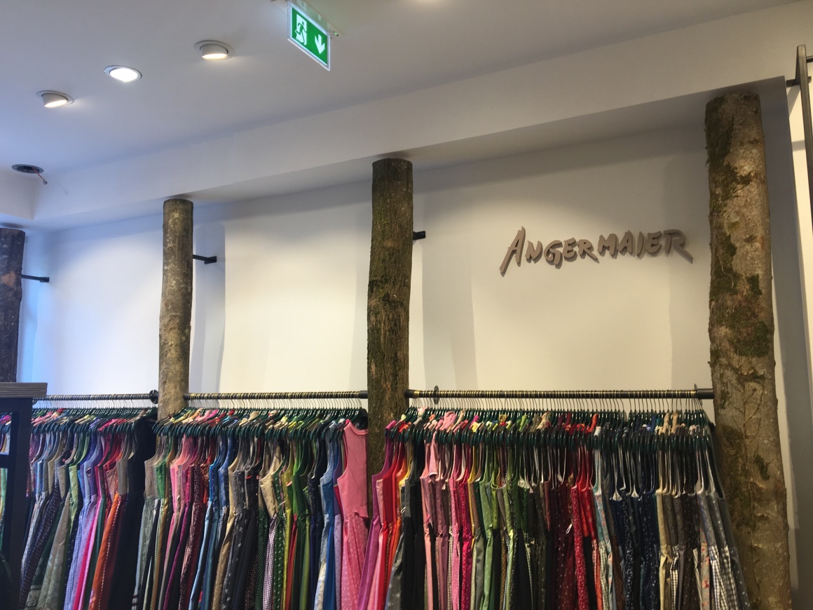
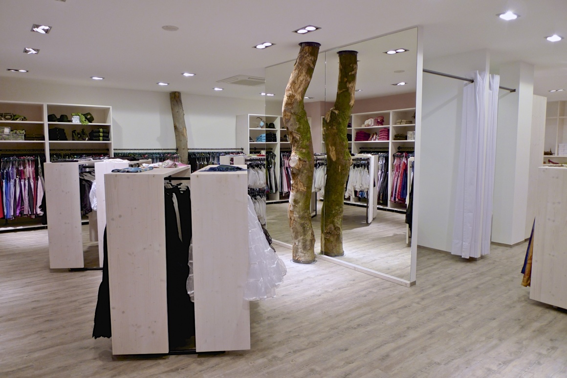
One interesting development: the previously installed halogen lamps drastically changed the wood the store used – it even lost its bark. Now the interior is protected thanks to new LED technology.
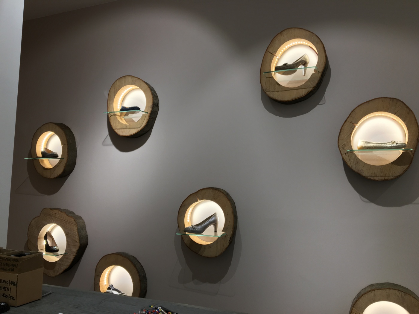
An absolute eye-catcher: the presentation of shoes on the walls in wood slabs that were hewn directly from a tree trunk and then hollowed out. The integrated LED strips illuminate the shoes inside the slabs.
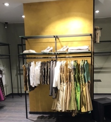
Fine gold leaf adorns the wall in the main location on Landsberger Straße. The artist Eva Kunze from Studio Alina Cesár for mural painting in Munich was hired for this project. The light reflects warmly and creates a rich look.
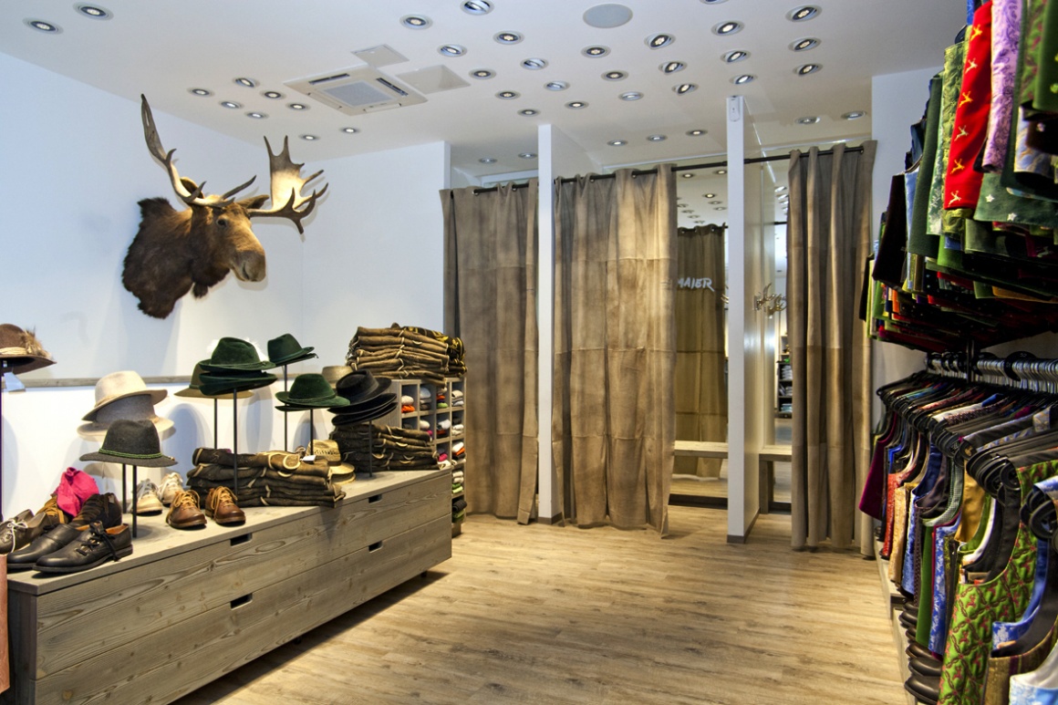
The men’s section is done in gray tones, while the women’s features the color white. The sales counter area for the women is adorned with a cloud-shaped lamp, while the men enjoy a fan-shaped light.
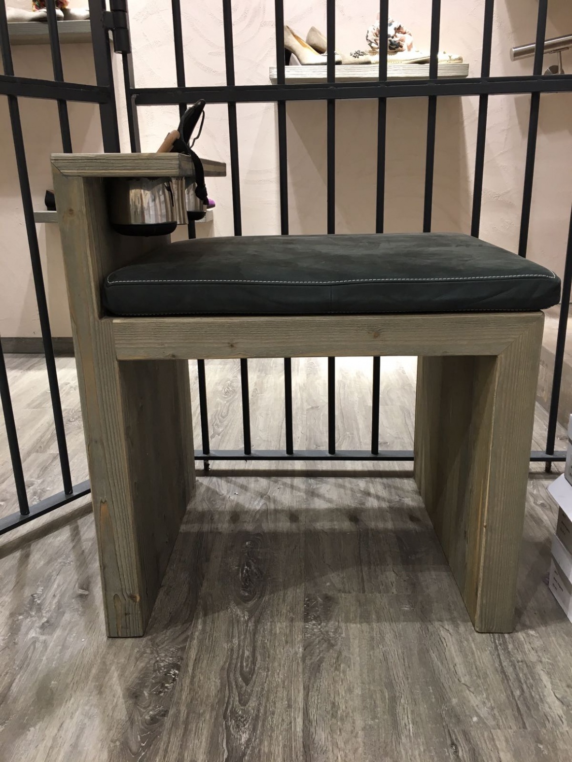
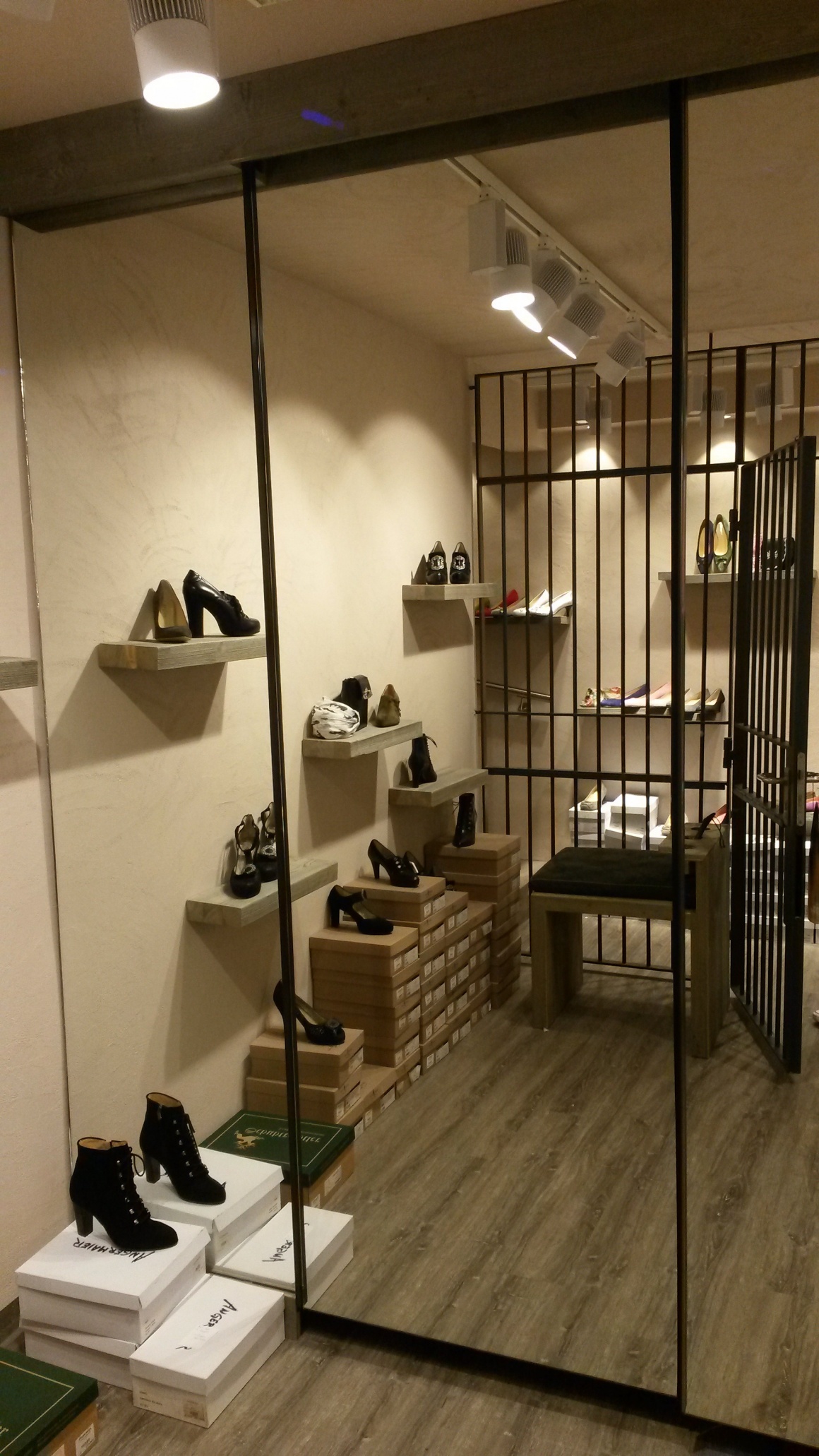
Safe accent: The previous store history includes a vault on the lower floor, which was converted into a “shoe vault”.
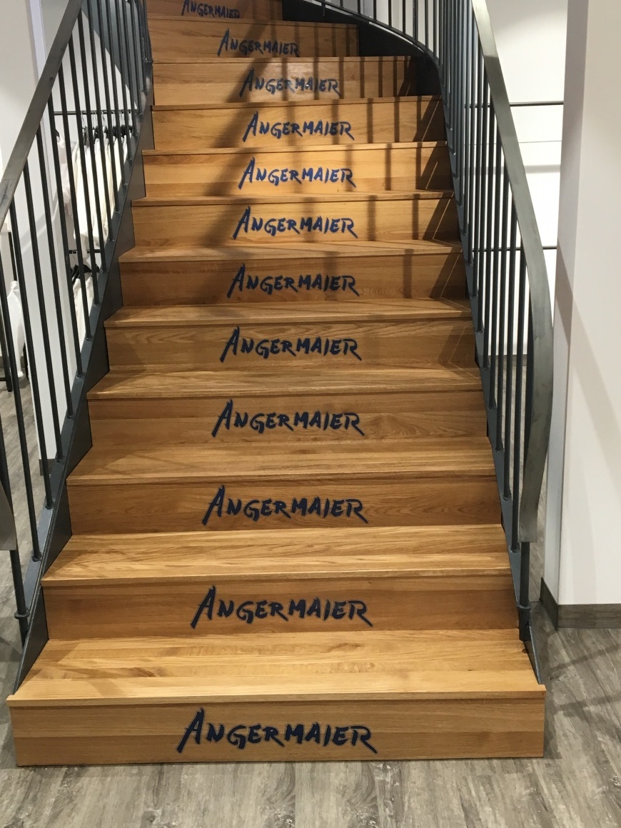
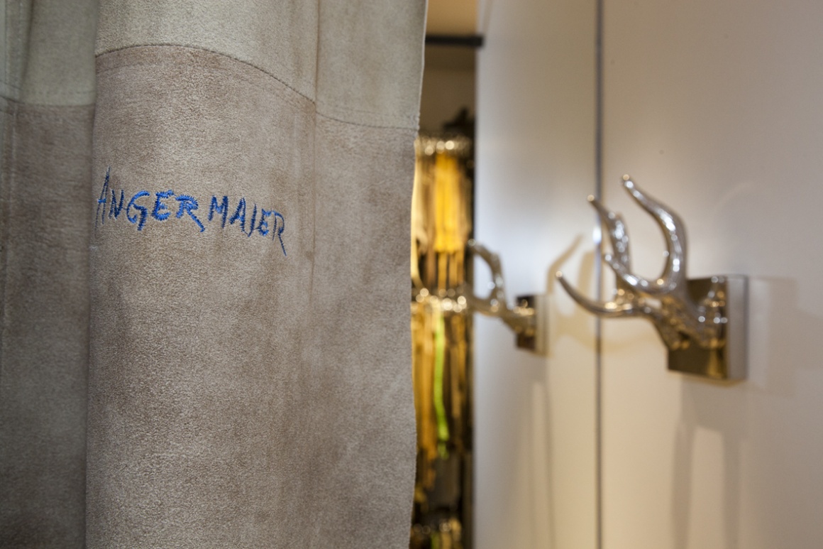
Discreet to noticeable branding. From the stairs to the embroidered curtains in the dressing rooms.
From empty space to finished store: some pictures from the Making of …

