It offers big opportunities to pique the curiosity of consumers and gets them excited right at the point of sale system and encourages them to buy. Having said that, the store needs to be designed in an emotional, attractive and - most of all- innovative way.
Every retailer is able to design and implement his own performance this way. This doesn’t require a sprawling budget, but just a few good ideas and the knowledge of how to do things. The following points illustrate what is really important when it comes to emotional, dramatic product staging.
Storytelling
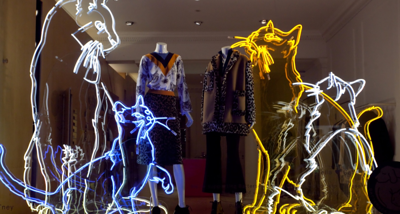
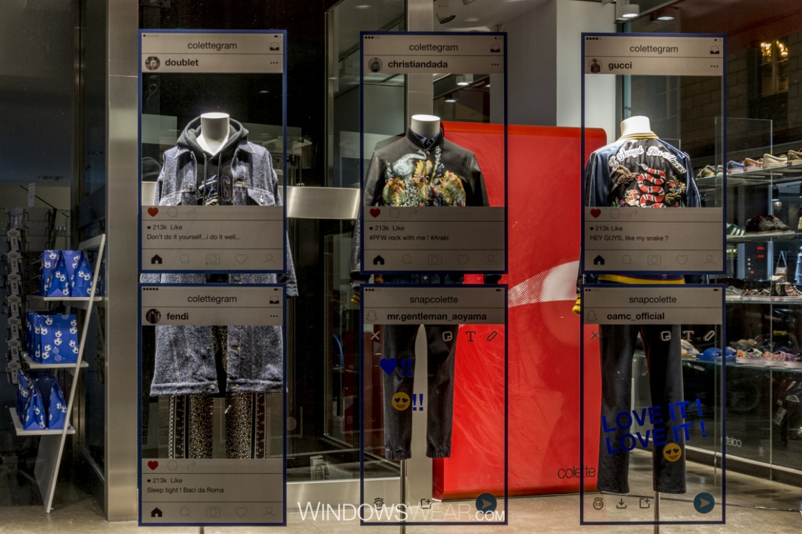
The big task of store window design is to stage products in a way that allows them to tell stories (storytelling). Customers devote their full attention and concentration to these types of designs. That is why it is only logical and makes sense that this trend moves towards sophisticated presentations that engage customers on an emotional level.
Retailers are therefore challenged to create dramatic scripts for visual marketing and actively include passing customers in the presentation. The design always needs to create a link to the current marketing campaign. Print and online advertising, store window displays and visual merchandising need to be perfectly coordinated and harmoniously intertwined. The stories start on the outside with the store window design and continue inside on the sales floor. In doing so, they significantly increase the recognition factor with consumers.
Geared towards experience, themes, and character
Viewers pay very close attention to the stories, especially if they are geared towards creating an experience. The fusion of merchandising and art is very attractive to customers. They are transported into a sentimental mood and consider it an added benefit. It is crucial that the stories also have a direct reference to the displayed products.
There are no limits to the themes of the stories. For example, themes might include fairy tales, legends, and anecdotes but also experiences taken from life, politics, our environment, art or social areas. You can convey life experiences, showcase knowledge or illustrate problem solutions. In addition, you can focus on traditions, values, and corporate culture. Last but not least, this setting is perfectly suited to make people the center of the story (for example, celebrities, well-known comic strip characters, artists, scenes from a popular TV series).
Macro trends in visual marketing in 2017
Retailers should know about the relevant macro trends because they are enduring and have a lasting impact on visual marketing. For the upcoming Spring/Summer 2017 season, visual marketing will need to address four strong trend topics.
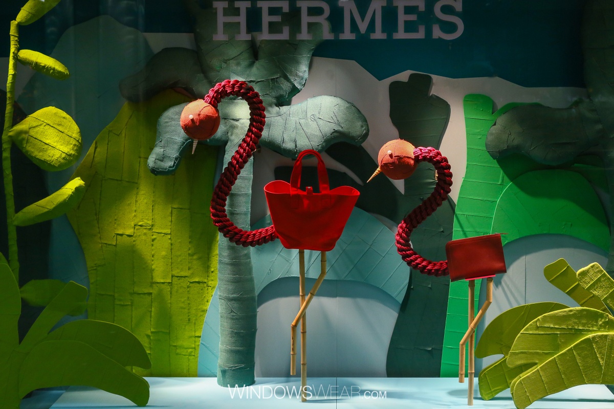
1. Refueling
We have to look at life from a different perspective. We look for sanctuaries to meditate and activate our creativity. The presentations should echo this – especially in the different sales areas. The elements, nature, the ocean or the sky are sources of inspiration in this case. The design reflects emotional authenticity.
2. Luxury with new value perception
New cosmopolitan status identities are developing. We draw inspiration from all over the world. We take away the most beautiful aspects of our travels. We buy worthwhile items: traditional and craft manufactured items. The luxury markets are changing. Luxury is being redefined.
Translated into visual marketing, this means we take advantage of new opportunities to creatively showcase luxury. Mixing cultural luxury and expertly positioning it; here we are utilizing the creative elements we find on travels that can be traditionally implemented. Presentations in brick-and-mortar retail can no longer be classified according to exact themes but rather in cosmopolitan, accessible cultural spaces.

3. The retail sector goes green
Visual merchandising will combine rural with urban elements and play with lots of green hues and urban shades of gray. Nature’s beauty will be reflected in the presentations and designs of retail. We are living a more urban life and need to make our designs more appealing. People want to escape the gray cities, fashion turns into work clothes; creative retailers will respond to this and adapt their sales rooms accordingly.
4. Travel to undiscovered worlds of inspiration
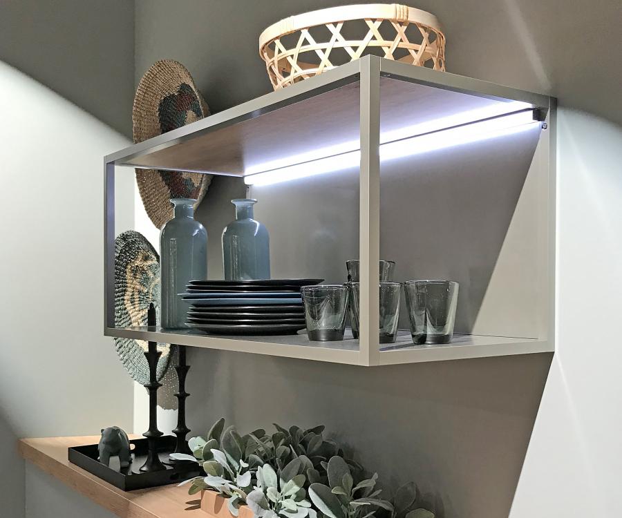
After a long period featuring no-nonsense concepts in retail, consumers hunger again for something new and opulent. We need modern and creative eye-catchers in sales rooms and store window designs for this. Imaginary behemoths are featured as eye-catchers. Fish in rainbow colors, birds of paradise and asymmetrical shapes are being used. LED lighting installations will increasingly impact the retail sector.
An outlook
The customer’s need for emotional designs is still high and will increase even further. Much of what is still experimental today will be up-to-date tomorrow. It’s already obvious that cosmopolitan cities like New York, Tokyo, Shanghai, Paris, London or Berlin will become metropoles of visual marketing. Yet smaller cities will also need to rise to the creative challenge of visual marketing. Anyone who thinks they can do without unique presentations in rural areas or smaller cities has not considered the needs of consumers. Nowadays, they are at home in the world and get inspired by their visual impressions. Retailers should absolutely pay tribute to this with their individual design concepts.

