Shopper, retailer and industry: product marketing needs to include these parties’ interests at the POS system. That’s good advice from Lars Roisch, Managing Director of the Stein Promotions Agency. In this interview, he explain how his team has solved this challenge in a design project for the Astra beer brand.
Mr. Roisch, what was your goal in designing the Astra brand vignette in the Rindermarkthalle?
We primarily wanted to create an emotional response from customers; they should enjoy shopping. The design and with it the visual merchandising are designed to help customers in making a buying decision and thus increase sales. After all, shopping is an emotional activity.
Appealing to consumers’ emotions – how did you translate this into the Astra project?
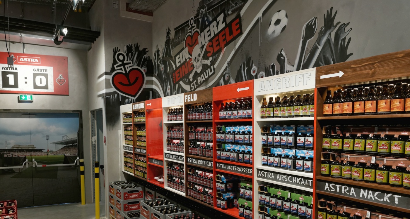
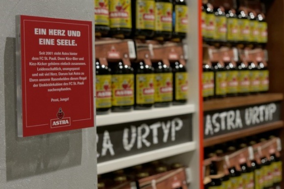
By creating a high level of authenticity in our design. The beer brand’s long-term bond with the St. Pauli football club is the recurring theme for the concept. The individual shelf sections are based on the look of the club’s locker rooms in the St. Pauli stadium. We also incorporated some “shabby chic” design elements to create a somewhat more down-to-earth look versus what things looks like in reality and align it with the ideas of the fans.

A jersey featuring the number 27 by defender Jan-Philipp Kalla is centrally placed – a treasured paraphernalia from the club’s history. A well-known street artist has created a mural with an Astra slogan. A scoreboard indicating the score “Astra:1 - Visitors:0” is also integrated into the design and is attached to the wall. The different product lines are labeled in chalk writing on chalkboards.
How do you decide where the different products should be displayed?
This depends on the emphasis and the surroundings of the market. This EDEKA market is not your typical neighborhood market. It features a high percentage of convenience items. There are many sights and subsequently many visitors in close vicinity of the Rindermarkthalle. This is why it totally makes sense to consider the consumer behavior when it comes to the products and their placement. In this case, six-packs are an appropriate and convenient product choice for example.
How long does it take you to design and implement a project like the Astra product vignette?
If all goes well, we need approximately eight weeks for the implementation. In this case, we needed three rounds of voting for the development in a two week period, as well as 14 days each for design and structural implementation. The project was part of a new development in the Rindermarkthalle. The project start was in spring of 2015.
What else was important to you?
Our special focus was to bring some calm into the vignette by displaying the products in a clear layout. This makes access easier and overcomes any shoppers’ reservations.
How is all of this received by retailers and customers?
To the best of our knowledge, the project is running smoothly and the merchandising generates increased sales.
What type of POS design do you recommend to retailers?
I believe I should build a store where people can have some fun! Shopping is an emotional activity. Products and presentation should appeal to consumers’ emotions and motivate them to buy. You should always keep shoppers, retailers and the industry in mind in your design!
Isn’t that a given?
Not necessarily. In the past, the focus was on the brand and the retailer. An emphasis on the shopper is still not something we see all that often. Today we truly need to take care of the customer. There is a lot of power in that! Our job is to understand the problems and concerns of the company and the merchant. To do this, we also need to incorporate the wishes and wants of shoppers.
After all, customers have a hard time today choosing from too many available products – the latest brain research findings prove this. What’s so difficult is identifying the differences between seemingly identical products. Because after all, what are the actual distinctions between the many hair care products? Oftentimes, retailers believe they need a large selection and corresponding pricing. Yet there are definitely consumers who are willing to pay more for a premium product – that’s because they also expect higher quality. In this instance, it clearly makes sense to highlight the pertinent products. Placement, as well as product selection, are important factors in this. A good example of this is DM and Schlecker.
How can retailers determine where and how they should showcase their products?
By analyzing their customers’ buying behavior even more – with heat maps, for example, to track where customers walk or with surveys on product choices. These let you draw many conclusions on where you should display products. POS is not rocket science!

