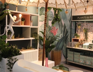
Within every consumer is primarily a human being: when architect Christoph Lay talks about his ideas for store design and concepts, you quickly realize that a store doesn’t just have to visually need to keep up with the times, but that a personal relationship with the customer should be crucial. For the past two-and-a-half decades, he has been designing stores; among them also stores for the drugstore chain dm-drogerie markt. Now he spoke with the iXtenso editorial staff about ideas that are out on the streets and ready for the taking and gives tips on how even large chain stores can permanently attract customers with an individual design.
Mr. Lay, to remain attractive to customers, store design needs to change with the times. How long should an outfit be used?
I like to remind everyone of the following developments: the phone needed 40 years to generate 10 million users. The fax needed 22 years, the PC seven, while the World Wide Web only needed five short years. The trend in store design moves similarly fast. While it took between eight and ten years not so long ago, today store design is outdated after five to six years and needs to be modernized or at least refreshed. Of course, this is somewhat more sophisticated depending on the industry sector; fashion for instance moves much faster, while car dealerships can take a little longer. The general rule however is that once a retailer thinks it’s time to change the store design, it usually is already too late. Therefore, the goal is to act and not just to react.
As an architect, where do you get your ideas from for new trends and brands?
The ideas are literally out there on the street. When I walk through the retail world with my eyes wide open, I immediately sense how the wind blows, where the action is, and where it isn’t. When I saw the first Uniqlo store in Tokyo several years ago for instance and then the one on 42nd Street in New York, it was clear to me that this concept would also be successful in Europe as it is now in Berlin. Whereas the home improvement store still advertises the latest super floor mop on an 11-inch monitor, things are really happening at Uniqlo with giant screens and brilliantly staged moving images.
To me, the trick is also in reaching the right conclusions from this and to find new concepts for the respective customer with the right finesse. To do this, I don’t just need to keep an eye out internationally, but also always keep an eye on the customer and his/her desires as a human being. After all, he/she is not just a potential buyer.
dm-drogerie markt, for which I have designed stores for more than 25 years, takes this a step further and says (loosely translated from an original Goethe proverb): “I am human – watch me shop“. This is not just a saying; the store truly means it and also implements this sentiment in its store design.
In its store design, architecture more and more tells the story of the brand. Why is this concept so important to retailers today?
You can buy any product in any place in any town. But people no longer want this kind of indifference. If that’s the case, they prefer to shop on the Internet and use their free time to do other fun things. Brick-and-mortar retailers thus need to showcase themselves entirely differently and offer a unique presentation. People are looking for authenticity, credibility and sustainability. Especially in times of anonymous online shopping with its obscure rating systems, the dialog about the product with “real“ people becomes more and more important. And the whole thing needs to happen in an atmosphere that’s comfortable like your own living room. Haptics and material properties play a big role in this. More to the point, this means that dialog and service have top priority.
What tips can you give retailers, who want to present several stores in a uniform fashion?
Especially chain stores need to be careful that they are not typecast as the destroyers of proprietary retailers. To do this, they need to individualize. They should directly try to understand their customers and form a friendship with their regular clientele. They have to take charge of their own destiny. Just like stores did in the actual market place back in the old days.
That said, this should not result in weakening the brand and treating the essentials as you see fit. In this case, the term “uniform fashion“ seems too naïve to me. With dm-drogerie markt, we kept asking ourselves how we could present 15,000 items under the “dm brand umbrella“ and created experiences that people remember. In other words, we created a typical ambience and paid attention to visual merchandising.
What options can retailers use to change their look in a simple way without overextending themselves in terms of time and expense?
To respond to social changes or act better and enjoy the first mover advantage, I can achieve this particularly with staging and visual merchandising. Just like in the theater, you cannot quickly and especially economically change the floors, walls and ceilings of a store. But you can actively change the stage design and change the lighting effects for instance. It is often enough to just accentuate or change the store lighting. This is easily done with current LED technology.
The traditional store layout is no longer quite as important today. With new technologies such as terminals, generous communication devices or moving images on the other hand, you can quickly load new content. That means, I don’t necessarily have to run out and buy a brand-new suit; it’s OK if I just buy a different shirt, a different pocket square or perhaps just a new tie.
How do you or the respective retailer find out if the customer likes the design?
Your sales figures will quickly tell the story. However, if you want to have more accurate and more detailed data on this, you have to conduct market research and – when it’s practical- eye tracking. “Going with your gut“ usually just represents a strong opinion and is usually deceptive.
What do you personally as a customer pay attention to when you enter a store?
You never get a second chance to make a first impression in my book. You have to appeal to all of my senses. This includes lighting as if on a summer day, appropriate sounds, unobtrusive smells – so please don’t scent the store! – and pleasant materials and surfaces with a typical feel. The product presentation needs to whet my appetite and should be explained to me in a dialog. And here is the most important thing of all: how I am being addressed as a human being in the store.
Natascha Mörs; iXtenso.com

