As part of an ongoing relationship with Puma, Green Room has designed key digital and physical experiences within the new City Store experience, to coincide with Puma’s new partnership with Manchester City.
The concept centres on bringing City fans into the fold. Inspired by the city’s diverse and vibrant culture, the space was designed to create a dynamic store experience that taps into Manchester’s infamous music scene.
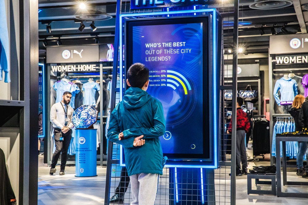
Green Room has designed four key areas within the new City Store; windows and external façade graphics, a giant landing zone on the ground floor, an interactive boot wall and the stairwell and lift zone which runs to the kid’s department at the start of the club tour.
Design of the new store
The store fascia has been transformed on both sides with a huge vinyl wrap, drawing people in from key transport links as they approach the stadium, while the global window campaign has been adapted with 4 premium windows to promote the new Home and Away kits.
Inside, a new landing zone spans the full width of the store and uses digital mirrors, ambient content and animated overhead lighting to draw the eye in and then out to category. The landing zone also provides a stage to tell 4 key stories at any time. For launch, this is dedicated to Home kit, Away kit, Customisation and Predict the Game; a new touch screen game for fans to play in-store that will pull-through game data once the season kicks off.
Engaging customers and fans
Green Room’s Group Creative Director, Paul Silcox said; “We approached this project with the intention of creating a more personal and characterful feel to the store. We wanted the space to deliver on customer retail expectation, but also offer elements of entertainment and surprise.” Silcox added “Fan engagement is at the heart of this concept, we want them to feel that the store belongs to them and that they want to come back time and again, we’re very proud of how it has all come together and excited to see how the store experiences impact on both home and travelling supporters.”

