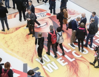
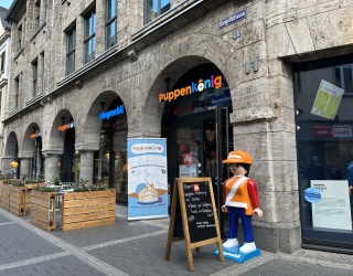
Fonts are like fashion. New designs hit the market, are discovered by the avant-garde, conquer the mass market and eventually they are “out“. We are going on an expedition through the world of typography and show where retail can find orientation.
Typography was once the art and technique of printing with lead letters. Today we print by pressing “ctrl P” on our computer keyboard. Retail has access to many printers, including receipt printers and large format printers. In an interview on this iXtenso topic, Achim Bukmakowski from Epson reports on the world of printing. We have asked him about posters and price tags.
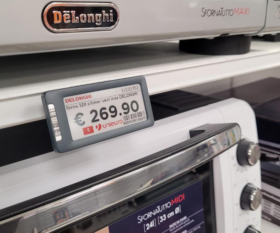
Shelves are not imaginable without price tags. Now a new era begins with electronic shelf labels. Prices can be changed in the whole store with the push of a button and then be correctly displayed at the checkout. By now, the small labels can display different fonts, even logos. Find out more on this in the iXtenso interview with Guillaume Portier from the French manufacturer SES.
Less is often more
Especially laypersons think they have to max out all options of today’s computers. They have the agony of choice and combine multiple fonts, bold, italic, normal, large and small, in black and color. Less if often more in this case. This applies to PowerPoint presentations, flyers and advertisements as well as websites or video screens. You should stick to one font, for instance Arial Bold Italic, at the most combined with another font for quotations or highlighting for example.
Each year there are countless new fonts, just like the changes occurring in the world of fashion. Not all fashion designers meet the tastes of all people. The same goes for font designers. Something we consider hip and edgy today, does not have a long lifetime. Some things have been around in the past in a similar form. Just like in fashion, there are no uniform trends in typography. Tastes differ.
Internet tips: old and new fonts
Typografie.info is a wiki, an online encyclopedia about fonts and typography. A treasure trove of old and hot fonts can be found at www.myfonts.com. In English, font originally means the cast mold of a character for letterpress printing. By now, font is the technical term for the electronic data file of a style of lettering on the computer. There are pixel and vector-based fonts. Whereas pixel-based fonts consist of points, vector fonts are calculated from lines in different angles, so-called vectors. This way they can also be printed in a large scale or blurred without frayed edges, regardless of the type of printer or operating system.
Myfonts is a U.S. site. If you look for fonts from the fifties for instance, you enter “Fifties” or “50s” in the search field and get several thousand hits. Some of it is reminiscent of the first minutes of old movies where the names of performers are faded in. This is exactly what such old fonts are trying to achieve – a trip down memory lane to the alleged “good old days“. That is why retro is one of the fashion trends in store design as well as visual marketing.
Stealing fonts is forbidden
Retail is fighting shop lifting, but stealing fonts is also illegal. The products by font designers are software and if you are caught with stolen, copied software, you can count on hefty fines – and to preserve evidence, the computer could even be confiscated. Or you have to destroy advertising material that was created using the font.
Buying a font is not expensive; many of them are available for less than 100 Euros. It pays off for retailers who want to set themselves apart from their competition. Word processing programs, graphical or image editing software often already contain a number of fonts that are included in the cost of the program.
From font to corporate design
To be identified as distinctive, the selected font has to be consequently used for all occasions – from stationery to sales receipts, from cars to external advertising. Experts call this corporate design. It does not just include the font, but also the logo and maybe even the picture language. You do not create a corporate image on the fly; laypersons can quickly go overboard. It is better to consult an expert, like a graphic designer or advertising agency.
You will notice that there are also fashion color trends in advertising. Pink or rather magenta was “in” in the 90s and not just with German Telekom, which back during its privatization popularized its T in the color pink. Turquoise was also a fashion color trend. Today there is a trend towards purism. Gray is often combined with another color.
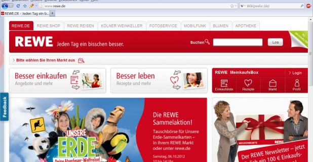
These days, if a website is relaunched, meaning it is revised, it is cleaned up a lot. Fewer background colors, white is preferred, more free space, fewer but larger images which is also tied to shorter loading times due to faster Internet connections. More frequently small, sans serif fonts like Arial are chosen. Serifs are the end on letters, clearly recognizable by the foot, like for instance on the capital A.
Keeping the target group in perspective
The font selection should not just be based on your own taste, but specifically on the taste of your target group and the image you want to portray. If you want to be considered modern, you also model yourself after the Zeitgeist (spirit of the times) in visual communication. If you want to achieve a dignified appearance, you choose traditional designs or modern architecture for your advertising; in any case, you need lots of free space.
Retail should keep the growing older target group in mind: it should not use small, squiggly fonts that constrict reading. Some day this will also apply to advertising flyers in food retailing. Advertising now contains multi-page inserts, often in small print with countless sales offers to offer something to everybody. However, eye motion tracking shows that the eye does not find any reference points there. The gaze sweeps over the sales offers and does not stop anywhere. The result: people quickly turn the page or put the ad away.
And since we are talking about sales offers: large numbers always work. They suggest special reduced prices. One part of every font is matching numbers. There are fonts that look like the hand painted or brushed posters of the past at the grocery store on the corner. And there are numbers without embellishments. However, slogans like “stinginess is cool” (“Geiz ist Geil“) and “20 percent off everything” (“20 Prozent auf alles“) have shown that aggressive price communication can reduce sales. This also applies to typography overall: you should not do everything the computer lets you do.
René Schellbach, iXtenso.com

