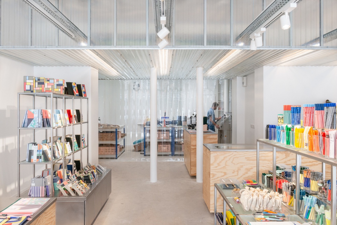
Papier Tigre, a contemporary stationery brand, is rehabilitating its showroom on rue des Filles du Calvaire in the Marais, in the heart of Paris. It brings together a sales area, a space dedicated to custom products and the workshop in the back.
The modularity of the space is the guiding thread of the architectural concept developed by Cent15 architecture. The architects’ desire is to find a legible solution that highlights the Papier Tigre products by simple use of raw materials. They transform the existing building and gives it a new writing that brings image and renewal.
The free plan highlights the various presentation modules of the products that come to inhabit it. These are mobile for a better distribution and appropriation of the place by its users and interchangeable in order to easily rearrange the presentation proposals.
Adapted to the existing slope of the store, the modules offer a dynamic to the project; a real ascent of the visitor. The furniture, key element of the project, provides a screened area between architecture and sculpture.
The architecture proposes an experience. The passer-by identifies the shop from the outside thanks to the new enlarged and lightened facade. It clears the border between outside and inside and invites the public to enter into the shop.
Three spaces are created within the showroom. They are at the same time independent of each other and unified by a singular spatial scenography. The first space is public, it is the shop. The products of the stationery are presented on six mobile modules in vibrated stainless steel. This modular system exposes the objects, organizes the space and defines the circulations in the heart of the shop.
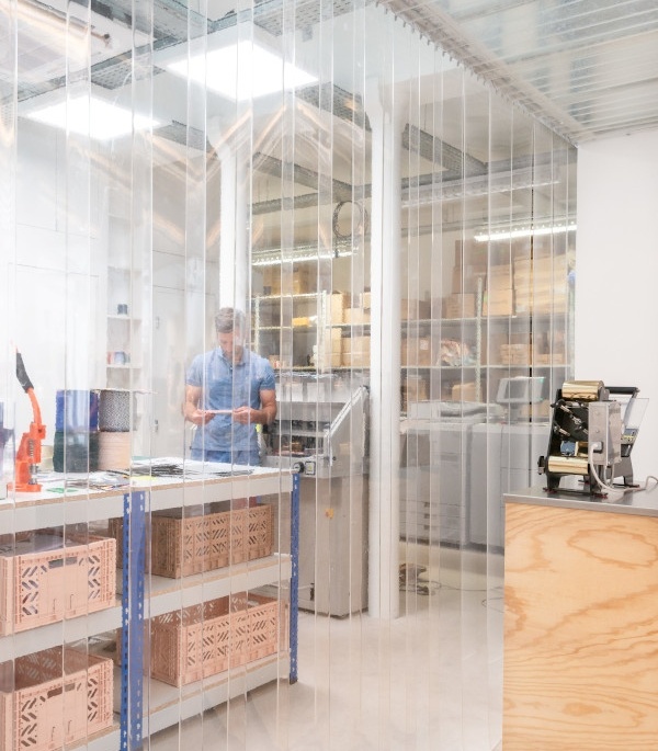
By playing on different intensities, the compression and expansion of space, architects offer an experiential and sensitive architecture, a buffer zone that starts the last space: the stationery manufacturing workshop. This last sphere is reserved for employees. A large part is bathed in natural light by zenithal supply of glass blocks, trace of an old Parisian courtyard in the heart of the project. The expansion is at its maximum, it encourages the visitor to observe the machines, the craftsmen, the savoir-faire of Papier Tigre through a curtain with flexible and transparent plastic straps.
Cent15 architecture takes the side of minimalism to highlight Papier Tigre’s highly distinctive identity by working particularly on the homogeneity of materials, lighting atmospheres and visual perspectives.

