Great architecture can get even better with the right light. Façade lighting highlights the outside, or a building is so transparent that the inside lighting also has an effect on the outside. Compared to metal, glass, stone and wood, architectural lighting has one key advantage: once installed, the facade can constantly be newly staged.
Which building should be illuminated? This should be the first question of lighting design. With new buildings, lighting design should be at the start not at the end of the construction project. It gets more difficult with existing objects. The type of use is also important: office buildings have different requirements than retail businesses. Protected historic buildings set narrow confines in terms of changing their appearance. Town ordinances also need to be observed. Many communities do not want to turn into a colorful Disneyland and have issued limitations for illuminated advertising. Advertising space or facade design – the lines can be blurred.
The next question is: what purpose does lighting design serve? Is it only about lighting for road safety or to evoke emotions? Does the building owner want to present something or even want to attract attention? Is static lighting planned or should different mood lighting be possible? The façade turns into a media facade, if videos or image sequences are played on the surface or current text messages are being shown.
Christmas lights as tourist attraction
Evoking emotions and attracting attention – that’s the goal of many Christmas decorations. Each year some large department stores in the US, in London or Paris turn into tourist attractions during the Christmas season. Crowds of people in front of the stores prove that pedestrians can get excited over something special – at least as long as it really is something special. If every retailer would gear up like Saks in New York or Macy's in Philadelphia, the glamour would quickly be over. People would complain about sensory overload. On YouTube these campaigns continue to have an effect for quite some time: thousands of clicks make for successful videos. Macy's generated Christmas spirit inside of its large stores but the walls of the historic building are a portent of the effects that could be created in the pedestrian zone.
Lighting design in the city
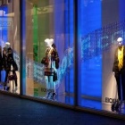
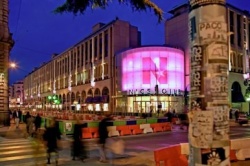
Lighting shapes the face of our cities at night for the past century, but now a change is coming. LEDs can now replace letters in fluorescent lamps. You can install luminous advertising on shop display windows and they still remain transparent. Modern lighting make evenly illuminated large areas possible. In Nice for example (in French the word etoile means star), the shopping center Nicetoile provides a special lighting accent in Nice’s cityscape. The glass front at the entrance is illuminated by varychrome RGB luminaires by Erco (www.erco.com) – the coloration can be varied based on the event. Magenta dominates, because this color is part of the corporate design that can be found everywhere in the store – on the pillars in the parking garage all the way to the service counters and seating furniture. This color also gives the website its distinction www.nicetoile.com.
Lighting with long range effect
Unlike in a town center, large relatively free-standing buildings can have a strong eye-catching long range effect. One great example for this is the Bauarena (construction arena) in Volketswil, west of Zurich, Switzerland (www.bauarena.ch). “All building ideas under one roof“– that’s how Bauarena solicits visitors. It is a mix between a department store, exhibition hall and home improvement store. It caters to building experts, professional and private house builders and future home builders. Over 100 vendors showcase their latest products to design every living- and garden space.
The Bauarena building stands out just by its size of 25,000 square meters alone, distributed over five levels. The building owners wanted to take advantage of the enormous square footage of the floor area. The facade was designed by lighting designer Linda Bohorc of the Zurich office of Heft Hess Martignoni (www.hhm.ch). An unusual lighting installation with 100 LED strip lights by the austrian company Zumtobel (www.zumtobel.com) was created. If desired, 15 different mood lighting versions can be created on the facade. The red color sequences were coordinated with the logo of the Bauarena.
Lighting for outdoor advertising can turn into lighting with artistic panache. It depends on the building owners whether people are excited about these designs. Not everything that is technologically possible is also pleasing to the eye. In any case, retailers will continue to shape the face of cities at night with their illuminated shop windows and facades.
René Schellbach, iXtenso.com

