Welcome to the movie set of the 70s – that’s probably the best way to describe the Cartoon flagship store in Hamburg’s Gerhofstraße. The casual label showcases its wares between film-studio items and props in a 1,000-square-foot space. Moving images clearly play a leading role in the store’s concept. This is underpinned by the “Cartoon – Fashion Production“ slogan, which is in turn reminiscent of a “movie production”.
Take One: The Living Room
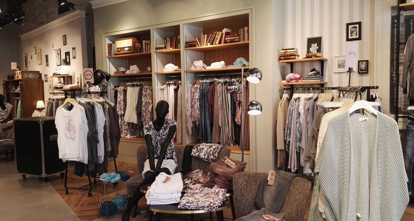
The right-hand side in the front of the store features the living room set. A small couch plus a chair and end table are the focus in this setting. The living room vibe is also highlighted by a bookcase in the wall and a vintage radio. The products are blended in throughout the store, matching the respective scene: pants and blouses are draped over the chair, the shelf does double-duty as a clothes rack. In between are various portable garment racks that could also be part of a prop room on the set of a movie.
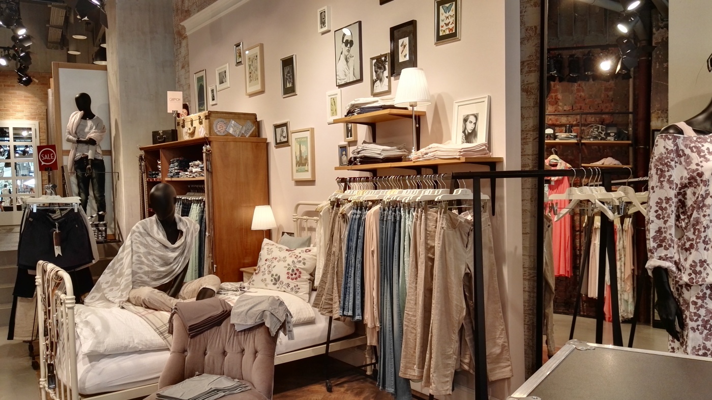
Take Two: The Bedroom
Right behind it is the bedroom set: a bed with a nightstand and a repurposed wardrobe which in turn serves as a shelf. The wall features black-and-white photos of actors interspersed with pastel-colored images with nature motifs. The fact that the mannequins seamlessly blend in throughout the store is also striking; it’s as if they are supporting actors in the movie because the customer is clearly the lead actor in this scenario. One of the mannequins sits on the couch, while another sits on the bed. They fit right into the overall picture, much like all the other props.
Take Three: The Office
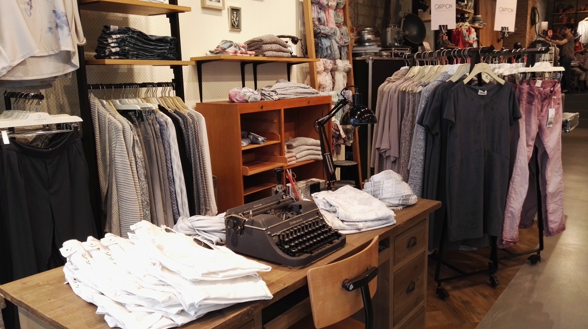
The office vignette is in the front left section of the store. A vintage-style desk and chair dominate the setting. Having said that, the highlight is the details. An old-fashioned Underwood typewriter sits on the desk, surrounded by a desk lamp, scissors, pencils and an old pencil sharpener machine. Again, it seems as if the pants and scarves are part of the set. There is also an old wardrobe in the background that was repurposed as a shelf. Various scarves are showcased on a ladder. The look of the office set is completed with folders and a globe, sitting above the wall mounted shelves.
Take Four: The Balcony and the Changing Rooms
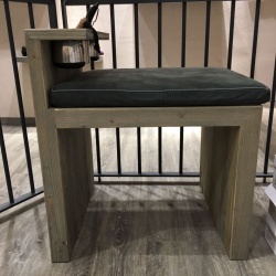
A balcony set and changing rooms are both located in the back part of the store on a platform. A handrail and patio furniture, as well as small plants, define a small waiting area which is once again used to showcase products. The changing rooms feature makeup mirrors, a vanity tray for makeup plus a small seating area that puts customers in the right light for good.
Take Five: The Studio
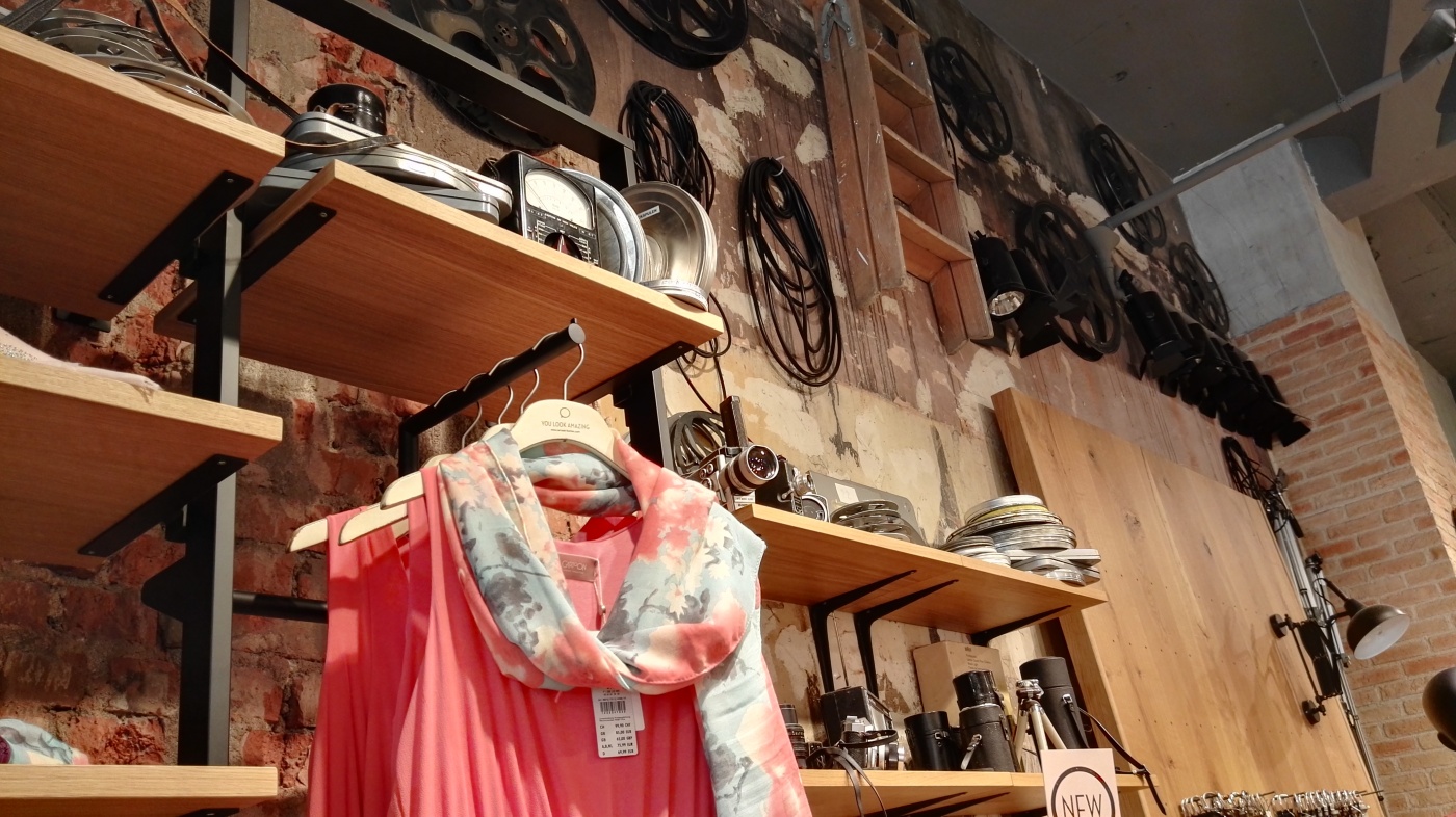
The film studio itself also has a lot to offer: cameras, film reels and boxes, spotlights, tripods and projectors are stacked on the shelves almost all the way to the ceiling. Black, portable equipment cases define the checkout area and are also integrated into the space. Clapperboards not only call for, “Ready-Set-Action!“, but also serve as price tags.
Antique objects always have a history and evoke emotions. That’s why the furniture pieces in the store all feature a vintage feel with added staging through natural, pastel and wood tones. The store’s decoration such as old books, globes, typewriters and movie equipment are also real. Customers experience and sense their stories and feel like they themselves turn into a movie star of the 70s; except the products still definitely call out “2016”.

