More and more outdated, no longer functional shopping malls need to be revamped. This also goes for the former Marstall-Center in the center of Ludwigsburg, Germany. With a new concept and design, the once unsightly square is meant to once again put customers in the mood for shopping starting the end of September.
More and more outdated, no longer functional shopping malls need to be revamped. This also goes for the former Marstall-Center in the center of Ludwigsburg, Germany. With a new concept and design, the once unsightly square is meant to once again put customers in the mood for shopping starting the end of September.
A hideous gray box in front of an even uglier high-rise facade – until recently, this is what the former Marstall-Center in Ludwigsburg looked like. Dwindling tenants and customers and an image that was tainted with terms like “eye sore“ and “blight“. This is now all meant to change. Shopping center operator ECE took over the building three years ago, removed the tenants and started to plan its renovation.
To do this, the company needed a brand-new concept. This is why the ECE brought the Schwitzke Graphics design agency on board and commissioned it to create the visual language - from logo to recurring motifs all the way to developing the shopping mall as a brand. Conveniently for the ECE, the partner of Graphics - Schwitzke & Partner- took over the interior design. "In doing so, we were able to deliver our ideas and designs from one source from the beginning," says Markus Schwitzke, Managing Partner of Schwitzke Graphics.
The concept is meant to distinguish itself from centers in the surrounding Breuningerland and the Wilhelmsgalerie. The certified design professional concluded, “Something the others don’t have for instance is a sensible food court or a connection between the interior and outdoor areas. We, therefore, needed an attractive gastronomic selection. In sunny weather, I don’t want to sit around in a shopping mall, but want to be outside instead. Perhaps I will go inside at one point to purchase something.“
The concept is also meant to interact with the pedestrian area and not create market cannibalization. The target group that is particularly being addressed here are people that have time to stroll. “We don’t want to be the cheap brand but rather show a likable, open concept that doesn’t erect any barriers," says Schwitzke.
A dwelling place
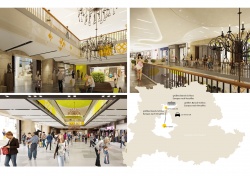
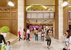
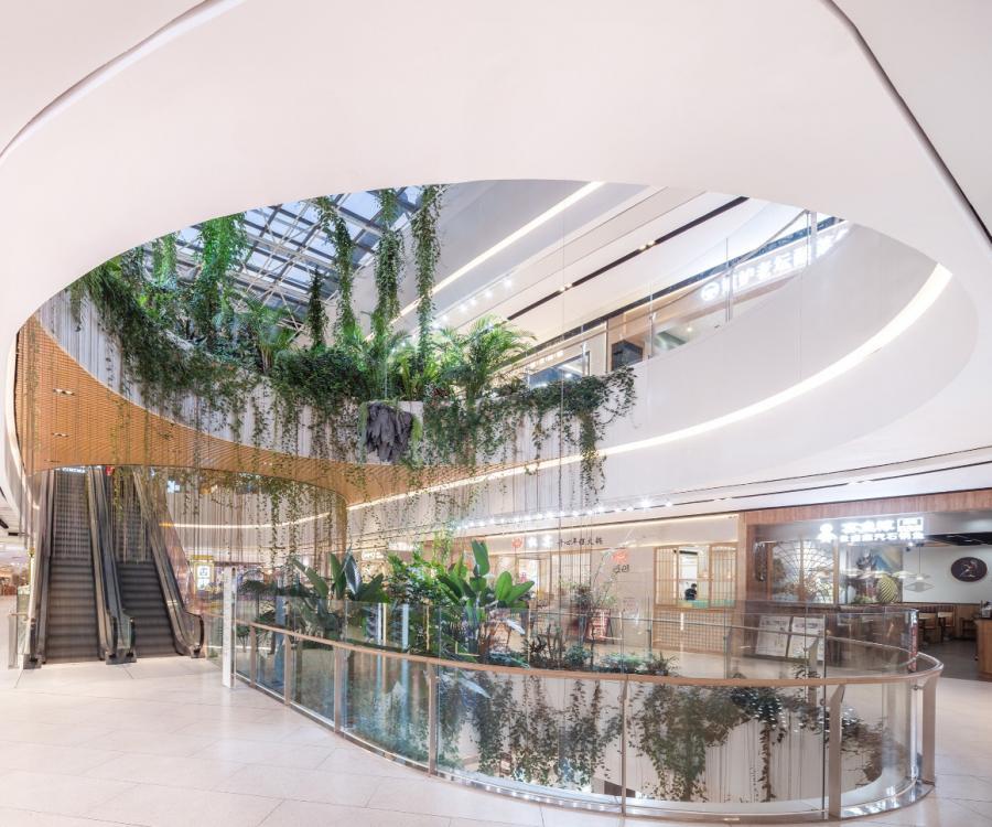
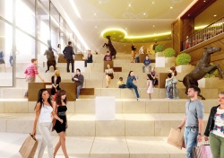
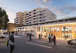
Initially, the foundation for this facelift were larger renovations by the ECE: escalators were installed and new atriums created. An architect office from Cologne designed the face of the building that features the stairs area – which serves as a seating area at the same time – that continues into the building. Further on top is where the food court starts from which one can get to the terrace. "This is one of the areas we created so different target groups would feel comfortable. We also try to convey to operators that the mix between fashion and food is important – for your daily coffee break. Even though these solutions are more expensive than a single food court, they are also far more attractive for the visitor," adds Markus Schwitzke with a twinkle in his eyes.
Your carriage awaits
Aside from structural alterations, he focused on one key aspect: to give the mall its own face and its own story to make the building unique. "To do this, we tried to understand the location and its special characteristics. Ludwigsburg has a beautiful downtown area with many Cafés. The second largest baroque castle after Versailles is located four minutes away from the Center. Many historic processions still take place here. There is also a horse market and a historic horse stable, the Marstall, where carriages and equestrian equipment were stored. This alone already speaks cultural volumes,“ the 40-year-old adds enthusiastically.
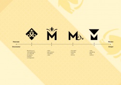
The history of the site became the heart of the new motif. "The equestrian elements keep recurring everywhere,“ he illustrates. “What’s more, we discovered that the reference to horses is definitely relevant to fashion. From Cavalli to Hilfiger, the motif keeps recurring."
The design can even be found in the parking garage where parked carriages are being suggested. From the tiles to equestrian figures all the way to stirrups and chandeliers – small elements keep recurring. The enormous wooden doors that lead to the lower interior space, hand rails made of real wood and black steel with rivets convey an additional stable ambiance. Jockey jerseys inspired the design team to use friendly colors – bright green and yellow playfully but not excessively catch the eye. “In some areas, the design is more intense, in others less so, depending on how powerful the tenants‘ own designs are,“ says Schwitzke.
Storytelling – turning the shopping center into a brand
Permeating the building with a recurring theme is not just for optical reasons. The story it conveys and the associated recognition is the goal of Schwitzke’s work. Storytelling is the keyword here.
Previously popular in brand development, the principle of “storytelling“ is completely transferrable to designing a shopping mall concept. “Once something has a story, it becomes more interesting to customers. For instance, customers are more willing to spend money on a piece of furniture that features a detailed description versus a piece without its own identity. Take Manufactum for example – this is actually furniture that my grandmother might have bought. However, the company makes an effort and describes the product that is being fairly produced for the past 200 years by this family business. This is what truly defines a brand. And this is exactly the additional value I can also lend to a store and a mall.“ Shopping centers abroad illustrate this.
German shopping centers lag behind
“Just compare the malls abroad with many here in Germany. White walls, barely any exciting attractions. Nothing is memorable,“ Schwitzke criticizes and draws comparisons to the Dubai Mall, in whose vicinity he lived for five years to establish an office for Schwitzke. “In Germany, shopping typically means to meet everyday needs. In Dubai on the other hand, everything happens at the mall. People have their breakfast there, visit the doctor, have a business lunch at noon and go there to celebrate in the evenings. And since I am already there, I might as well buy something. Back then, I only went to the mall once a week to shop. But I went there many more times for other things.“
Gradually, this insight also registers with tenants and retailers in Germany. Actually, the most difficult aspect is to convince the lease administration that having your own concept is not too expensive.
"Shopping mall operators need to create an attractive selection – and become a brand that attracts both tenants and customers. They need to create an ambiance, diversity, and an exciting tenant variety – ranging from odds and ends all the way to ‘I treat myself‘. A great gastronomic selection and regional options should also be added to this. In short, I need to create spaces the customer likes to visit.“
People in Ludwigsburg who still remember the Center from the past are still skeptical. “A poorly run Center is meant to be turned into one that works well? OK, this I want to see.“ The end of September will show whether the concept is ultimately successful. That’s when the stable opens its doors.
Author: Natascha Mörs; iXtenso.com

