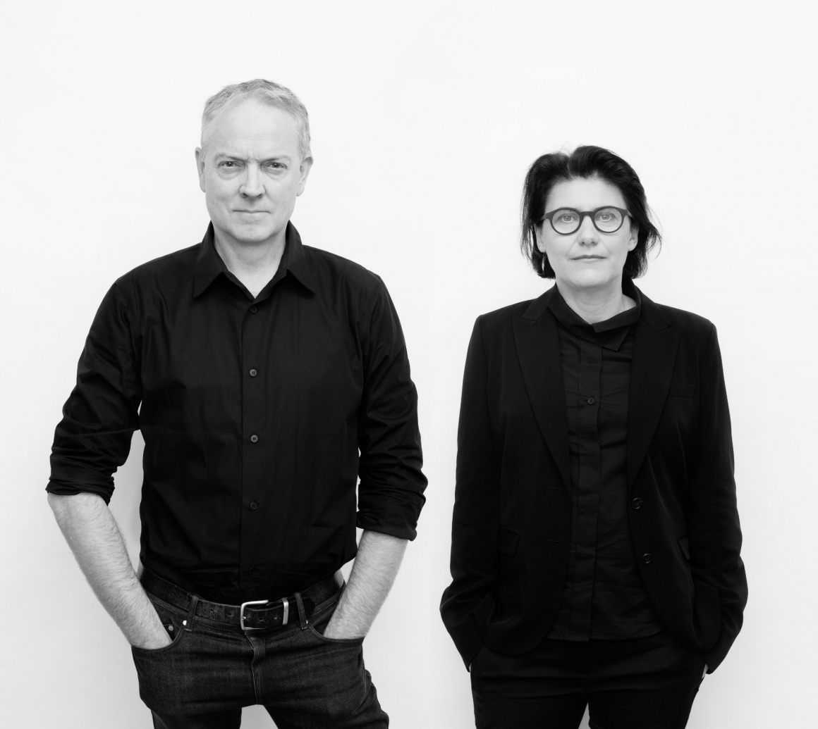
It is one of the first major retail stores the architects Jakob+MacFarlane have designed. Hopefully, it will not be the last, since it is offers a highly surprising and individual look.
Brendan, what is special about the new store of Frédéric Malle?
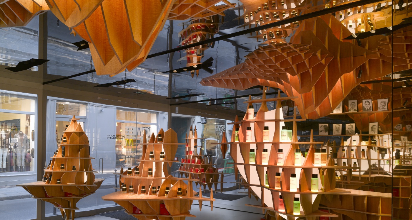
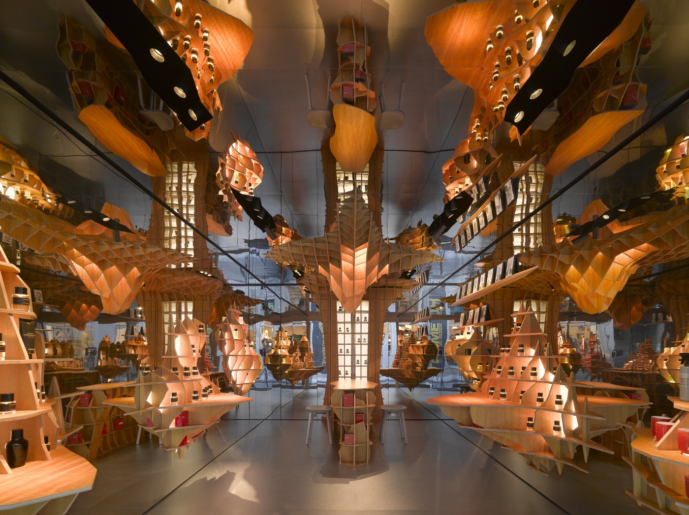
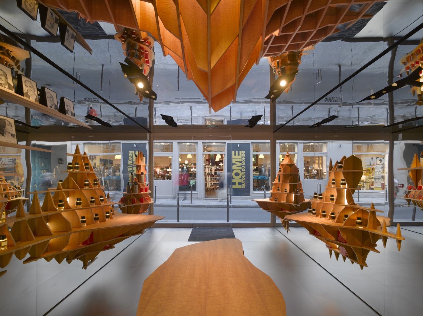
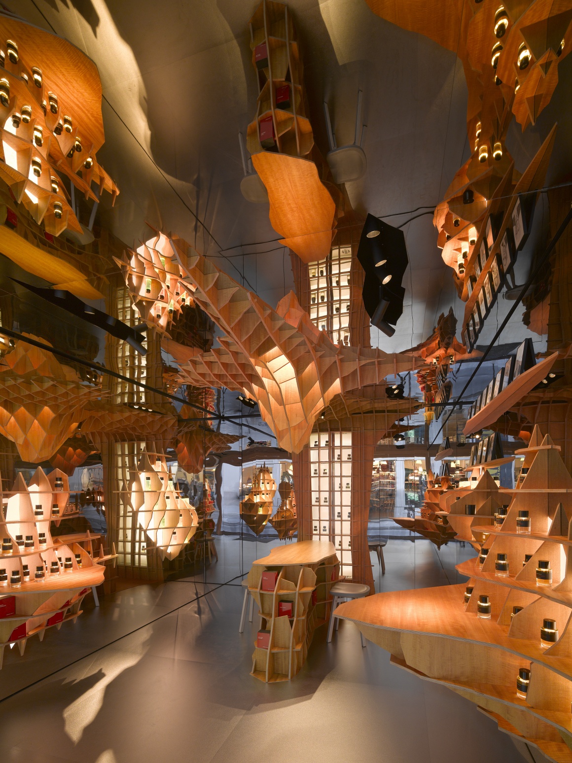
The biggest surprise of the boutique is that you do not know where it ends. We achieved this by making the walls reflective. The ceiling is made of polished stainless steel and the floor of matt brushed stainless steel. The boutique is tiny with 24 meters squared but through the mirrored walls, ceiling and floor we make the space seem infinite. With the mirrors, we wanted to create the feeling that you are in a much bigger space and to show the feeling what perfume can do. It has the possibility to take you into the past or move you into another space emotionally – like a voyage into a parallel world.
How come you chose this form of shelves?
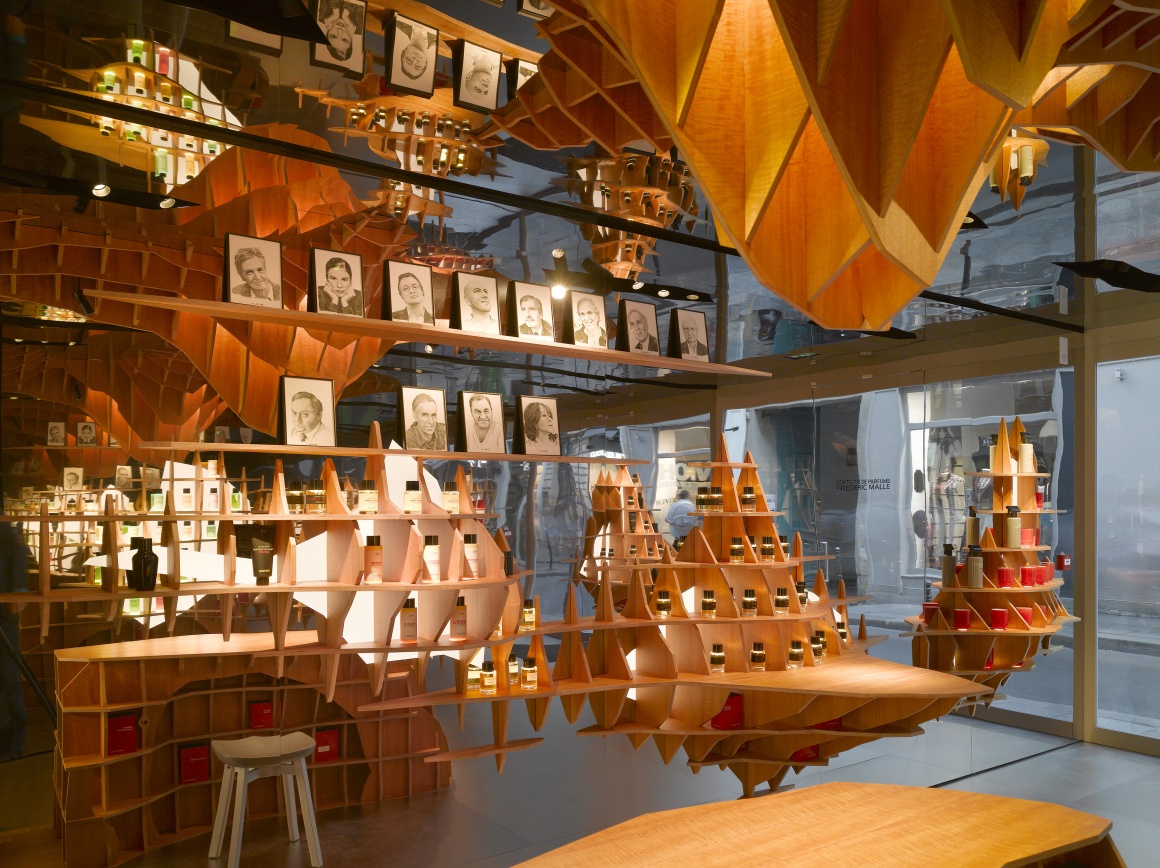
The shelves we developed are sort of book shelves. Frédéric’s mark has been around for quite some time and he has always been interested in perfume as a new edition, in bringing out a book and a series of books over the time. Because of this parallel, he sees his shop as a kind of book shop.
Furthermore, Frédéric found the location of the new store in Le Marais quite interesting on the edge to a very important gallery district and shopping street in Paris. It is popular for tourists and younger people and so it is a very dynamic shopping street, especially at the weekend. He was aware of the kind of presentation of art. That gave us the physical context – and then we talked about art, travel and the creation of perfume and architecture. We as architects were interested if there are any parallels between the perfume world and the architecture world.
So, we thought about the shop as a gallery and a book shop. Therefore, we used a wooden structure which allowed us to present one perfume alone or in a collection. A big part of making the shop is a play between the unique object and the unique being seen to be part of a larger context of pieces.
What is happening at the tables in the middle of the store?
In the middle of the boutique there are four little tables where the customer can sit down and smell the bouquet of the perfume. By this “ritual” and by using the mirrors Frédéric wanted the customers to slow down.
Lighting played an important role in this store concept.
Yes! One of the big keys in retail is lighting. With it we play with peoples' emotions and expectations by changing the mood of the boutique. You do that as well with architecture – but through architecture you are in a fixed medium. With light, you can potentially change the reading of that. It is very much close to a theater where you create moods with different kinds of lights.
Would you describe the implementation and function of the lighting elements?
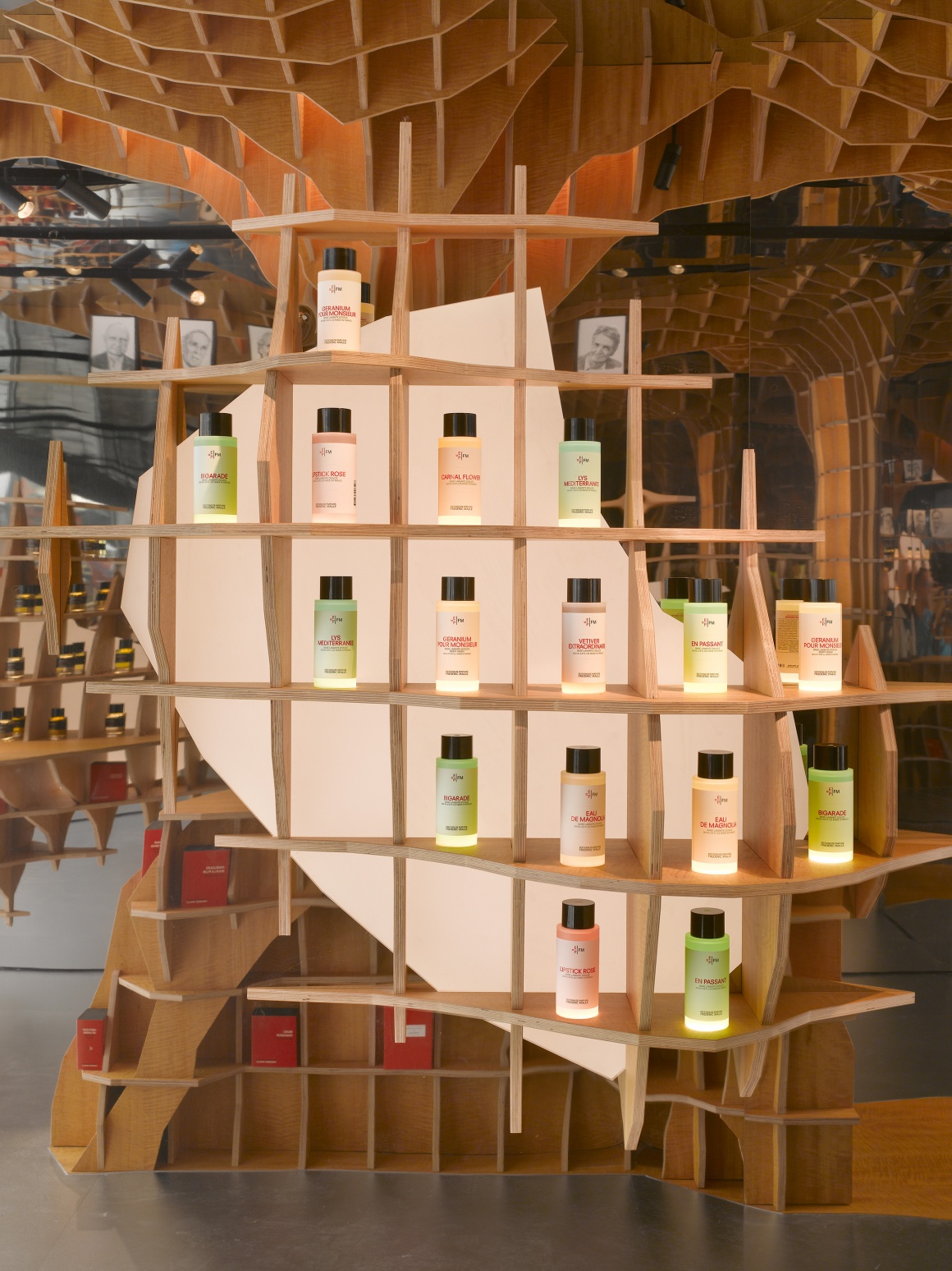
We implemented three kinds of light. The first is the lighting from below – what I call the micro lighting. In the shelves the light is carefully hidden under a glass disc with a little LED light which can light the volume of each unique bottle.
The secondary, intermediate light comes from behind the wall of the boutique. It lights all the sides of each shelf. This white surface diffuses the side light to the bottle to the inside of the boutique.
The third light is a macro light – an over-hit spot. These movable black painted spots are placed in the ceiling. What is special about it is that we have a 24 hours lighting system that works by using a timer in the computer. Within the morning, we have a very soft low light, in the midafternoon a middle light and later in the afternoon bright light. During the closing times the light is glowing like coal in a fire. That is kind of fun!
What about the materials you chose?
In the boutique, we used simple materials like stainless steel and wood – to keep the idea very simple. Frédéric places a lot of importance on natural and organic materials for his perfumes. So, the materials in the store reflect this continuity. That makes a relationship to the product. The product comes first and you should not undermine it by a wrong kind of architecture.
What do you think about sustainability in shop fitting and architecture?
I think sustainability is a global issue. In matters of retail it strongly relying on what you are selling. If you are selling a highly technological product and maybe it is not that much touching on sustainability it is a bit absurd to bring that into an only sustainable issue. But if it fits to the boutique – why not? You should concentrate on what the product is trying to present. And you need to be realistic – your clients come to you. You cannot always work with sustainable issues because the world is a complex place.
The well-known perfume columns where customers can smell the fragrances which are typically for all Frédéric Malle stores are implemented differently in this boutique.
Yes, you cannot see them directly in this store since we hide the them behind the mirrored wall in the back of the boutique to emphasize the impression of infinity first. In all of Frédéric’s stores of the past he uses this glass transparent cylinders that spray a perfume in. That way, the client can smell without the perfume spreading it throughout the whole store. After using it the door closes and the column is filled with clean air.
Here, we painted the columns black and on the back wall inside you have a small digital video of a fire. That was a personal vision by Frédéric. With it, he is bringing another sensorial experience into the column.
How do you think do store design and digital elements fit together generally?
Digital elements and architecture should all be part of the same thing. This is getting more and more important – especially with things like augmented reality which we already use a lot when creating projects. It is the interface between the real and the virtual world which I find so interesting. I think in the long run the most creative spaces in the world are the ones where people have an idea. And then they look for what is around them. There is a huge variety of creativity in there.

