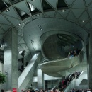
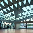
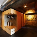
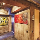
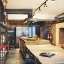
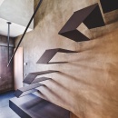
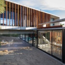
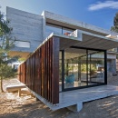
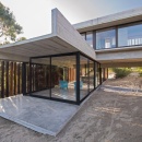
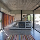
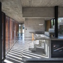
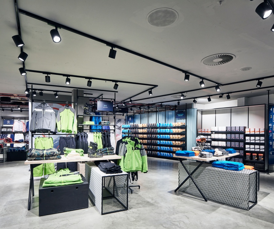
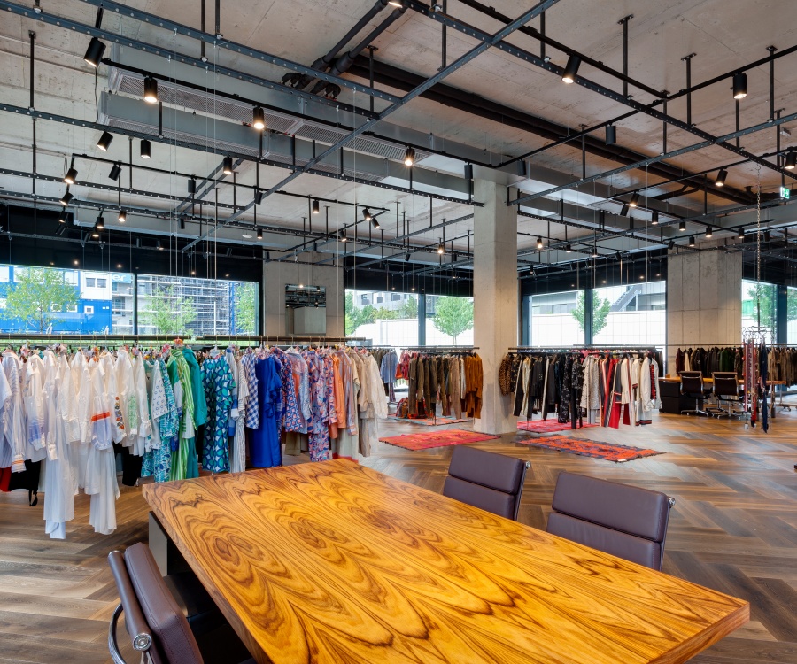
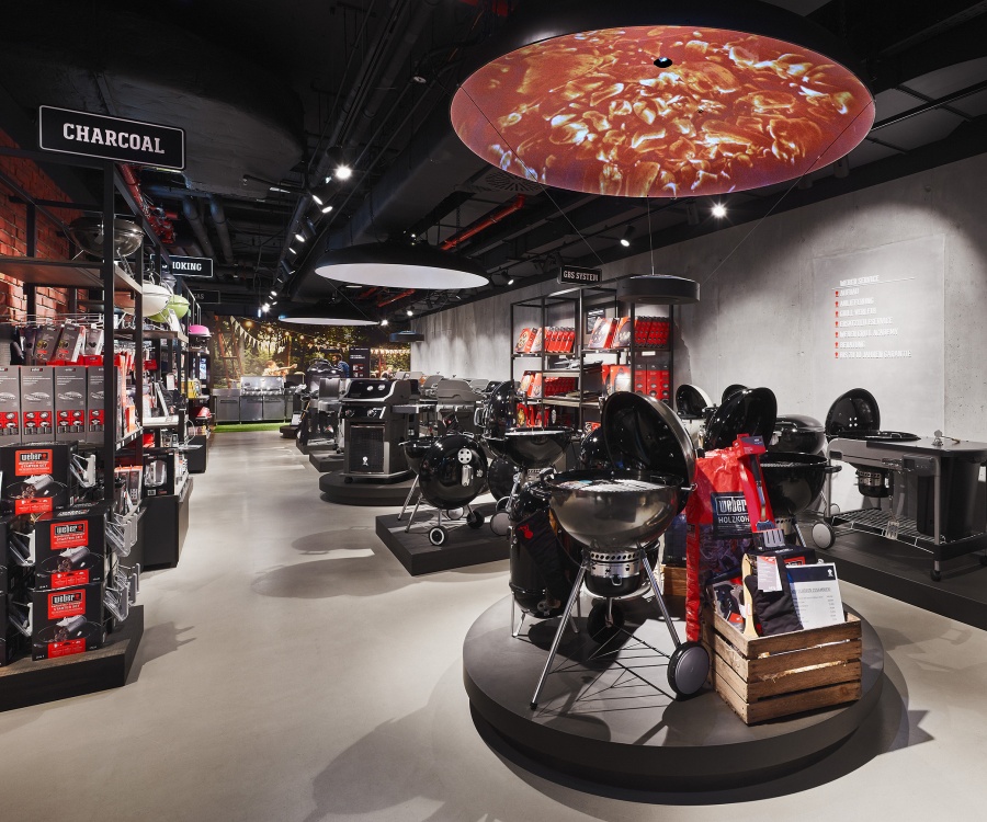
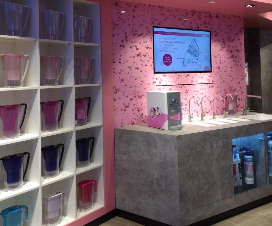
By calling their latest album "Concrete & Gold", the members of the American rock band Foo Fighters are not the only ones who are playing with the contrast between concrete and other materials. Architects also use this building material, which already saved the Parthenon of Ancient Greece from destruction in increasingly creative ways. The concrete look is also frequently featured in retail store design.
Chris van Uffelen has published several books, essays and newspaper articles on the art and architecture from antiquity to the present.
Mr. van Uffelen, you wrote a book about the use of concrete in architecture. What makes this building material suddenly so attractive again?
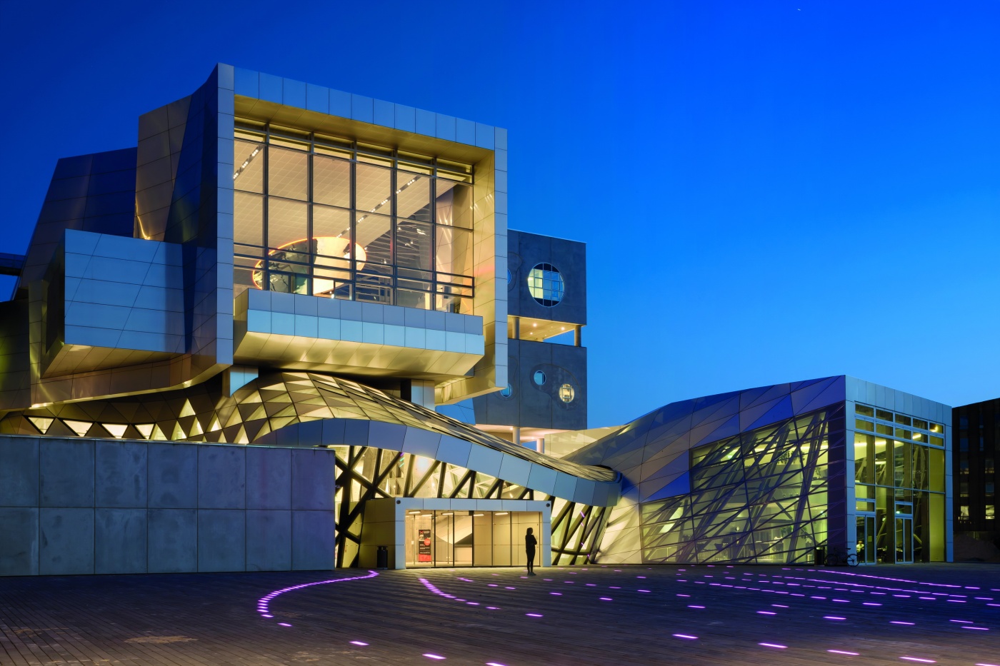
To be fair, concrete had actually never fully vanished from the scene. The same applies to pallet-related architecture and design. Right now, imperfection is very much back in fashion – meaning essentially self-made creations in stark contrast to all the flawless perfection that has dominated in the last decades in the form of parametric architecture, where powerful computers are needed to calculate the curves of walls etc. With concrete, you simply pour it into a form and your wall is done.
Imperfection: That sort of reminds me of the patina finish for metals that’s also very popular right now.
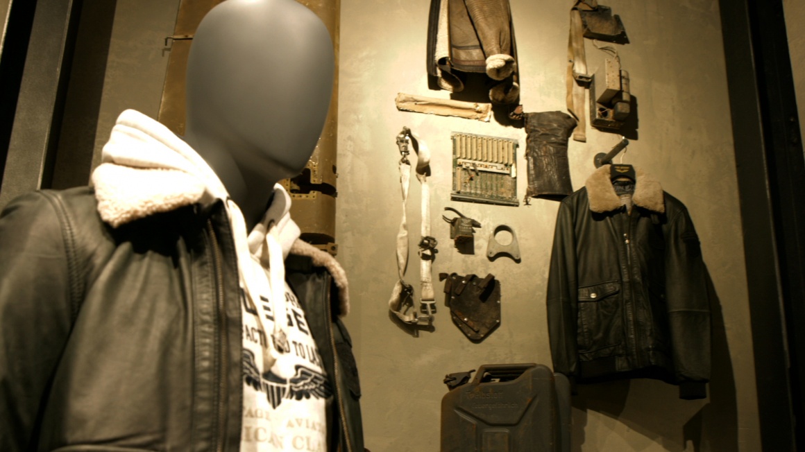
That’s right. In this case, the metal is pretreated to make it look aged and vintage in a short amount of time. In fact, that’s the benefit of every natural material: it is allowed to age. Chic white walls must never show any scuffs or scratches. Unlike brick, concrete and any natural material, where signs of use are permitted to show.
To me, concrete always felt somewhat bulky and crude. Are there any new design options?
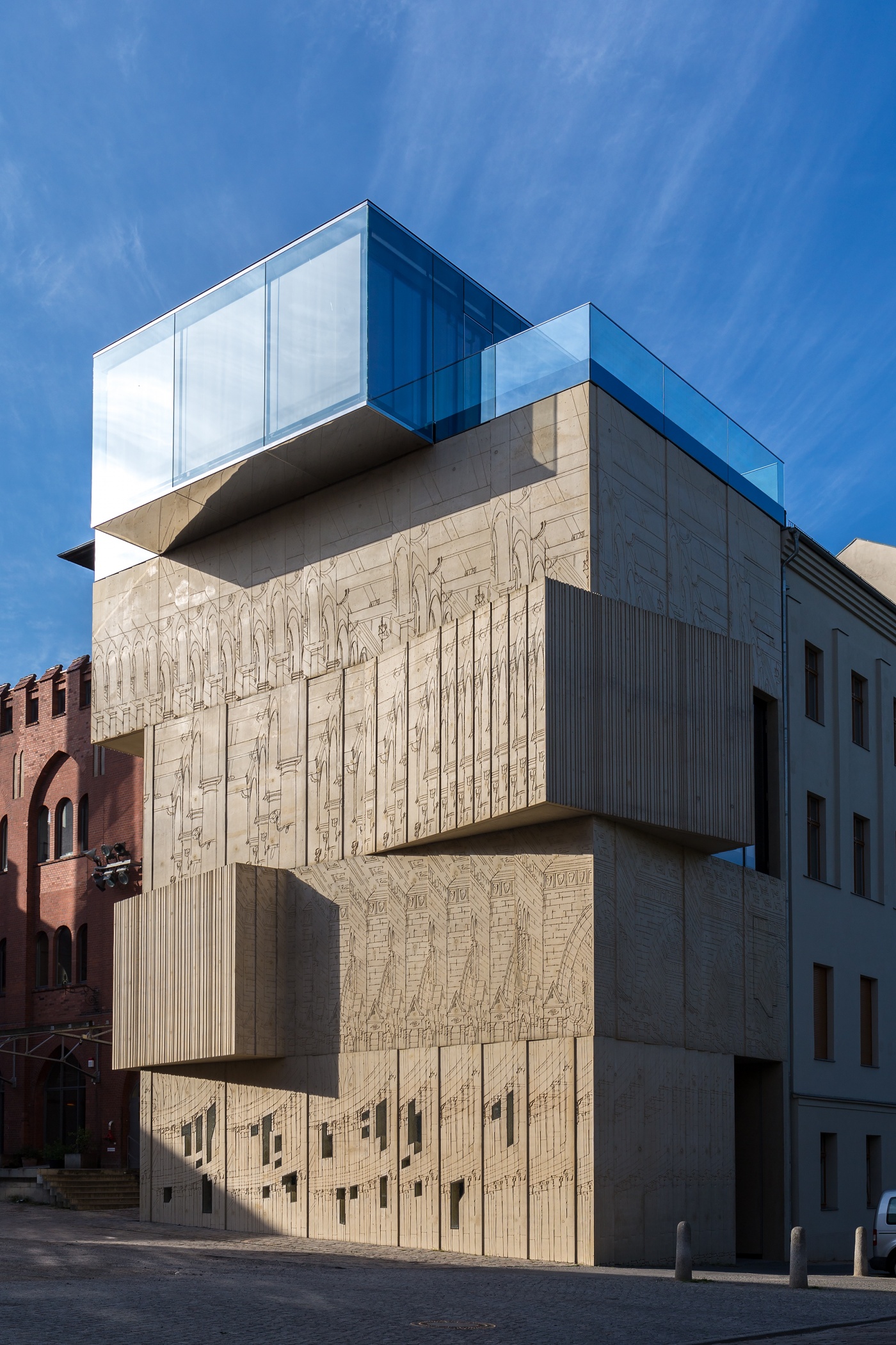
Computer-aided design or CAD allows designers to make concrete formwork in any shape and it’s cheaper than it was in the past. Methods used in shipbuilding are utilized in this case. In the 1970s and 1980s, everything still needed to be formed by hand, which was far too expensive. That's the reason we lost this imaginative expression of concrete. Formwork carpentry was simply too expensive. What makes formwork so exciting is the patterns it creates in the concrete. The Berlin Museum for Architectural Drawing is a great example of this. Large sketches and drawings were etched across the concrete formwork and now the reliefs adorn the walls.
What are some possible color variations?
Any color is feasible. Much of the concrete is made up of additives. You can add whatever you like – gravel in exposed aggregate concrete for example. You can also add pigments in any color to dye the concrete. Even if the wall gets a scratch, the color underneath is still visible. The addition of marble makes concrete look like a marble wall. Polishing is another option. A finer additive allows you to get more shimmer.
Concrete is one of the most sought-after looks in retail store design. Is this always real concrete?
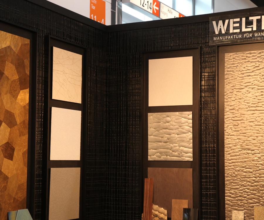
Not always. There is real concrete and then there is a concrete look. A look at colors and plaster reveals that there are a number of products that can make a wall look like a concrete wall thanks to plasterwork you apply or wall panels you simply attach on top of the existing wall. This makes it look like poured concrete.
So why would you still use real concrete?
Among other things, concrete allows you to cover large surfaces because it also features steel reinforcement. It is structurally stable and very durable - and a very clean material.

So it’s sustainable?
Concrete is made up of natural materials. Having said that, its removal is quite expensive and elaborate because it is typically stabilized with steel reinforcement. You first have to separate the two materials. Meanwhile, recycled concrete is also becoming increasingly popular. The material can be grinded down and then reused in other types of concrete.
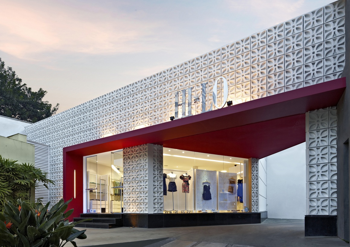
What are some favorite materials that are combined with concrete in retail store design?
Wood and steel look great with concrete. The same applies to glass. That's pretty perfect. The imperfect look of concrete also provides a great contrasting surface to showcase products. Take an expensive and elegant pen and place it on rough concrete for instance. This makes the pen’s features stand out even more.
Der Opus Caementitium, direkter Vorläufer des Betons, wurde schon von den Römern genutzt.

