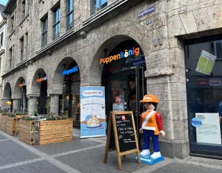
A new decade has begun and has inspired the iXtenso editorial team to track down the latest retail design trends for you. One of the hottest trends of the moment is biophilic design.
Loosely translated, biophilic design means "design inspired by the love of life in nature”. The trend seeks to integrate natural elements into man-made environments. This design concept is based on the inherent human inclination to closely affiliate with nature. The assumption is that those of us who spend more time outdoors, generally tend to be happier, healthier and less likely to suffer from stress or fatigue. Biophilic designers aim to bring the feel and benefits of nature indoors.
It’s no wonder that retailers are now hopping on the bandwagon and wholeheartedly embrace this trend. After all, satisfied customers make happy retailers! Here are a few tips on how nature can inspire your store design:
Getting in touch with nature
A real tree inside the store? “Absolutely”, say proponents of biophilic design. Needless to say, there are also less elaborate and less expensive options to enhance indoor environments with greenery. Vertical garden formats are very popular in many scopes of interior design as they offer many design options. Any wall can be personalized with herbs, grasses or flowers in different arrangements. Hanging baskets, indoor flowerbeds, planters, mini greenhouses or a Zen garden are just a few design ideas that can enhance your retail space.
Let the sun shine in your store
Of course, lighting is of utmost importance if you decide to add a little greenery to your store. Special LED lights can replace sunlight, giving plants a chance to grow and thrive even in indoor settings. Yet plants are not the only species that crave sunlight. Customers also need and prefer sunlight. The same rule also applies in this setting: take a cue from nature! Customers very much appreciate natural light as products look their best and are more alluring, while the light creates a cozy atmosphere and overall enhances the shopping experience. Cool neon lighting does nothing to make produce, clothing or technical devices look more attractive and appealing. That’s why you should always work with warm tones and partially indirect light. This makes people and plants feel more comfortable in your store.
Trendy curves
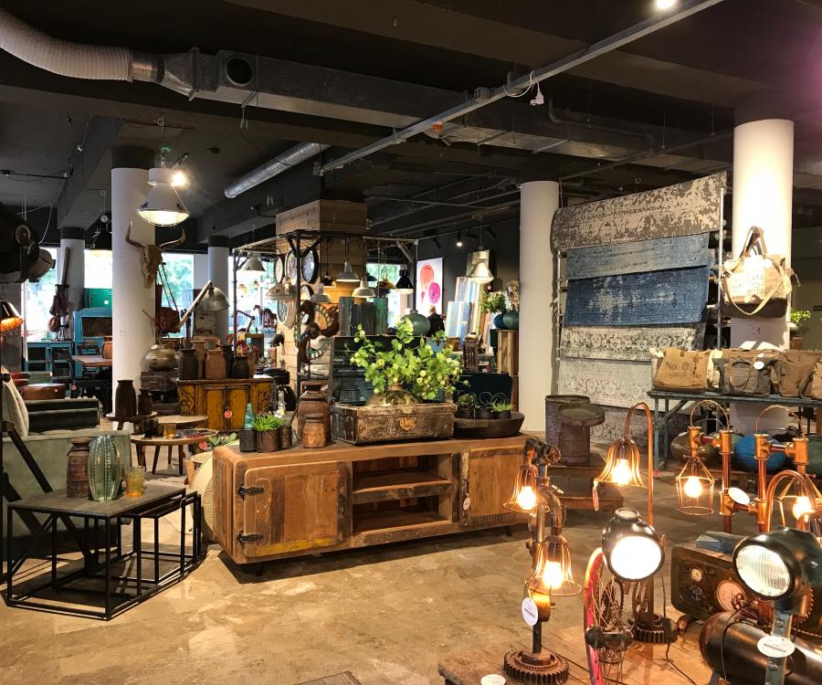
There aren’t really that many distinct, geometric shapes that occur in nature. This is where irregular, asymmetrical and organic shapes and patterns dominate. Of course, straight lines or square corners will never disappear from store design simply because they are efficient and make sense. Having said that, curved, organic shapes and forms are increasingly relevant again. And the same rule applies when it comes to seating, shelving or lamps: be more daring! Add some spice to your store and boldly stir things up!
Let your light shine!
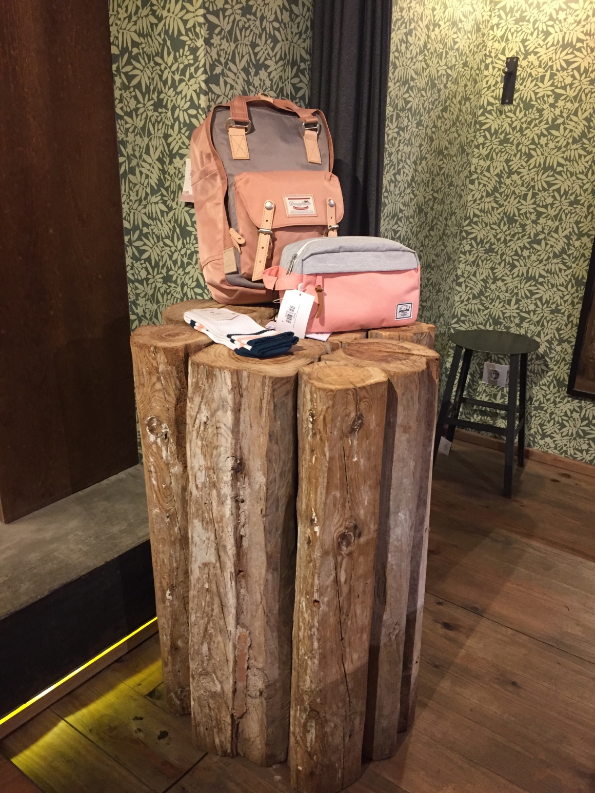
The neutral color palette of classic minimalist Scandinavian design has made the latter a top trend for many years. But now, bold color is making a comeback. Natural and warm color shades are brightening up stores again. However, colors should always be used in moderation and deliberately to get the full effect. Moss green, crimson or sunshine yellow brighten up your merchandise and let your brand shine.
More substance, less pretense
Faux wood versus real wood? Artificial versus real plants? Biophilic designers will always choose the latter and never the former. The design should not just look natural, it must also be natural. In doing so, this design philosophy fits seamlessly into the sustainability mindset that has become the center of recent public interest. And by the way, your customers also have an increased awareness of this issue. So stay authentic and be transparent with your customers!


