When a long-established jewelry store prepared to make the move to a better-trafficked location, the owners saw an opportunity to embrace a new look that would appeal to a fresh generation of shoppers. While they wanted the new retail environment to honor their established customer base, they also hoped to appeal to new customers and current tastes.
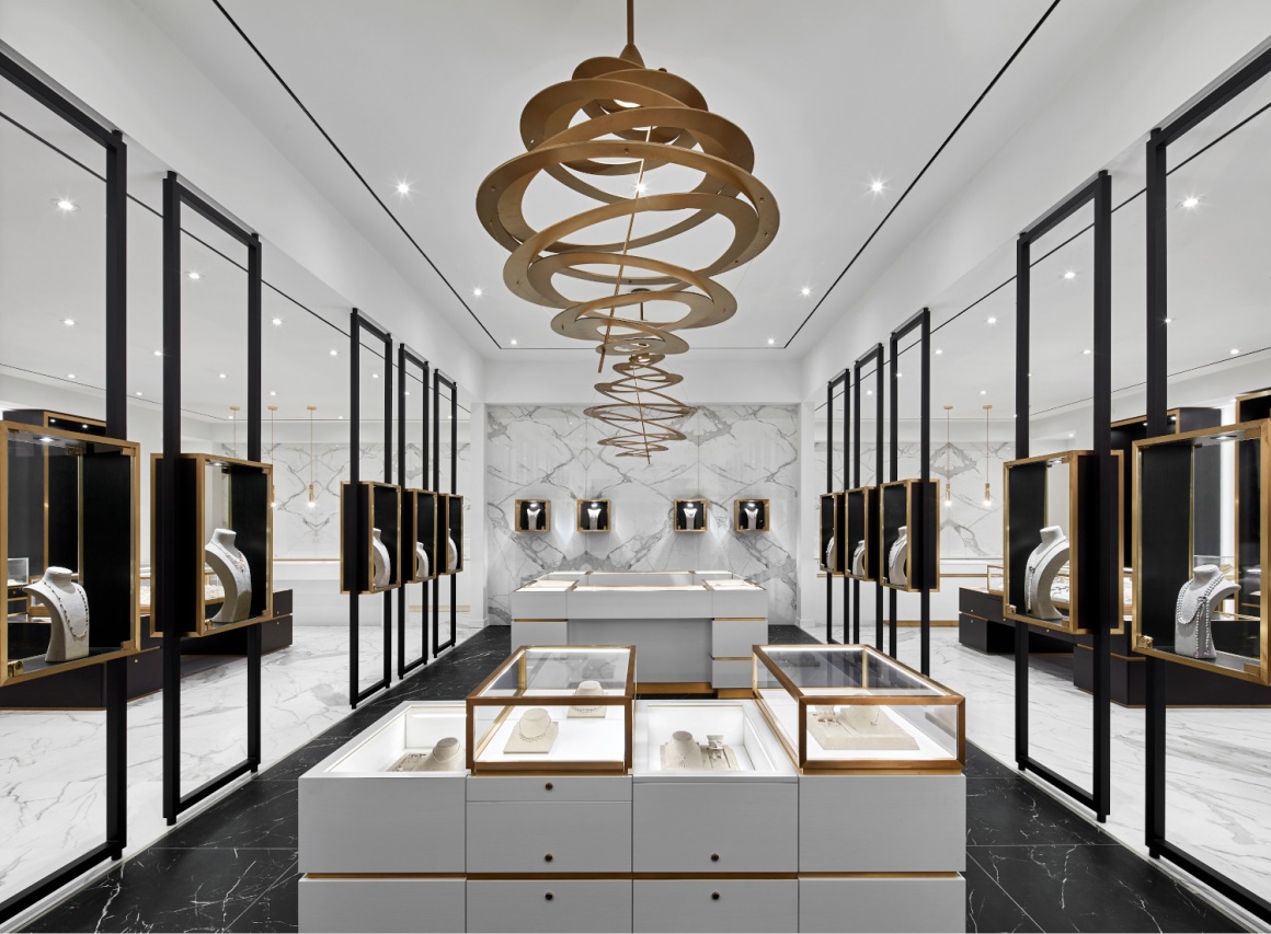
Toronto-based design firm Cecconi Simone Inc. set out to create a harmonious and timeless design within the 3,500-square-foot retail space, envisioning an aesthetic that was both sophisticated and approachable. A luxurious backdrop would showcase both the store’s own popular product line and a range of other brands, with a simplified display area, a warm black-and-white color palette, and rose-gold metal accents for a hint of color.
“Jewelry stores can traditionally feel over-cluttered, with brands and products competing for attention. Our challenge was to create a visual style that was simple and minimalistic, bringing focus to the stunning jewelry on display,” says Cecconi Simone principal Anna Simone. “To accomplish that, we installed custom jewelry cases and employed contrasting tones that carry the eyes to key focal points. The result is sophisticated but not intimidating – and makes the jewelry the star.”
A monochromatic white-on-white zone draws eyes first, forming a spine through the center of the shop and acting as a backdrop for featured displays. On either side, black-on-white zones lead shoppers through, inviting them to peruse both the store brands and those they support. Custom wood-and-glass cases create continuity throughout – treating the jewelry like art in a gallery and removing the clutter of competing brand marketing – while rose-gold metal highlights both the display cases and accent lighting. The same metal twists like a delicate necklace through a dramatic focal-point light fixture above, drawing eyes to a fixture that feels like a piece of jewelry itself.
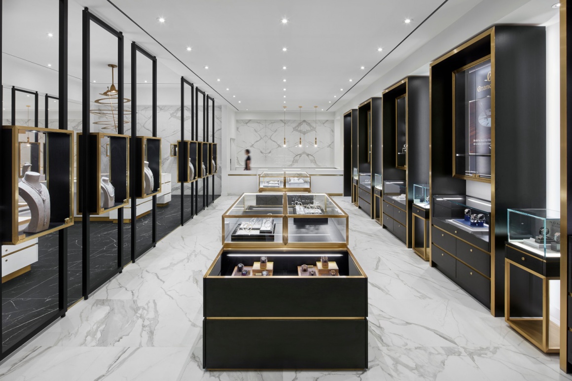
Combined, the high-contrast aesthetic creates a sense of balance and rhythm, but the design doesn’t immediately give everything away. Rather, shoppers are invited to come in and explore all the secrets on display, opening up opportunities for one-on-one interactions with staff.
“The shop’s owners embrace a warm and personalized sales approach, and our aim was to create a space that both represents and supports that,” Simone says. “We think that we succeeded. The aesthetic feels warm and welcoming and encourages people to linger as they deliberate on what can often be a costly, once-in-a-lifetime decision like purchasing an engagement ring.”
To accommodate the different types of shoppers that will ultimately visit the store, the design also features a social lounge where shoppers can sit down with a cup of coffee and engage in conversation, as well as a diamond room where they can be left alone in private to deliberate. There’s even an Instagram wall – providing the perfect backdrop for selfies and photos to share with friends.
“The space is luxurious but not overwhelming, and respects the fact that people have different ways of shopping,” Simone says. “We designed it to give everyone the opportunity to interact however they feel most comfortable.”

