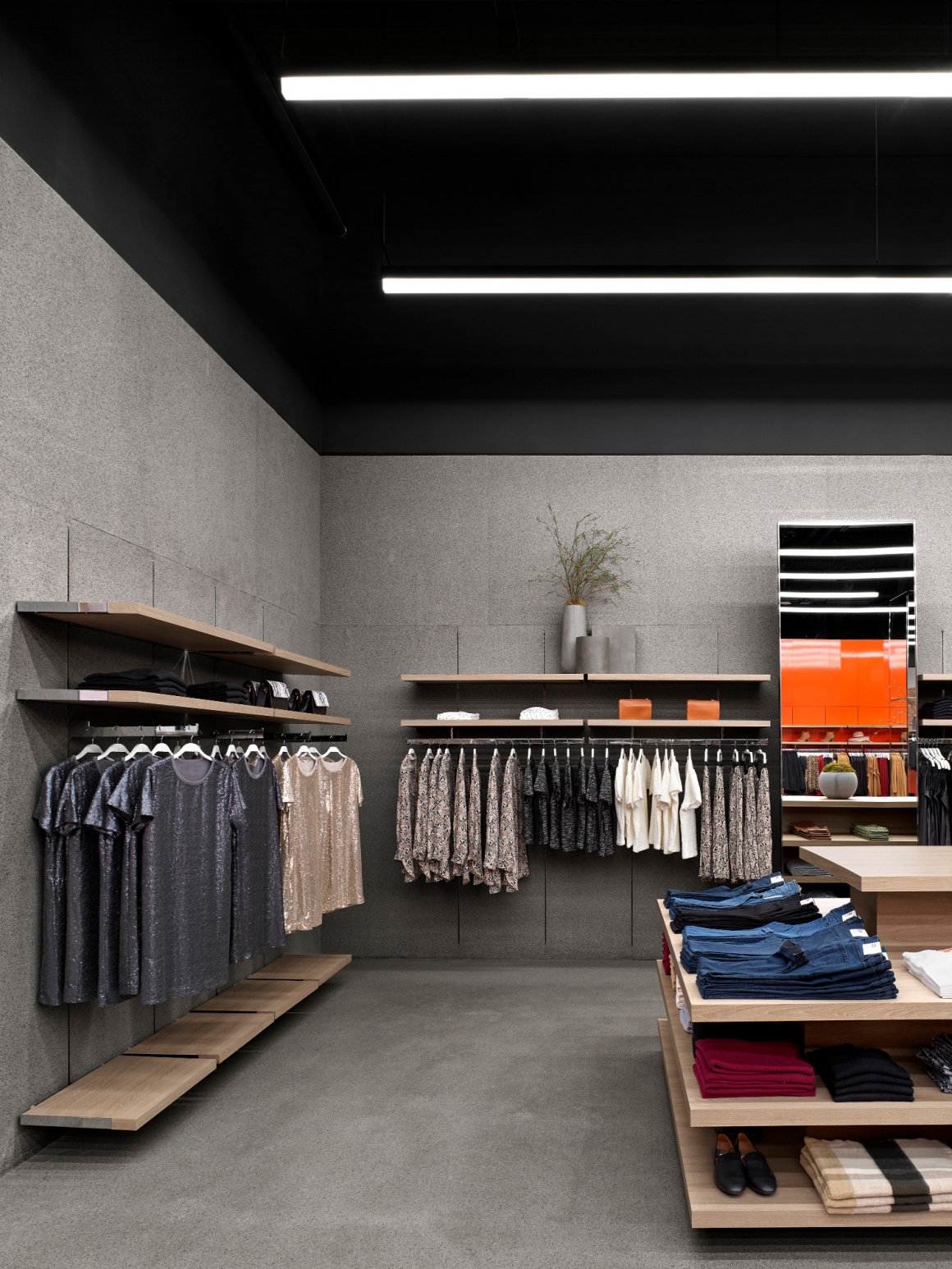
The newly opened Joe Fresh Flagship store in Toronto offers an energizing environment experience. Designed by Burdifilek, the unique retail space embodies the essence of the Joe Fresh brand, resulting in a youthful, fashion-forward, and fresh atmosphere. In collaboration with the Joe Fresh team, Burdifilek envisioned an interior design concept that would be representative of the brand’s evolution.
‘‘... the design strategy was to create a distinctive look and feel with one bold stroke. A strong move sending a clear message, providing a point of memory for the shopper while offering a powerful interior …” explains Diego Burdi, Creative Director, and Founding Partner at Burdifilek.
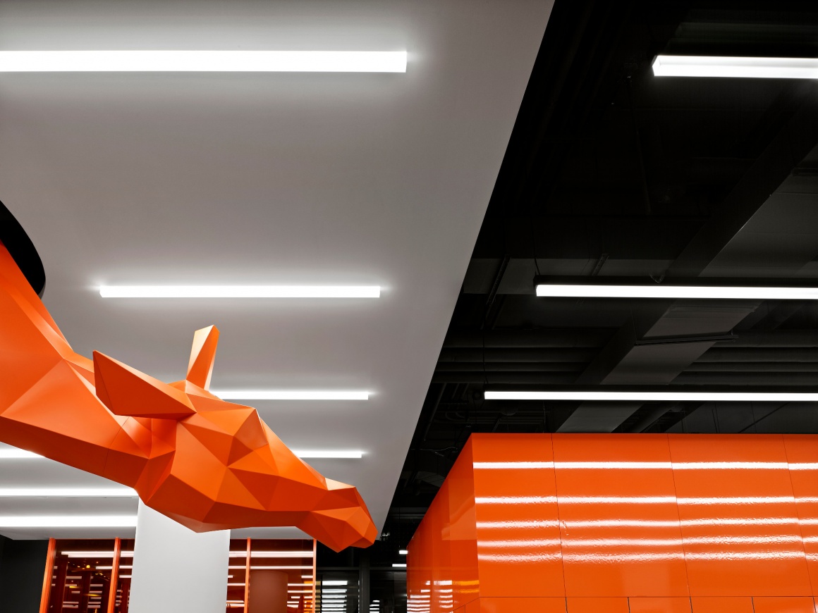
A row of customized bright orange translucent glass screens begins the colorful transition between exterior and interior, providing a glimpse into the enticing retail space. Upon entering the 6,400 square foot store, a juxtaposition of sculpted geometric volumes and planes, mingling with high gloss and matte surfaces, bold colors, and creative installations strike a visual chord. Throughout the store, Joe Fresh's “signature orange” serves as a graphic voice between men, women, and kid’s zones. Defining the specific areas, the bright orange volumes also provide a dual purpose of concealing its functional areas, including a cube-shaped fitting room and a stock room.
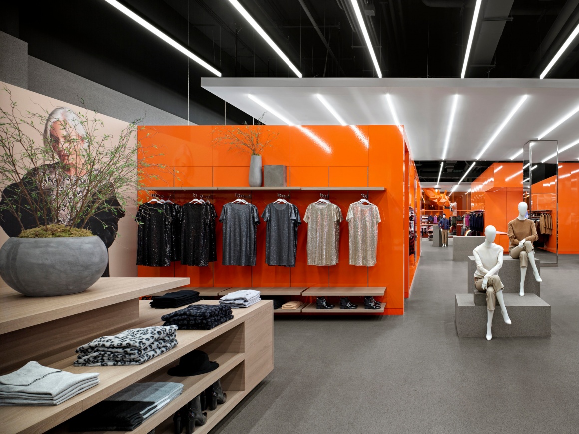
Warmer materials were introduced to create visual harmony and balance; custom oversized tables and displays made of wood laminate serves as a perfect counterpoint. The grey rubber flooring that extends to the wall surfaces and podiums adds a softer feel while unifying the space.
Emanating from the dark grey ceiling, an arrangement of multiple fluorescent fixtures runs the length of the store, shining vibrant energy onto the surfaces below. The lighting installation also serves as a linear grid, guiding patrons towards the kid’s zone, where a geometrically-sculpted, life-sized orange giraffe awaits. Hanging in suspension from a contrasting white ceiling, the giraffe gazes down at shoppers, and infuses the space with an added sense of magic and playfulness, while also serving as a social gathering point.
Burdifilek’s novel interpretation embodies the continuous evolution of the Joe Fresh brand, advancing in unison with consumer trends and behaviors. In response to the latter, the design team also incorporated modern technologies aimed at enhancing the overall shopping experience, including interactive mirrors in the fitting rooms, and self-service checkout points that replace the traditional long-counter cash experience.

